October 2026 rebrands
20 new logos launched in October 2026, by 5 studios and in-house teams. Each entry has the old and new logo side by side, with sources.
- 20
- Rebrands
- 13
- Industries
Rebrands by industry
Featured · 7 with both logos


All rebrands · 20
| What changed | |||
|---|---|---|---|
| Asylum Seeker Resource Centre | Oct 2026 | The Key | The Melbourne refugee and human rights organization kept its purple ASRC letters and bird but redrew both: the thin line drawing of a dove over barbed wire became a solid flying bird with an orange breast, and the capitals got heavier and rounder. |
| Magene | Oct 2026 | Studio not recorded | Smart cycling brand Magene replaced its heavy geometric Magene wordmark in upper and lower case with an all-caps Magene wordmark in a custom typeface with forward-leaning letters and sharp lines, and kept Energy Orange at the heart of a new color system with Performance Blue, Elite Grey and Metallic Silver. |
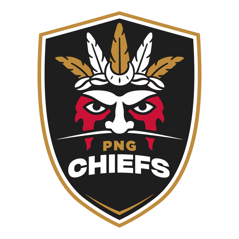
| PNG Chiefs | Oct 2026 | Studio not recorded | The PNG Chiefs, Papua New Guinea's new NRL club, launched their first logo: a face shaped like the map of Papua New Guinea with red paint, under a five-feather headpiece carrying the Southern Cross, with a cassowary bone and kina shells, designed by a team of Papua New Guinean graphic artists. |
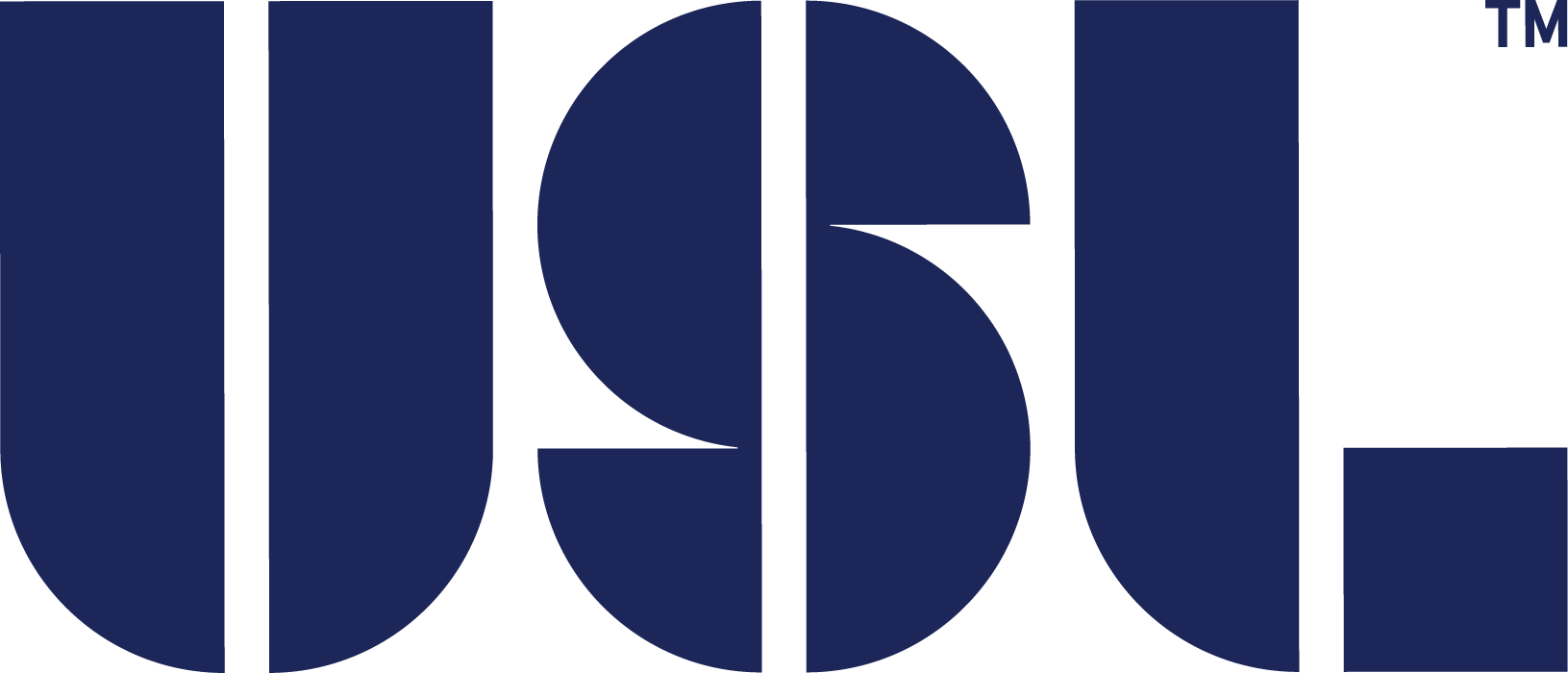
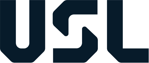
| United Soccer League | Oct 2026 | Spark | "United for Soccer" rebrand by Spark: the rounded stencil USL letters were replaced by an angular USL wordmark with a stair-step S, drawn from soccer-ball geometry, plus new goal-net league marks in a unified USL Blue. |
| University of Nevada, Reno | Oct 2026 | Studio not recorded | The Block N, a white collegiate N on a navy square, was replaced as the primary logo by a custom Interlocked U and N whose negative space traces the outline of Nevada, with a star for Reno. |
| Lord Abbett | Oct 2026 | Studio not recorded | The gold knight tile and spaced capitals were dropped for a stacked, symbol-free Lord Abbett wordmark; the firm says the new wordmark removes any symbols and puts the name at the center. |
| Sharjah Museums Authority | Oct 2026 | Studio not recorded | For its 20th anniversary the Sharjah Museums Authority dropped its geometric knot emblem and small bilingual name for a symbol-free logotype: angular Arabic lettering over the English name in spaced capitals, part of one system for the authority and its 20 museums. |
| Mascom | Oct 2026 | Studio not recorded | The Botswana mobile operator dropped the rounded yellow box with its name in navy capitals and a red swoosh for a lowercase black mascom wordmark with a yellow ring for the o, and swapped the line Number 1 because of you for the tagline Always You. |
| CTF Media & Entertainment | Oct 2026 | Studio not recorded | Hong Kong's i-CABLE Communications, renamed CTF Media & Entertainment, replaced the red i box and cable-rings box of its i-CABLE logo with a red ME monogram beside the new name, two identical letterforms whose negative space forms a forward-facing triangle. |
| Sunlife | Oct 2026 | Studio not recorded | Sun Life became Sunlife, one word, and its rayed sun-globe was simplified for digital use into a solid yellow sun beside a new wordmark, with the tagline Making life brighter. |
| n8n | Oct 2026 | Studio not recorded | Workflow automation platform n8n replaced its connected nodes symbol, a line of circles branching in two, with a pink symbol of three linked crosses whose negative space holds eight nodes, alongside a new wordmark typeface and a refined pink. |
| PGI | Oct 2026 | Studio not recorded | The Memphis automotive parts supplier replaced its blocky PGi wordmark in a blue gradient with a slanted, angular PGi in navy with a light-blue dot on the i, keeping the blue palette it calls its signature. |
| Press Association | Oct 2026 | Studio not recorded | PA Media went back to its old name, the Press Association, and dropped the yellow hexagon and lowercase pa media wordmark for a heavy, condensed all-caps Press Association wordmark stacked over three lines. |
| Remote | Oct 2026 | Collins | On Oct 13, 2026, Remote replaced its rounded R monogram with a heavy custom wordmark by Collins, a cube motif, the Rotina typeface and banknote colors. |
| The Document Foundation | Oct 2026 | Ura | After 16 years of signing with the LibreOffice logo, The Document Foundation got its own: a green stylized page with diagonal stripes beside a two-line The Document Foundation wordmark in Inter, designed by Ura Design. |
| TFS HealthScience | Oct 2026 | Studio not recorded | The Lund-based clinical research organization replaced its red TFS box and slate sans HealthScience wordmark with a single-color wordmark that pairs a bold sans TFS with a serif and sans HealthScience, and a new claim, Securing the path from science to life. |
| Apple Music | Oct 2026 | Studio not recorded | On Oct 21, 2026, Apple Music replaced its light title-case "Music" wordmark with a heavy, tightly spaced lowercase "music" beside the Apple logo, plus a sonic identity. |
| ICICI Life Insurance | Oct 2026 | Ogilvy India | ICICI Prudential Life Insurance became ICICI Life Insurance: the ICICI Prudential wordmark with the Prudence head and the gradient Life Insurance band gave way to a bold italic ICICI Life wordmark with Insurance set in spaced capitals below, keeping the orange and red ICICI i mark, with the tagline Har Kal Aasaan. |
| Kuda | Oct 2026 | Studio not recorded | Seventh-anniversary "More Life" rebrand by Barkas: the lowercase rounded kuda. wordmark was replaced by chunky geometric KUDA letterforms inspired by Nigerian art and architecture. |
| Skydance | Oct 2026 | Studio not recorded | On closing the Warner Bros. Discovery acquisition, Paramount Skydance Corporation renamed itself Skydance and replaced the Paramount mountain lockup with the serif Skydance wordmark. |