Lord Abbett
The gold knight tile and spaced capitals were dropped for a stacked, symbol-free Lord Abbett wordmark; the firm says the new wordmark removes any symbols and puts the name at the centre.
Lord Abbett logo before and after
BeforeUntil Oct 2026
Logo: Lord Abbett. Source: lordabbett.com (archived)


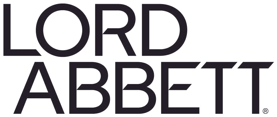

AfterSince 19 Oct 2026
New Lord Abbett wordmark from the official press release image, background removed (adapted by Rebrand Log). Source: lordabbett.com
DownloadLightSVG not availablePNGDark mode version adapted by Rebrand Log
Key facts
Lord Abbett launched a new logo on 19 Oct 2026.
- Brand
- Lord Abbett
- Launched
- Source: lordabbett.com
- Studio
- Not recordedAdd it
- What changed
- The gold knight tile and spaced capitals were dropped for a stacked, symbol-free Lord Abbett wordmark; the firm says the new wordmark removes any symbols and puts the name at the centre.
- Sources
- lordabbett.com, roi-nj.com
Cite this Rebrand Log, "Lord Abbett new logo (2026)", https://rebrandlog.com/rebrand/lord-abbett-2026/, last updated .
The Lord Abbett rebrand, explained
Lord Abbett, the Jersey City asset manager founded in 1929, launched a new brand and visual identity on 19 October 2026. The firm said it covers a new logo, website and refreshed visual and verbal expression, and that it went live the same day across its website, digital channels, offices and client materials.
Managing partner and CEO Doug Sieg tied the change to a decade of growth across public and private markets, a stronger institutional platform and a wider global footprint. In the release he said the new brand better reflects the firm Lord Abbett has become and where it is headed, while staying grounded in the principles it has followed since 1929. ROI-NJ reported the same points and noted that the release gave no cost and no changes to the firm's Jersey City operations. No agency was named.
The old logo paired a white chess knight on a gold square with the name set in widely spaced capitals. The new wordmark removes any symbol, in the firm's words, and puts the name at the centre: Lord sits over Abbett in a tight, geometric sans, with angled cuts in the crossbars of the R, B and E. In the launch artwork it runs in near-black on a warm beige next to the line Independent Thinking. Intentional Action.
The release was the only formal announcement, and coverage stayed with business and regional outlets. Reaction on social media was limited to shares of the news.
Losing the knight is a real loss of character, because it was one of the few memorable emblems in asset management. The stacked wordmark is confident and the cut crossbars give it a detail to own. It is also the same move most of the sector has already made, so Lord Abbett now looks modern and a little like its peers.
In short: The knight leaves the board.
Quote
“Our new brand better reflects the firm we've become and where we're headed, while remaining grounded in the principles that have defined Lord Abbett since our founding in 1929.”
Press
Reactions
Sources
- 1. lordabbett.comhttps://www.lordabbett.com/en-us/financial-advisor/about-us/media-relations/press-release/2026/lord-abbett-unveils-new-brand-reflecting-a-firm-built-with-intention.html
- 2. roi-nj.comhttps://www.roi-nj.com/2026/10/19/finance/lord-abbett-rolls-out-new-brand-identity-at-jersey-city-based-firm/