Press Association
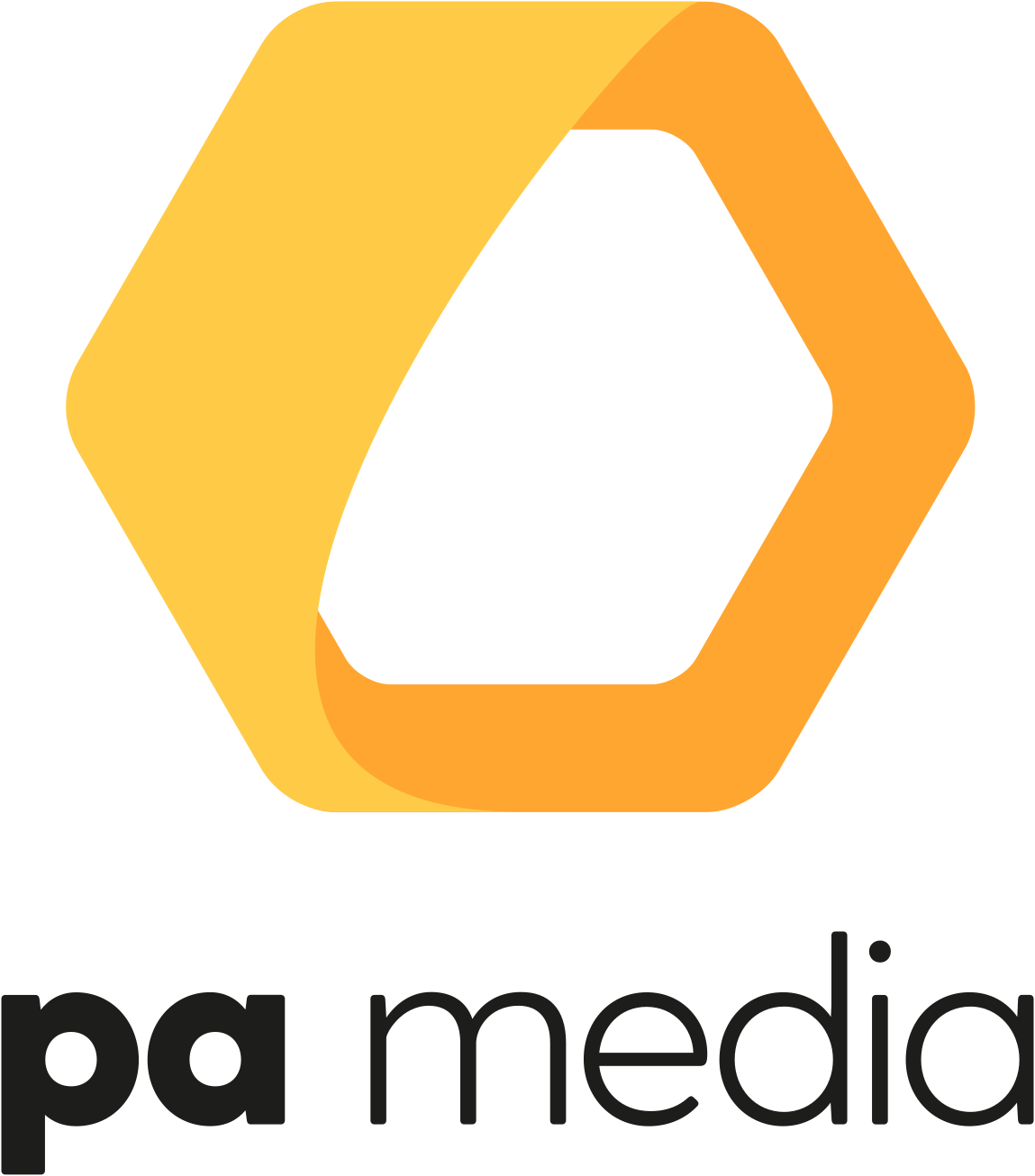
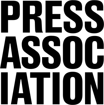
PA Media went back to its old name, the Press Association, and dropped the yellow hexagon and lowercase pa media wordmark for a heavy, condensed all-caps Press Association wordmark stacked over three lines.
Press Association logo before and after
BeforeUntil Oct 2026
Logo: Press Association. Source: pa.media (archived)
AfterSince 13 Oct 2026
Press Association logo from the official website. Source: pressassociation.com
Key facts
Press Association launched a new logo on 13 Oct 2026.
- Brand
- Press Association
- Launched
- Source: thepa.com
- Studio
- Not recordedAdd it
- What changed
- PA Media went back to its old name, the Press Association, and dropped the yellow hexagon and lowercase pa media wordmark for a heavy, condensed all-caps Press Association wordmark stacked over three lines.
Cite this Rebrand Log, "Press Association new logo (2026)", https://rebrandlog.com/rebrand/press-association-2026/, last updated .
The Press Association rebrand, explained
On 13 October 2026 the UK and Ireland's national news agency announced that PA Media was reviving its traditional name and becoming the Press Association once again. The parent company, PA Media Group, became The PA, an umbrella brand for the agency and businesses such as Alamy, Podium, StreamAMG and Hydrogen. The agency had been called PA Media since 2019, when, as Press Gazette reported at the time, a group-wide rebrand replaced the Press Association name.
The company framed the change as a return to trust. Emily Shelley, chief executive of The PA, said: "This feels like the right moment to return to our roots, because they’ve never been more important." Editor-in-chief Jack Lefley said that returning to the name signals that the agency's founding principles of accuracy, impartiality, verification and speed are also at the heart of its future. The release says the new brand identity was created with the design agency Significant.
The old PA Media logo set a large yellow and orange hexagon above the words pa media in a light, rounded lowercase. The new Press Association logo has no symbol. It is a black wordmark in a heavy, tightly spaced condensed sans, set in capitals and broken over three lines as Press, Assoc and Iation. The PA uses a matching block style, with The and PA stacked in blue.
Alongside the name, the agency launched an updated website and a new site for The PA and its businesses, and the Press Association Academy moved to a new office in Stratford, London. InPublishing reported the change the same day. Over the coming months the group's PR and marketing businesses will come together and relaunch as Hydrogen.
Few brands get to undo a name change and be praised for it, but this one has an easy argument: in news, a name people already trust is worth more than a modern symbol. The broken word is the boldest part, and it trades a little readability for a lot of character. On a byline, the old name will do more work than any logo.
In short: The hexagon goes, the old name comes back.
Quote
“This feels like the right moment to return to our roots, because they’ve never been more important.”
Press
Sources
- 1. thepa.comhttps://thepa.com/media-centre/pa-goes-back-to-the-future-with-a-rebrand-built-on-trust
- 2. inpublishing.co.ukhttps://www.inpublishing.co.uk/articles/pa-rebrands-27009
- 3. pressassociation.comhttps://pressassociation.com/
- 4. pressgazette.co.ukhttps://pressgazette.co.uk/news/press-association-rebrands-as-pa-media-as-part-of-ongoing-digital-transformation/