Sunlife
Sun Life became Sunlife, one word, and its rayed sun-globe was simplified for digital use into a solid yellow sun beside a new wordmark, with the tagline Making life brighter.
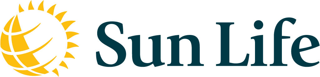
Sunlife logo before and after
BeforeUntil Oct 2026
Logo: Sunlife. Source: sunlife.com

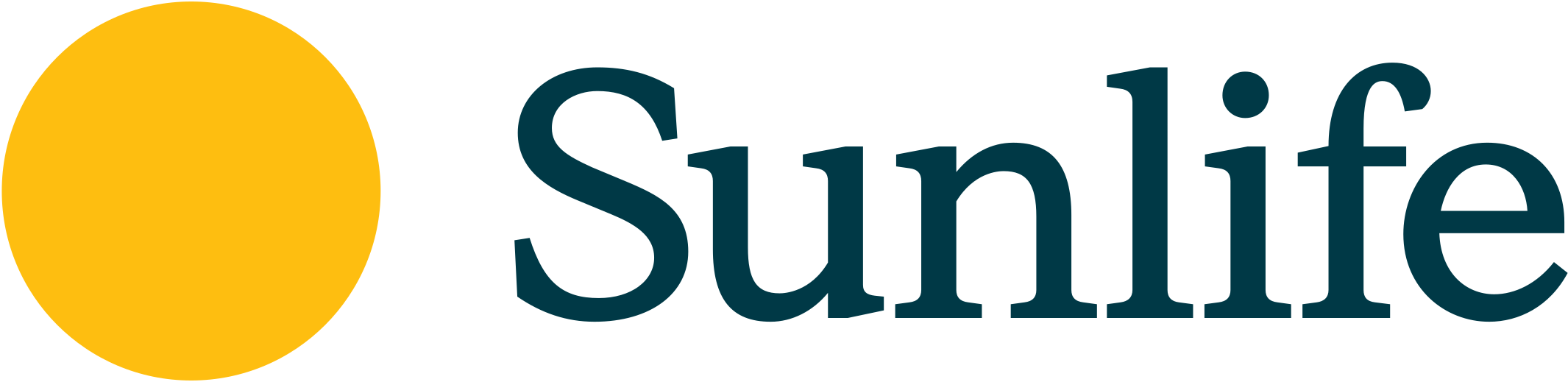
AfterSince 15 Oct 2026
Sunlife logo from the official website (live site). Source: sunlife.com
Key facts
Sunlife launched a new logo on 15 Oct 2026.
- Brand
- Sunlife
- Launched
- Source: sunlife.com
- Studio
- Not recordedAdd it
- What changed
- Sun Life became Sunlife, one word, and its rayed sun-globe was simplified for digital use into a solid yellow sun beside a new wordmark, with the tagline Making life brighter.
- Sources
- sunlife.com, marketingnewsroom.com
Cite this Rebrand Log, "Sunlife new logo (2026)", https://rebrandlog.com/rebrand/sunlife-2026/, last updated .
The Sunlife rebrand, explained
Sun Life Financial unveiled the refreshed global brand on 15 October 2026. It joins the name into one word, Sunlife, modernises the logo and adds a global tagline, Making life brighter. The company said it has grown well beyond life insurance into asset management, health and wealth, and that the brand needed to match. The legal name, Sun Life Financial Inc., and the SLF ticker stay the same.
President and CEO Kevin Strain said the change was about much more than how Sunlife looks, and about a brand aligned to the company's purpose and its next chapter. Linda Dougherty, chief client and strategy officer, said a great brand is defined by the experiences it creates, not by a logo. Chris Hewitt, global chief client experience and marketing officer, called the launch the beginning of the journey. Sunlife did not name a design agency, as Marketing Newsroom also noted.
The old logo was a yellow sun-globe, a sphere of latitude and longitude bands ringed by rays, next to Sun Life set in a dark teal serif. The company describes the new logo as a version simplified and optimised for a digital world. In practice the sun becomes a solid yellow circle and the name is redrawn as a single word, Sunlife, in the same dark teal with the yellow kept as the brand colour.
The rollout is phased across Sunlife's markets, starting with digital and client-facing channels, so old and new branding will appear side by side for a while. Brand New also covered the change. On X, designers argued over the plain circle: one called it an oversimplification but much better than the old logo, while others praised the new type.
Turning a globe into a dot is about as far as reduction goes, and it costs the old mark its sense of reach. It works as a sun though, and the joined-up name is the smarter change. Sunlife reads as one thing, and the new wordmark gives it the warmth the circle alone does not.
In short: The globe sets, a sun rises.
Quote
“This is about much more than changing how Sunlife looks. It's about building a brand aligned to our Purpose and ambition for the next chapter of our company.”
Press
Reactions
- Stephen Edward (Steve) Kee 🎤@steve_kee on XNew Sunlife brand is just begging to be turned into an emoji.15 Oct 2026 · 1 like
- mully@andrewrmullins on X@pizzaboy @SunLife Yellow circle is a bit of an oversimplification imo. But, much better than the old corposlop logo. New type is great20 Oct 2026 · 1 like
- Dan@pizzaboy on X@amillionandback @SunLife why would it be satire? You and I were not the decision makers in rebranding Sun Life? But they did rebrand, and what they ended up with, in my opinion, is nice.19 Oct 2026 · 1 like
- MARKETECH APAC@MarketechAPAC on XA brighter look for @SunLife ☀️ Sun Life Financial Inc. has unveiled a refreshed global brand with a modernised logo, the one-word name “Sunlife” and the tagline “Making life brighter”. #marketing #brandrefresh #global16 Oct 2026 · 0 likes
Sources
- 1. sunlife.comhttps://www.sunlife.com/en/newsroom/news-releases/announcement/sunlife-unveils-new-global-brand/124140/
- 2. marketingnewsroom.comhttps://marketingnewsroom.com/brands/branding/sun-life-becomes-sunlife-global-rebrand/