The Document Foundation
After 16 years of signing with the LibreOffice logo, The Document Foundation got its own: a green stylised page with diagonal stripes beside a two-line The Document Foundation wordmark in Inter, designed by Ura Design.
The Document Foundation logo before and after
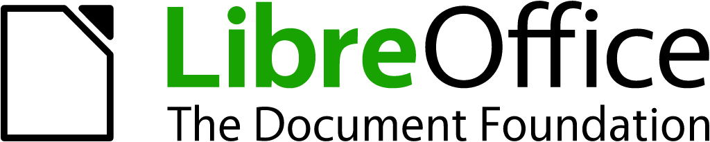
BeforeUntil Oct 2026
LibreOffice / The Document Foundation logo from the official website. Source: documentfoundation.org (archived)

AfterSince 9 Oct 2026
The Document Foundation logo from the official logo package (tdf.io/tdflogo). Source: blog.documentfoundation.org


Key facts
The Document Foundation launched a new logo on 9 Oct 2026, designed by Ura.
- Brand
- The Document Foundation
- Launched
- Source: blog.documentfoundation.org
- Studio
- UraAll rebrands by Ura
- What changed
- After 16 years of signing with the LibreOffice logo, The Document Foundation got its own: a green stylised page with diagonal stripes beside a two-line The Document Foundation wordmark in Inter, designed by Ura Design.
Cite this Rebrand Log, "The Document Foundation new logo (2026)", https://rebrandlog.com/rebrand/the-document-foundation-2026/, last updated .
The The Document Foundation rebrand, explained
The Document Foundation, the foundation that hosts LibreOffice and its community, announced its own visual identity on 9 October 2026. Since its founding in 2010 it had used the LibreOffice logo to represent itself. In the announcement, Italo Vignoli wrote that this was deliberate: a young project needed to put all its recognition behind one name and one mark. Sixteen years on, the foundation works on the Open Document Format standard, joins policy debates on interoperability and digital sovereignty, and deals with public administrations and standards bodies, where it speaks as an institution and not as a software project.
The identity was created with Ura Design, which OMG! Ubuntu describes as a Berlin agency whose clients include Mozilla and Tor. It consists of a logo, a colour palette and a typeface. The logomark is a stylised page, a nod to the documents and the document standard at the centre of the foundation's mission. The palette is built around the green of the logo with a neutral scale, and all recommended text and background pairings meet WCAG 2.1 contrast requirements.
The old signature was the LibreOffice lockup: a document icon with a folded corner, LibreOffice with Libre in green, and The Document Foundation set underneath. The new logo is a green page outline with diagonal stripes across its upper part, next to The Document Foundation on two lines. The wordmark and all other text use Inter, by Rasmus Andersson, released under the SIL Open Font License, which the foundation says fits its mission because anyone can use it.
Nothing changes for LibreOffice, whose name and logo stay as they are. The new identity will replace the LibreOffice logo on the foundation's website, social accounts and institutional documents over the coming months, with Writer and Impress templates to follow. The logo package is available to download. OMG! Ubuntu and Time for Designs covered the change, and Brand New listed it on 16 October. On X, one post noting the foundation finally had a logo of its own, a page but a nicer page, drew agreement in the replies.
This is a modest change done well. Separating the institution from the product is overdue, and the striped page reads as the same family as LibreOffice without being confused with it. The choice of Inter is safe, but for an organisation that campaigns for open formats, an open typeface makes more sense than a custom one.
In short: Still a page, now its own.
Quote
“In these contexts, the foundation speaks as an institution, not as a software project, and it needs a signature of its own.”
Press
Reactions
- Dan@pizzaboy on XThe Document Foundation used LibreOffice's logo from 2010 until this month, when they finally got one of their own. It's a page, but it's a nicer page.20 Oct 2026 · 30 likes
- Precious Baridoosia@thepreciousbx on X@pizzaboy the current logo is much better fr20 Oct 2026 · 2 likes
- Tyler Vea@TylerVdesign on X@pizzaboy We all love a nicer page20 Oct 2026 · 1 like
Sources
- 1. blog.documentfoundation.orghttps://blog.documentfoundation.org/blog/2026/10/09/tdf-visual-identity/
- 2. omgubuntu.co.ukhttps://www.omgubuntu.co.uk/2026/10/document-foundation-new-logo
- 3. timefordesigns.comhttps://www.timefordesigns.com/blog/2026/10/20/document-foundation-new-identity-libreoffice-logo/