Kuda
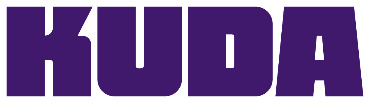
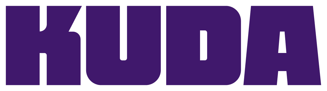
Seventh-anniversary "More Life" rebrand by Barkas: the lowercase rounded kuda. wordmark was replaced by chunky geometric KUDA letterforms inspired by Nigerian art and architecture.
Kuda logo before and after
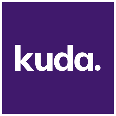
BeforeUntil Oct 2026
Kuda logo via Wikimedia Commons (author: https://digestafrica.com/companies/kudabank). Source: commons.wikimedia.org
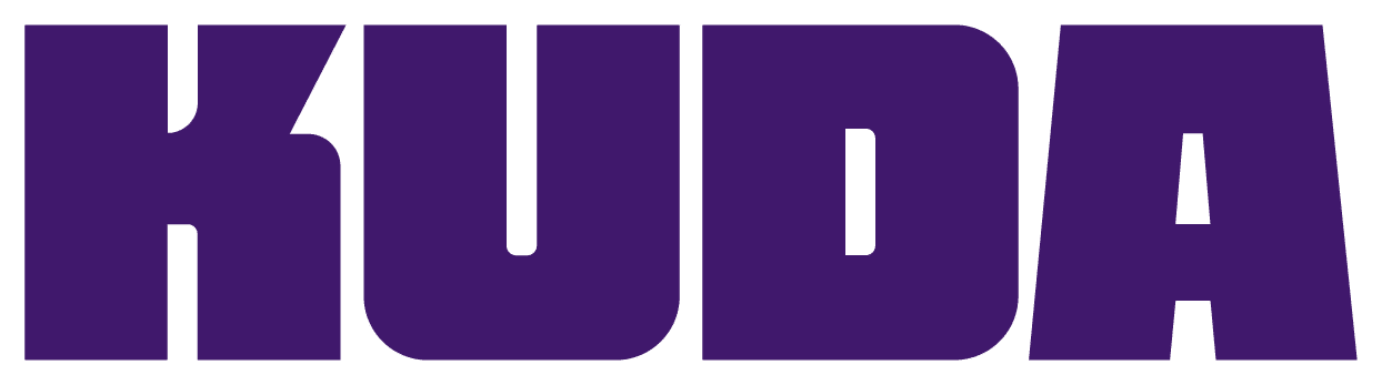
AfterSince Oct 2026
Kuda logo from official website (live site). Source: kuda.com
Key facts
Kuda launched a new logo in Oct 2026.
- Brand
- Kuda
- Launched
- Studio
- Not recordedAdd it
- What changed
- Seventh-anniversary "More Life" rebrand by Barkas: the lowercase rounded kuda. wordmark was replaced by chunky geometric KUDA letterforms inspired by Nigerian art and architecture.
- Sources
- itsnicethat.com, creativereview.co.uk
Cite this Rebrand Log, "Kuda new logo (2026)", https://rebrandlog.com/rebrand/kuda-2026/, last updated .
The Kuda rebrand, explained
Kuda, the Nigerian digital bank, launched a new identity in October 2026 with the Copenhagen creative company Barkas, covering positioning, identity, website and rollout across personal and business banking. The platform is the phrase More Life, Jamaican slang for wishing someone well that has since travelled globally.
It's Nice That's Ayla Angelos described the logo as Kuda's short name in thick, geometric letterforms inspired by Nigerian art and architecture, with KU stacked over DA like a stamp, and four iterations developed for legibility and flexibility. Personal banking uses a deep purple, Kuda Business black. The system adds a custom Naira sign made with local partners and a bespoke typeface, Kuda Modena. Angelos framed it against the challenger-bank house style of soft gradients, pastels, friendly sans serifs and flat illustrated people.
Creative Review's Daniel Milroy Maher reported the same structure and added that the identity targets aspirational, digitally savvy young Nigerians, with documentary photography by Rachel Seidu and motion that uses rhythmic editing and layered sound. He quoted group CEO Babs Ogundeyi: banking in Nigeria had stopped seeing the human behind the account number and the dream behind every Naira.
This is one of the more convincing escapes from fintech sameness, and the reason is specific. The stacked wordmark is heavy, local in its references and works as a stamp on a card or a flag. The risk is the slogan. More Life is borrowed from Jamaican slang, and both outlets had to explain its origin, which is a lot of context for a Lagos bank's core idea. But the logo does not need the explanation, and that is the part that will last.
In short: KU over DA, stamped, not smiling.
Sources
- 1. itsnicethat.comhttps://www.itsnicethat.com/articles/barkas-kuda-graphic-design-project-131026
- 2. roastbrief.ushttps://roastbrief.us/barkas-shares-distinctive-new-identity-for-nigerian-digital-bank-kuda/
- 3. barkas.comhttps://barkas.com/projects/kuda/