Apple Music
Oct 2026: Apple logo + title-case Music in SF -> Apple logo + heavy tightly spaced lowercase music (Apple Music Hall, then iOS 27.2 beta)
Apple Music logo before and after
BeforeUntil Oct 2026
Apple Music logo via Wikimedia Commons (author: Apple Inc.). Source: commons.wikimedia.org

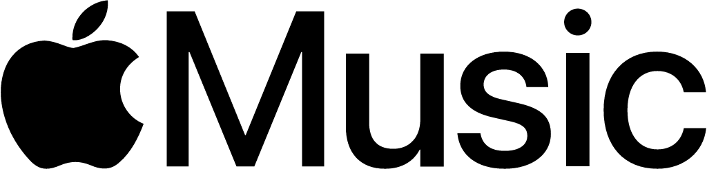
AfterSince Oct 2026
Apple Music logo via Wikimedia Commons (author: Apple). Source: commons.wikimedia.org


Key facts
Apple Music launched a new logo in Oct 2026.
- Brand
- Apple Music
- Launched
- Source: theverge.com
- Studio
- Not recordedAdd it
- What changed
- Oct 2026: Apple logo + title-case Music in SF -> Apple logo + heavy tightly spaced lowercase music (Apple Music Hall, then iOS 27.2 beta).
- Sources
- macrumors.com, theverge.com, appleinsider.com
Cite this Rebrand Log, "Apple Music new logo (2026)", https://rebrandlog.com/rebrand/apple-music-2026/, last updated .
Official video
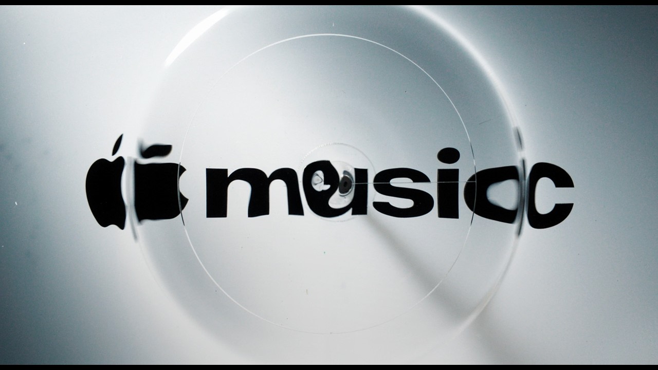
The Apple Music rebrand, explained
Apple Music launched in 2015 with a wordmark that paired the Apple logo with the word Music in Apple's clean, minimal San Francisco typeface, in title case. The new version first surfaced in September 2026 in a promotional video and website for Apple Music Hall, Apple's London venue, before an iOS developer beta in October confirmed it was coming to the service itself. Apple then made it official on 21 October 2026 with a short film on its Apple Music YouTube channel, Apple Music. Made by Sound: Behind the new brand identity, presenting a new logo, the updated wordmark and a new sonic identity.
The change is all in the word. Music becomes music, lowercase, in a much heavier weight with tight spacing, which makes the whole logo noticeably wider and denser. The Apple logo stays. AppleInsider described it as chunkier than ever, and MacRumors noted it was the first logo change since the service launched eleven years earlier.
The icon changed too, to black and white, and that drew the loudest reaction. Engadget reported people hating the monochrome icon, Cybernews wrote of a backlash, and on Reddit's logo design forum opinion split between those who liked the retro, Y2K weight of the wordmark and those who called it a generic regression from Apple's playful colour.
Apple has not named a design studio for the identity. In the film, Apple says: "For the rebrand of Apple Music, we wanted sound to create the visuals." Sound played through a rig moves a tank of liquid over the logo, and the visuals were captured in camera. The Verge and MacRumors report that the new sonic identity was made with British producer Fred Again and NEST Acoustics.
The context helps. Creative Bloq noted the logo first appeared with Apple Music Hall, an intimate 600 capacity venue in Battersea Power Station, and quoted a Redditor for whom the type felt like a music magazine cover or a cassette insert. It placed the move in a line running from iOS 7 killing skeuomorphism to last year's Liquid Glass, alongside colourful laptops and Gen Z-baiting TikTok ads. MacRumors then found the iOS 27.2 beta swapping red highlights for blue and putting widgets on black, suggesting Apple was phasing out much of the red branding. That makes this a full colour reset, not just a heavier word.
Creative Bloq read it as evidence that the long reign of minimalism, the flat restraint Apple itself helped popularise with iOS 7 in 2013, is ending. That may be over-reading one wordmark, but the move is striking for Apple: heavy, compact type feels more like a streetwear label than a tech company. It is louder and more ownable, if less elegant.
In short: Apple goes heavy and lowercase. Less elegant, more presence.
Sources
- 1. theverge.comhttps://www.theverge.com/tech/998783/is-apple-music-experimenting-with-a-new-logo
- 2. appleinsider.comhttps://appleinsider.com/articles/26/10/06/modernized-apple-music-logo-is-now-chunkier-than-ever
- 3. creativebloq.comhttps://www.creativebloq.com/design/logos-icons/the-bold-new-apple-music-logo-signals-the-end-of-minimalism
- 4. macrumors.comhttps://www.macrumors.com/2026/10/13/ios-27-2-apple-music-icon/
- 5. macrumors.comhttps://www.macrumors.com/2026/10/21/apple-music-new-look-announced/
- 6. theverge.comhttps://www.theverge.com/tech/1015533/apple-music-new-logo
- 7. appleinsider.comhttps://appleinsider.com/articles/26/10/21/apple-musics-gorgeous-rebrand-leans-on-liquid-glass