Magene
Smart cycling brand Magene replaced its heavy geometric Magene wordmark in upper and lower case with an all-caps Magene wordmark in a custom typeface with forward-leaning letters and sharp lines, and kept Energy Orange at the heart of a new colour system with Performance Blue, Elite Grey and Metallic Silver.
Magene logo before and after
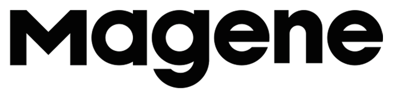

BeforeUntil Oct 2026
Magene logo (before 2026), cropped from the official Previous and New comparison image published with Magene's rebrand announcement. Source: magene.com
DownloadLightSVG not availablePNGDisplay versions adapted by Rebrand Log
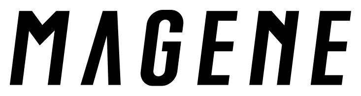

AfterSince 21 Oct 2026
Magene logo (2026), cropped from the official Previous and New comparison image published with Magene's rebrand announcement. Source: magene.com
DownloadLightSVG not availablePNGDisplay versions adapted by Rebrand Log
Key facts
Magene launched a new logo on 21 Oct 2026.
- Brand
- Magene
- Launched
- Source: magene.com
- Studio
- Not recordedAdd it
- What changed
- Smart cycling brand Magene replaced its heavy geometric Magene wordmark in upper and lower case with an all-caps Magene wordmark in a custom typeface with forward-leaning letters and sharp lines, and kept Energy Orange at the heart of a new colour system with Performance Blue, Elite Grey and Metallic Silver.
Cite this Rebrand Log, "Magene new logo (2026)", https://rebrandlog.com/rebrand/magene-2026/, last updated .
The Magene rebrand, explained
Magene announced the change on its own blog on 21 October 2026, presenting a new logo and visual system for a brand that it says reaches users in more than 100 countries and regions. Founded in 2015, the company makes smart GPS computers, smart trainers, power meters, sensors and smart lights. Cycling Weekly and Bicycling Australia reported the rebrand the same day, largely following the company's own text.
According to Magene, the new logo sets the name in capitals in a custom typeface, with pronounced forward-leaning letterforms and sharp lines meant to suggest speed, energy and movement. The colour system keeps Energy Orange as the brand's signature and adds Performance Blue, which the company links to professionalism and precision, plus Elite Grey and Metallic Silver as quieter, low-saturation neutrals.
Side by side, the difference is easy to read. The old logo was a heavy, upright geometric sans with a capital M and lowercase letters. The new one is all capitals, every stroke slanted and cut square, and the A has lost its crossbar so it reads almost like an upturned V. Magene sums up its approach as Less Is More and calls the design philosophy Mastery of the Moment.
The rollout will be gradual: over the coming year the identity moves onto packaging, product interfaces, product design, retail displays and exhibitions. Magene ties the change to its push into professional racing, including a 2026 partnership with a UCI WorldTour team. The new mark looks much more like a racing brand than the friendly logo it replaces, though comments under the announcement were mixed, with some riders asking for better software before a new look.
In short: A friendly upright wordmark turns into a fast, slanted one built for racing.
Press
- Magene21 Oct 2026Magene Unveils Global Rebrand, Marking a New Chapter in Its Global and Professional Development
- Cycling Weekly21 Oct 2026Magene unveils global rebrand, marking new chapter in its global and professional development
- Bicycling Australia21 Oct 2026Magene unveils new global brand identity
Sources
- 1. magene.comhttps://www.magene.com/en/blog/103_magene-unveils-global-rebrand.html
- 2. cyclingweekly.comhttps://www.cyclingweekly.com/news/magene-unveils-global-rebrand-marking-new-chapter-in-its-global-and-professional-development
- 3. bicyclingaustralia.com.auhttps://bicyclingaustralia.com.au/news/magene-unveils-new-global-brand-identity/