Google (2025)
The "G" mark's four flat colour segments replaced by a seamless bright gradient; first change in nearly a decade; wordmark unchanged
Google logo before and afterRefinement
BeforeUntil May 2025
Google logo via Wikimedia Commons (uploader/author: Google LLC). Source: commons.wikimedia.org


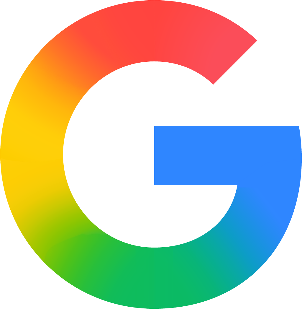
AfterSince 12 May 2025
Google logo via Wikimedia Commons (uploader/author: Original: Google Vector: Designism, Liquinoid, and YeBoy371). Source: commons.wikimedia.org
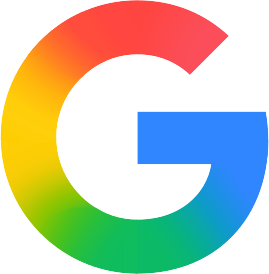
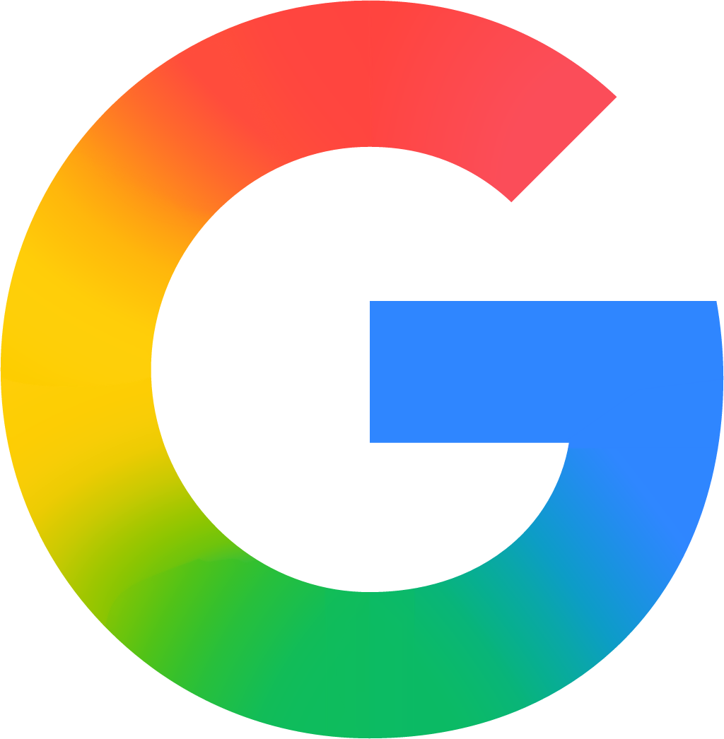
Refinement: the mark keeps its form. The refresh also covers color.
Key facts
Google launched a new logo on 12 May 2025, designed by Google in-house.
- Brand
- Launched
- Studio
- In-house at Google
- What changed
- The "G" mark's four flat colour segments replaced by a seamless bright gradient; first change in nearly a decade; wordmark unchanged.
- Sources
- theverge.com, 9to5google.com
- Logo history
- 4 rebrands
Cite this Rebrand Log, "Google new logo (2025)", https://rebrandlog.com/rebrand/google-g/, last updated .
The Google rebrand, explained
Google's G is one of the most familiar marks in tech, the front door to search on phones. So when it changed in May 2025, the shift was small in drawing and big in meaning. The Verge reported that an update to the Google app on iOS and Pixel phones showed a new G that blends red, yellow, green and blue into a gradient, the company's first logo change in almost ten years, a story first spotted by 9to5Google.
The previous major change came in September 2015, when Google moved its wordmark to a sans serif and introduced a G that carried all four brand colours as distinct segments. The new version keeps the shape and the colours but removes the hard borders between them. As 9to5Google described it, red melts into yellow, yellow into green and green into blue.
Google offered no detailed explanation at launch, and did not immediately respond to The Verge's request for comment. The outlet pointed to the most obvious context: the blended look brings the G in line with the gradient Google uses for its Gemini AI brand. The rollout was gradual. At first only iOS and Pixel phones showed it, while the web and other Android devices kept the segmented version. Within weeks, 9to5Google reported, the new G had appeared on stage at the I/O 2025 keynote, become the google.com favicon, replaced the icon in the Search widget, including its Dynamic Color variant, and topped the AI Mode input page.
The wordmark itself was not touched. This is an icon change, aimed at app and system surfaces where the G stands alone.
Read through the Gemini lens, the logic is clear. Google is trying to make its search brand and its AI brand feel like one family, and soft gradients have become the house style of AI products generally. Blending the colours makes the G look more fluid and less like four separate services glued together. The trade off is clarity. The 2015 G was crisp, flat and instantly legible at tiny sizes; gradients muddy at favicon scale, as 9to5Google itself noted when it said the effect was hard to make out there. It also nudges one of the most distinctive marks in tech toward the same glowing look every AI startup uses. Small change, but a revealing one about where Google thinks its future lies.
In short: Four colours melt into one.
Rationale
A modernising refresh of the core mark; Google published no detailed rationale at launch.
Press
Reactions
- Brian MacDuff@itstheBMAC on X🚨 Google has a new logo! 🚨 After almost a decade of the color-segmented "G" logo, Google has debuted a new gradient "G" logo! 🎨 The new "G" logo is live now for the Google app on the iOS App Store! 👀12 May 2025 · 1 like
- DesignRush@designrushmag on X@Google just changed its 'G' icon after 10 years — and didn’t tell anyone. 😮 A softer gradient, AI-aligned design, and zero fanfare. Is this the start of a quiet rebrand? #googleupdate #branding #uxdesign #aidesign…13 May 2025 · 1 like
- Techmeme@Techmeme on XGoogle is updating its "G" icon for the first time in 10 years, with its four colors now blending together on a gradient (@technacity / 9to5Google)12 May 2025 · 3 likes
- heiseonline@heise.de on BlueskyStatt klar abgegrenzter Farben Rot, Gelb, Grün und Blau setzt das neue Logo von Google auf fließende Farbübergänge. #Google13 May 2025 · 5 likes
- Jafcompu@jafcompu.bsky.social on BlueskyGoogle cambia su logo después de 10 años!!! #jafcompu #tecnologia #ciencia #frikgeeks #google https://atomix.vg/google-cambia-su-logo-despues-de-10-anos/23 May 2025 · 0 likes
- Son Dakika TR@sondakikatr.bsky.social on Bluesky📰 🔴 SON DAKİKA: Google, 10 yılın ardından logosunu değiştirdi: İşte yeni logo Kaynak: Donanım Haber #haber #sondakika #YeniLogo #GoogleGelişmeleri #TeknolojiHaberleri13 May 2025 · 0 likes
Sources
- 1. theverge.comhttps://www.theverge.com/news/664958/google-g-logo-gradient-design-change
- 2. 9to5google.comhttps://9to5google.com/2025/05/23/new-google-logo-apps/