Google (2013)
Flat wordmark with thinner letters, shadows removed
Google logo before and after


BeforeUntil Sep 2013
Logo: Google. Source: google.com (archived)
DownloadLightSVG not availablePNGDarkSVG not availablePNGDark mode version adapted by Rebrand Log



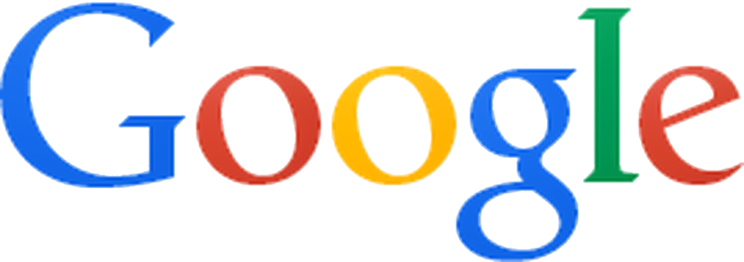
AfterSince Sep 2013
Logo: Google. Source: google.com (archived)
DownloadLightSVG not availablePNGDarkSVG not availablePNGDark mode version adapted by Rebrand Log


Key facts
Google launched a new logo in Sep 2013, designed by Google in-house.
- Brand
- Launched
- Studio
- In-house at Google
- What changed
- Flat wordmark with thinner letters, shadows removed.
- Why
- Google said its 2013 update refined its colour palette and letter shapes to match the flatter logo rolling out across its products.
- Sources
- en.wikipedia.org, techcrunch.com, bbc.com
- Logo history
- 4 rebrands
Cite this Rebrand Log, "Google new logo (2013)", https://rebrandlog.com/rebrand/google-2013/, last updated .
The Google rebrand, explained
From 1999 Google's logo was Ruth Kedar's design, set in Catull, an old-style serif, with a primary-colour sequence broken by a green l. A 2010 update softened the shading. On 19 September 2013 Google introduced a flat, two-dimensional version alongside a redesigned navigation: TechCrunch noted the old black bar across the top of Google's pages was gone, replaced by an app-launcher style menu.
The letters stayed Catull, but the shading went: no shadows, just flat colour in a slightly altered palette with thinner-looking letters. It was a small change on paper, and Google kept refining it, even nudging the second g and the l by a pixel in 2014.
The Verge confirmed the official version on 19 September 2013. Google described the update as a refined colour palette and slightly altered letter shapes, matching the flatter logo that had surfaced earlier that month, and said it would roll out across more products in the coming weeks. It arrived together with a redesigned navigation: the black bar across the top of Google's sites was replaced by an apps grid like the one on Android, and the outlet noted the logo matched the design language Google had been bringing to its Android and iOS apps.
The update was designed in-house by Google, and rolled out over several weeks; the older 2010 logo lingered for a while on pages such as the Doodles archive.
Reaction was mostly a shrug of approval. The BBC covered it alongside the search page revamp, Ars Technica confirmed the flat logo was spreading across Google's properties, and It's Nice That argued the redesign worked because people already trusted the brand. On Reddit's design forum many called the loss of bevel and shadow overdue, while some preferred the old 3D look.
The BBC put the flat logo in a busy season: Yahoo and Bing had also updated their marks that month, and this was Google's first logo change since 2010. A Forrester analyst said the changes were subtle because free software depends on loyalty, and nobody wanted to alienate users. Analysts at Gartner and elsewhere suspected the slimmer navigation, with other products tucked behind a grid icon, was partly about pushing Google+. The analysts were right about the subtlety: the flattening was a correction, not a reinvention.
Seen today, 2013 is the hinge between Google's two eras. Flattening the serif showed how dated the skeuomorphic shading had become, but it also exposed that the serif itself belonged to an earlier internet. Two years later Google replaced it entirely. As a standalone redesign it is modest; as a step, it was necessary.
In short: Google's logo loses its shadows, and with them its last bit of 2000s gloss.
Sources
- 1. en.wikipedia.orghttps://en.wikipedia.org/wiki/Google_logo
- 2. techcrunch.comhttps://techcrunch.com/2013/09/19/google-makes-its-new-flat-logo-and-app-launcher-style-nav-menu-official-will-roll-out-over-the-next-few-weeks/
- 3. bbc.comhttps://www.bbc.com/news/technology-24170053