Revant
Revant swapped its capital wordmark with a yellow plant for a lowercase Revant wordmark with a stroke in the v and a new descriptor.
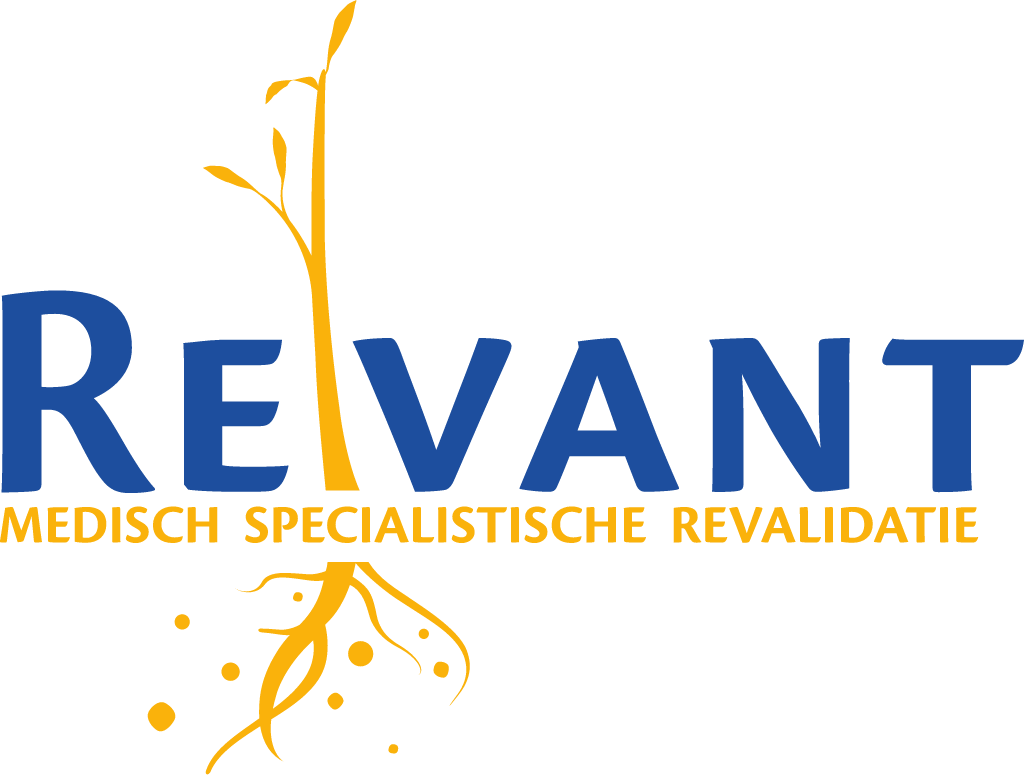
Revant logo before and after




Key facts
Revant launched a new logo on 28 Oct 2026.
- Brand
- Revant
- Launched
- Source: revant.nl
- Studio
- Not recordedAdd it
- What changed
- Revant swapped its capital wordmark with a yellow plant for a lowercase Revant wordmark with a stroke in the v and a new descriptor.
Cite this Rebrand Log, "Revant new logo (2026)", https://rebrandlog.com/rebrand/revant-2026/, last updated .
The Revant rebrand, explained
Revant says the new house style carries its renewed identity, built around one goal: increasing quality of life. The launch also brings a new pay-off, ‘Revant zet je in beweging’, a renewed revant.nl and werkenbijrevant.nl for future colleagues, students and volunteers. The post does not name a design studio.
According to Revant, the new logo looks clean but friendly, and the stroke in the v adds character. The familiar Revant blue stays, yellow stays too, and a fresh coral is added. The new descriptor under the logo reads medische revalidatie experts, replacing medisch specialistische revalidatie. Revant says the new look will appear step by step at its locations and in its communication.
Side by side, the old logo set the name in blue capitals, with a yellow plant whose stem rises between the E and the V and whose roots spread below the yellow descriptor. The new logo drops the plant: a lowercase Revant wordmark in a sans, the left stroke of the v set apart as a short dash, above the descriptor in lowercase.
In short: Revant replaced its capital wordmark and yellow plant with a lowercase wordmark with a stroke in the v in October 2026.
Press
Sources
- 1. revant.nlhttps://www.revant.nl/nieuws/we-zien-er-anders-uit/
- 2. revant.nlhttps://www.revant.nl/wp-content/uploads/2026/10/Jaarbericht-2025.pdf