Home Instead
Home Instead replaced its plum tulip in a circle with a dark green house mark built around a lowercase h, next to a lowercase home instead wordmark, with the campaign A Better What's Next.
Home Instead logo before and after

BeforeUntil Dec 2024
Home Instead logo (2021 to 2024), cropped from the lockup image Honor published with its Aug 2021 acquisition announcement. Source: honorcare.com
DownloadLightSVG not availablePNGDisplay versions adapted by Rebrand Log
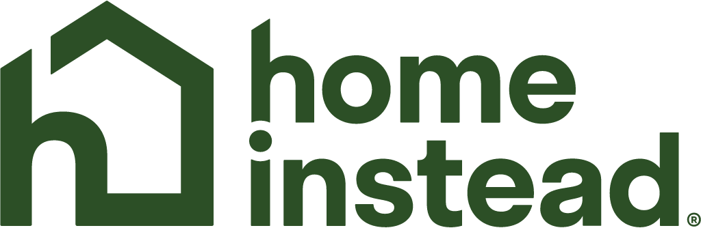
AfterSince 16 Dec 2024
Home Instead logo (2024), official SVG from the header of homeinstead.com. Source: homeinstead.com

Key facts
Home Instead launched a new logo on 16 Dec 2024, designed by Honor in-house.
- Brand
- Home Instead
- Launched
- Studio
- In-house at Home Instead
- What changed
- Home Instead replaced its plum tulip in a circle with a dark green house mark built around a lowercase h, next to a lowercase home instead wordmark, with the campaign A Better What's Next.
- Sources
- homeinstead.com, honorcare.com, linkedin.com
Cite this Rebrand Log, "Home Instead new logo (2024)", https://rebrandlog.com/rebrand/home-instead-2024/, last updated .
The Home Instead rebrand, explained
The old tulip is gone. The January 2021 logo was a plum circle with a tulip inside it and Home Instead® beside it on two lines. The new logo is a dark green mark in which a house and a lowercase h are one shape, with a lowercase home instead wordmark beside it. Everything about the old logo was replaced: colour, shape, lettering.
Home Instead is a brand with a long history. Paul and Lori Hogan founded it in 1994. In January 2021 the company showed a refreshed logo made with the agency Energy BBDO: Senior Care left the name, the shapes got simpler and the tulip stayed, because it had come to stand for personal care. On 6 August 2021 Honor announced the acquisition, in a post by Seth Sternberg. Home Instead kept its own name and now calls itself "an Honor company".
On 16 December 2024 Mark Privett, Honor's vice president of design, wrote on LinkedIn: "Today at Home Instead we launched a rebrand and our new creative campaign." The goal was to speak to the next generation of aging adults, "rather than past them", with optimism about what the aging experience can be, and to do it with "a modern, vibrant, and flexible visual branding system". The campaign is called A Better What's Next.
The h deserves a look. Both brand names begin with an h, and the h in the Home Instead logo is Honor's. The house and the h share one outline, so the mark says home and new owner at the same time.
The why is a move of category. Sternberg wrote in 2021 that Honor and Home Instead would combine high-tech with high-touch. Kim Atkinson describes the new work on a podcast as moving home care from "crisis care" to "a better what's next". Home Instead offices are independent franchises, so a rebrand has to be sold to owners first. Atkinson says you need your "promoters" lined up before you launch anything controversial.
Privett thanks Joshua Bruner and Kami Manstedt, the heads of brand design and marketing, and the agency FCB Chicago. Atkinson, who led the programme, wrote: "I'm proud to introduce the new branding and campaign for Home Instead." The PR campaign around the new identity, by 5WPR, ran in February 2025, during American Heart Month and National Caregivers Day. On 2 December 2025 Home Instead said on its own site that Fast Company had put the campaign on its Brands That Matter list.
Our verdict: the right idea, with a price. A house is the most literal sign for care at home and the h makes it yours. But in 2021 Home Instead said it was keeping the tulip because it had come to stand for personal care. Four years later it is gone, and the plum with it. Dark green is calmer and less sweet, and it sits well next to Honor's orange.
In short: A plum tulip became a green house with an h inside it.
Quotes
“I'm proud to introduce the new branding and campaign for Home Instead”
“We've given our logo a modern, refreshed look, while keeping the tulip that has come to symbolize the highly personalized care we're known for.”
Press
- Home Instead6 Jan 2021Home Instead Introduces New Brand and Campaign
- Honor6 Aug 2021Honor acquires Home Instead
- LinkedIn (Mark Privett)16 Dec 2024Today at Home Instead we launched a rebrand and our new creative campaign
- LinkedIn (Kim Atkinson)18 Dec 2024I'm proud to introduce the new branding and campaign for Home Instead
- 5WPR2025Honor / Home Instead Case Study
- Home Instead2 Dec 2025Home Instead Named to Fast Company's 2025 Brands That Matter List
Sources
- 1. homeinstead.comhttps://www.homeinstead.com/news-and-media/new-brand-and-campaign/
- 2. honorcare.comhttps://www.honorcare.com/news/honor-acquires-home-instead/
- 3. linkedin.comhttps://www.linkedin.com/posts/privett_today-at-home-instead-httpslnkdinea27rigc-activity-7274463207522545665-P2n6
- 4. linkedin.comhttps://www.linkedin.com/posts/kim-atkinson-van-pelt-182a924_im-proud-to-introduce-the-new-branding-and-activity-7274979022193799168-brPP
- 5. 5wpr.comhttps://www.5wpr.com/practice/honor-home-instead.cfm
- 6. homeinstead.comhttps://www.homeinstead.com/news-and-media/fast-company-brands-that-matter-2025/
- 7. linkedin.comhttps://www.linkedin.com/posts/privett_home-instead-is-named-as-fast-company-brand-activity-7401718581723365376-0yC3
- 8. podscan.fmhttps://podscan.fm/podcasts/the-narrative-8/episodes/how-honor-generated-a-billion-impressions-in-30-days-by-bringing-back-macaulay-culkin-as-kevin-mcallister-kim-atkinson
- 9. homeinstead.comhttps://www.homeinstead.com/