Solidarm
Solidarm dropped the ring and tricolor quill around its lowercase wordmark for a bolder wordmark under two slanted strokes in blue and red.
Solidarm logo before and after
BeforeUntil Oct 2026
Solidarm logo (before 2026) from the official Solidarm website (solidarm.fr). Source: solidarm.fr
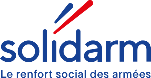
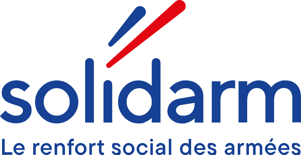
AfterSince 28 Oct 2026
Solidarm logo (2026) from the official Solidarm website (solidarm.fr). Source: solidarm.fr
Key facts
Solidarm launched a new logo on 28 Oct 2026.
- Brand
- Solidarm
- Launched
- Source: solidarm.fr
- Studio
- Not recordedAdd it
- What changed
- Solidarm dropped the ring and tricolor quill around its lowercase wordmark for a bolder wordmark under two slanted strokes in blue and red.
- Sources
- solidarm.fr, solidarm.fr, solidarm.fr
Cite this Rebrand Log, "Solidarm new logo (2026)", https://rebrandlog.com/rebrand/solidarm-2026/, last updated .
The Solidarm rebrand, explained
Solidarm supports military personnel, civilian Defense staff and their families in France. It was created in 2021 from the merger of two historic mutuals and, in its own words, carries close to 80 years of solidarity within the Defense community. The post announcing the change names no design studio.
Solidarm says the new identity should make it easier to recognize while keeping familiar cues, and that it goes with its positioning line "Solidarm, le renfort social des armées". The post is clear on what stays: "Notre nom ne change pas. Notre engagement non plus."
Side by side, the old logo set a thin lowercase solidarm inside a large ring, with a small blue, white and red quill above the letters and the tagline La mutuelle sociale des forces armées beside it. The new logo drops the ring and the quill. A heavier blue wordmark sits under two slanted strokes, one blue and one red, with Le renfort social des armées set below.
In short: Solidarm replaced its ringed wordmark and tricolor quill with a bolder wordmark under two slanted strokes in October 2026.
Press
Sources
- 1. solidarm.frhttps://www.solidarm.fr/solidarm-fait-evoluer-son-identite-visuelle-pas-son-engagement/
- 2. solidarm.frhttps://www.solidarm.fr/wp-content/uploads/2025/06/Groupe-360.svg
- 3. solidarm.frhttps://www.solidarm.fr/wp-content/uploads/2026/07/STATUTS-ET-RM-Solidarm-MAJ-le-25.06.2026.pdf