The Scouts (UK)
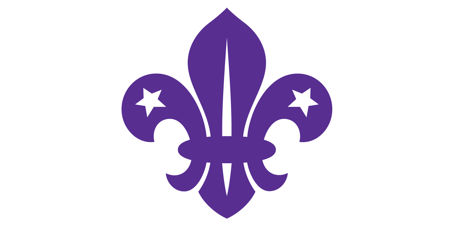
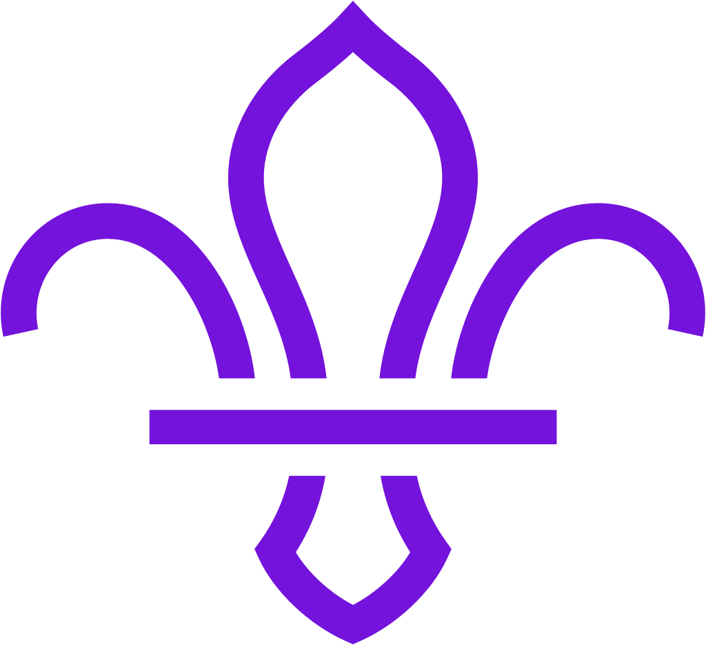
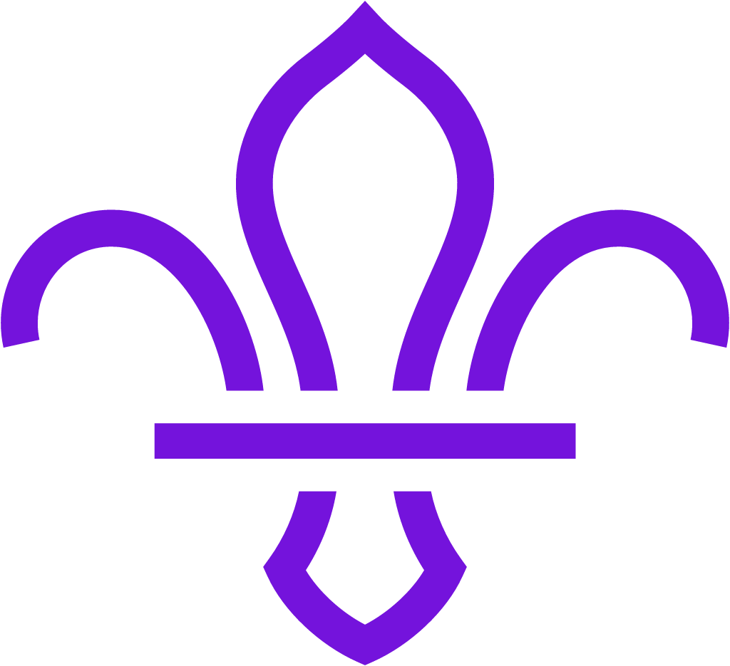
The solid purple fleur-de-lis with two white stars and a collar band, last redrawn in 2001, was replaced by a flat outline fleur-de-lis drawn in a handful of strokes with a straight bar across it, in a brighter violet. The stars and the small details were dropped.
The Scouts logo before and after
BeforeUntil May 2018
Logo: The Scouts. Source: scouts.org.uk (archived)
DownloadLightSVG not availablePNGDark mode version adapted by Rebrand Log
AfterSince 17 May 2018
Logo: The Scouts. Source: scouts.org.uk (archived)


Key facts
The Scouts launched a new logo on 17 May 2018, designed by NotOnSunday.
- Brand
- The Scouts
- Launched
- What changed
- The solid purple fleur-de-lis with two white stars and a collar band, last redrawn in 2001, was replaced by a flat outline fleur-de-lis drawn in a handful of strokes with a straight bar across it, in a brighter violet. The stars and the small details were dropped.
Cite this Rebrand Log, "The Scouts new logo (2018)", https://rebrandlog.com/rebrand/scouts-2018/, last updated .
The The Scouts rebrand, explained
The fleur-de-lis has been the Scouts' emblem since the movement was founded in 1907 and was last redesigned in 2001. By 2018 the different nations and local groups each used their own versions, and the old logo had small text that did not work well on digital platforms.
London studio NotOnSunday kept the symbol but, in Design Week's words, "stripped back and simplified" it into "a flat, line-drawn symbol." Dezeen reported that the new fleur-de-lis "is made up of just five lines designed to work more effectively across print, fabric and digital mediums." The purple was shifted to a brighter violet, with colour pairings for each UK nation and the free Google font Nunito Sans for the logotype.
The work took seven months and was tested with more than 7,000 people. NotOnSunday said the research suggested parents from black and minority ethnic communities would be 44 per cent more likely to volunteer. Templates, guidelines and a local logo generator went into an online brand centre for more than 7,000 Scout groups.
The identity launched with a five-year strategy aimed at adding 50,000 members. It was rolled out over two years and applies to UK Scouts only.
In short: The fleur-de-lis lost its stars and became a line drawing.
Quotes
“It was important for us that we created a brand that was fun and exciting whilst retaining strong links to its heritage.”
“There was a feeling of the Scouts as quite old-school and quite white.”
Press
Sources
- 1. designweek.co.ukhttps://www.designweek.co.uk/issues/14-20-may-2018/scouts-looks-become-cool-unified-brand-identity/
- 2. dezeen.comhttps://www.dezeen.com/2018/05/24/uk-scouts-new-visual-identity-notonsunday-design/
- 3. creativereview.co.ukhttps://www.creativereview.co.uk/scouts-fleur-de-lis-gets-facelift/
- 4. docs.scoutsbrand.org.ukhttps://docs.scoutsbrand.org.uk/guidelines.pdf