Popeyes
May 2020: bouncy mixed-height "POPeYeS" wordmark over a red "Louisiana Kitchen" banner replaced by a calmer, evenly set orange wordmark (Jones Knowles Ritchie; Colophon "Chicken Sans").
Popeyes logo before and after
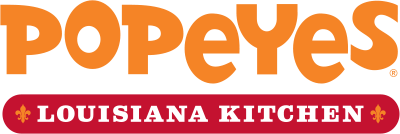
BeforeUntil May 2020
Logo: Popeyes. Source: popeyes.com (archived)
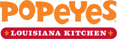
AfterSince May 2020
Logo: Popeyes. Source: popeyes.com (archived)




Key facts
Popeyes launched a new logo in May 2020, designed by Jones Knowles Ritchie (JKR).
- Brand
- Popeyes
- Launched
- Source: news.popeyes.com
- What changed
- May 2020: bouncy mixed-height "POPeYeS" wordmark over a red "Louisiana Kitchen" banner replaced by a calmer, evenly set orange wordmark (Jones Knowles Ritchie; Colophon "Chicken Sans").
- Why
- Popeyes rebranded because, for all its New Orleans quirk, it had never had a cohesive visual system.
- Sources
- news.popeyes.com, fastcompany.com, ccr-mag.com
Cite this Rebrand Log, "Popeyes new logo (2020)", https://rebrandlog.com/rebrand/popeyes-2020/, last updated .
The Popeyes rebrand, explained
Popeyes had been working on a brand overhaul since late 2018, and then the chicken sandwich happened. Launched in August 2019, it sold out within weeks, started a social-media sandwich war and drove US comparable sales up 37.9% in the fourth quarter. With an aggressive international push planned, beginning with China and a first Shanghai flagship in May 2020, Popeyes called the moment its modern renaissance.
Jones Knowles Ritchie led the identity. JKR's creative director told Fast Company that, for all its New Orleans quirk, Popeyes had never had a cohesive visual system: everything was dissident. The old logo bounced letters of different heights over a red Louisiana Kitchen banner. The new one keeps the mix of upper and lower case but sets it evenly, with consistent spacing, in a single colour the brand called unapologetically orange, drawn from crispy chicken and hot biscuits. Colophon drew an exclusive typeface, Chicken Sans. A hand-drawn orange pattern of chicken thighs, roosters and trumpets covers bags, cups and boxes, and the restaurants were redesigned with warm woods and metalwork inspired by the St Charles streetcar of New Orleans.
The challenge, the JKR creative director said, was making it clean and contemporary without losing the warmth and familiarity people knew. An executive at parent company Restaurant Brands International said every element was checked against the brand's Louisiana roots and values.
Fast Company's headline captured the trade-off: Popeyes ditched its goofy branding for a buttoned-up look. The Takeout found it basically the same as the old logo, but less jumbled and maybe less fun.
Business Insider framed the identity as the front end of an expansion push at an unlikely moment. Popeyes called it the Modern Popeyes Renaissance, a plan to build a brand that would outlast the hype around its chicken sandwich, which had helped deliver a 29 percent year-on-year sales rise in the first quarter of 2020 while rivals struggled through the pandemic. The chain had just opened its first restaurant in China, where it planned more than 1,500. The wordmark got thicker, straighter letters and lost its red, the P inside a Louisiana Kitchen roundel became a white chicken silhouette on orange, and renovated stores turned white outside and brighter inside.
It is a sensible tidy-up for a brand going global and onto phones. The orange alone carries the recognition, and the illustrated packaging gives back some of the play the logo gave up. But the jumble was the charm, and the new wordmark is noticeably more polite than the food.
In short: A buttoned-up wordmark for a brand going global, with the fun moved onto the bags.
Sources
- 1. news.popeyes.comhttps://news.popeyes.com/blog-posts/the-modern-popeyes-r-renaissance
- 2. fastcompany.comhttps://www.fastcompany.com/90508666/popeyes-ditches-its-goofy-branding-for-a-buttoned-up-new-look
- 3. transformmagazine.nethttps://www.transformmagazine.net/articles/2020/transformtuesday-2-june/