Sporting CP
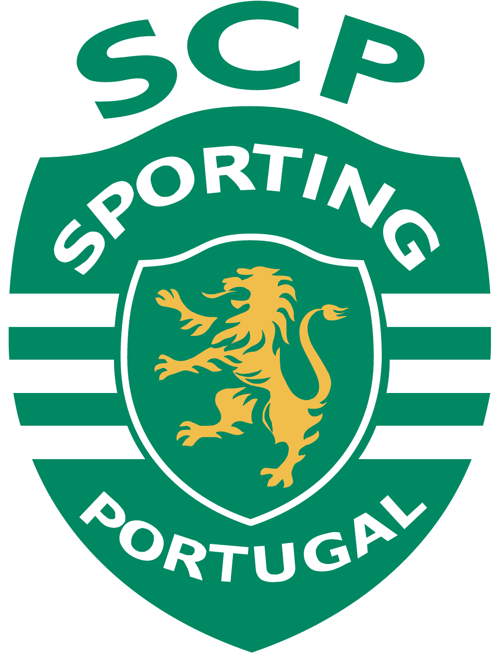
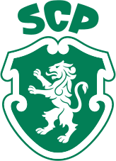
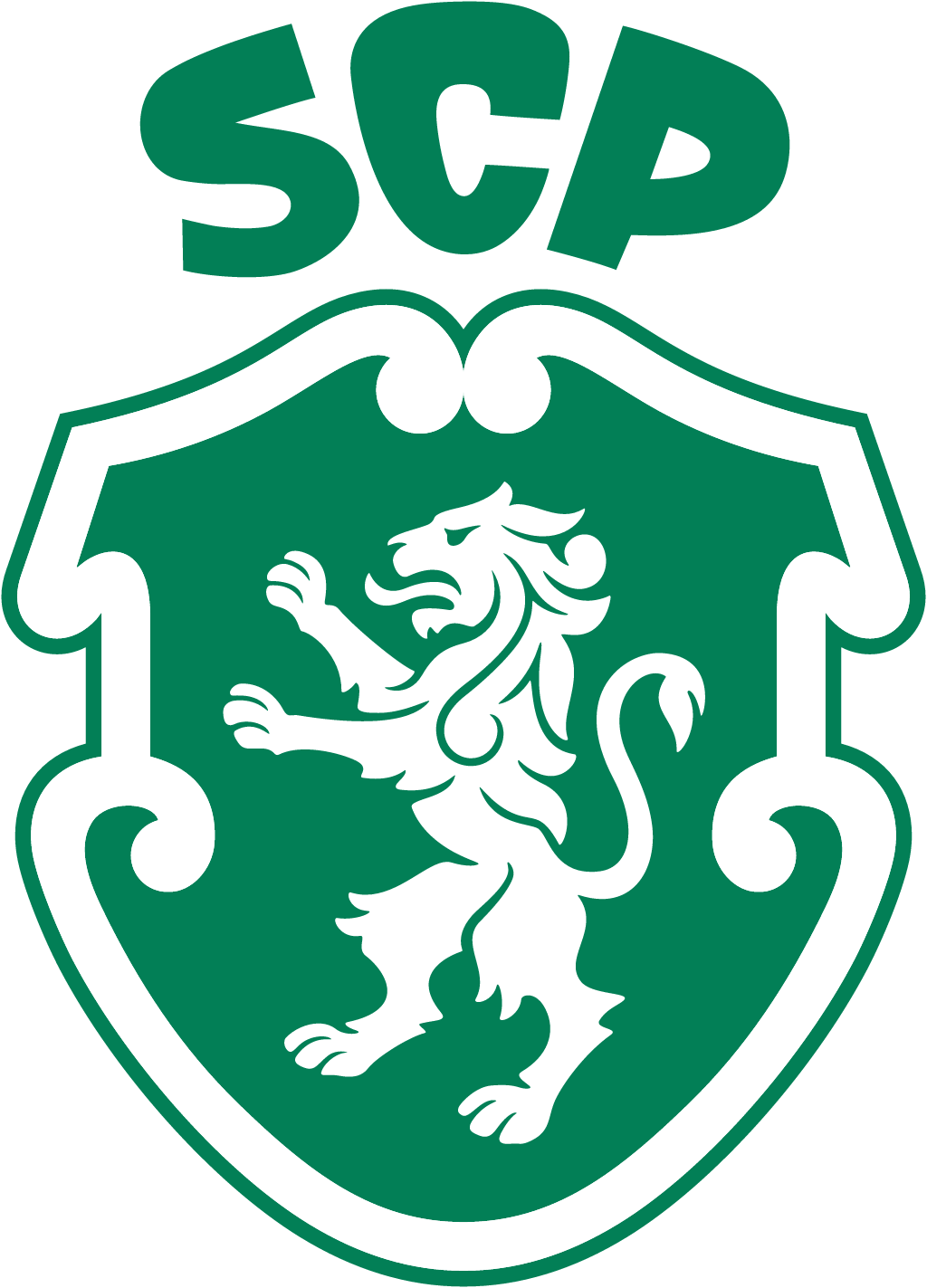
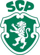
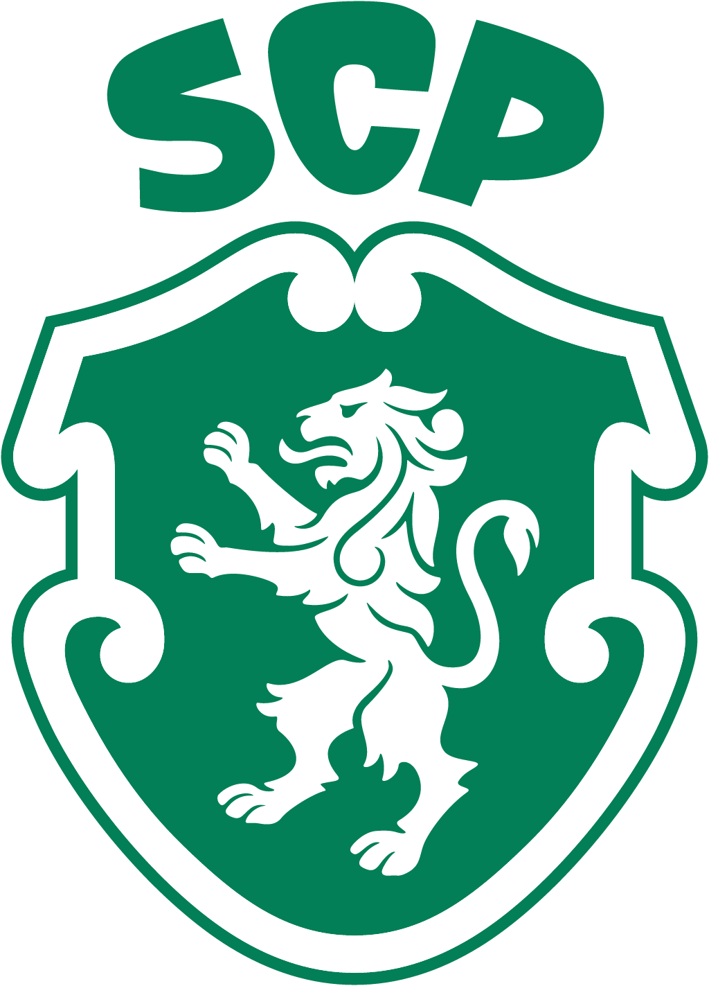
For its 120th anniversary Sporting Clube de Portugal replaced its previous crest, a gold lion inside a striped shield with Sporting Portugal around it, with a simpler green shield based on the 1945 badge: a white lion with an S-shaped tail under the letters SCP arranged as a crown.
Sporting CP logo before and after
BeforeUntil Jul 2026
Logo: Sporting CP. Source: sporting.pt (archived)


AfterSince 1 Jul 2026
Sporting CP crest from the official website. Source: sporting.pt
Key facts
Sporting CP launched a new logo on 1 Jul 2026, designed by Jones Knowles Ritchie (JKR).
- Brand
- Sporting CP
- Launched
- Source: sporting.pt
- What changed
- For its 120th anniversary Sporting Clube de Portugal replaced its previous crest, a gold lion inside a striped shield with Sporting Portugal around it, with a simpler green shield based on the 1945 badge: a white lion with an S-shaped tail under the letters SCP arranged as a crown.
- Why
- Sporting Clube de Portugal presented its new identity on 1 July 2026, as part of the celebrations for its 120th anniversary.
- Sources
- sporting.pt, designweek.co.uk, dezeen.com
Cite this Rebrand Log, "Sporting CP new logo (2026)", https://rebrandlog.com/rebrand/sporting-cp-2026/, last updated .
The Sporting CP rebrand, explained
Sporting Clube de Portugal presented its new identity on 1 July 2026, as part of the celebrations for its 120th anniversary. Design Week called it the club's first comprehensive brand refresh in a quarter of a century. The work was done by the branding agency JKR, which Dezeen reports designed both the badge and the wider identity.
The new identity brings together five symbols tied to the club: Porta 10-A, the gate players walk through onto the pitch at the Estádio José Alvalade, the stripes, the shield, the crown and the lion. André Bernardo, the club's chief strategy and operations officer, said: "The Code has always rested on one principle: develop the human, then the athlete." Sean Thomas, global executive creative director at JKR, said: "This was not a case of starting from scratch."
The previous crest put a gold lion on a green and white striped shield, with Sporting arched above it, Portugal below and the letters SCP on top. The new crest draws on a 1945 version that supporters liked. It is a plain green shield with a white lion, and the letters SCP above it form a crown. Dezeen notes that the lion was redrawn with more flowing hair and a tail shaped like an S, as a nod to the club's name.
JKR also created a custom typeface, Sporting Sans, with the foundry F37, based on the crown lettering. The ironwork of Porta 10-A became a graphic pattern, and the stripes drive the motion design. Design Week placed it among a growing number of football clubs commissioning their own type.
Going back to an older badge is a common move in football, but it usually means copying it. This one is a real redraw: the gold, the outer stripes and the words are gone, and what is left reads clearly at any size. Fans lose a familiar crest, but they gain one that looks like Sporting at a glance.
In short: Back to 1945, with a cleaner lion.
Quotes
“This was not a case of starting from scratch.”
“The Code has always rested on one principle: develop the human, then the athlete.”
Press
Sources
- 1. sporting.pthttps://www.sporting.pt/pt/noticias/clube/2026-07-01/nova-identidade-no-120o-aniversario
- 2. designweek.co.ukhttps://www.designweek.co.uk/sporting-cp-reveals-first-new-brand-identity-in-25-years/
- 3. dezeen.comhttps://www.dezeen.com/2026/07/06/sporting-cp-club-badge-logo-rebrand/