Pringles (2020)
Mr. Pringle was redrawn as a flat black graphic: the brown hair and shaded face outline are gone, leaving a bolder, more dynamic mustache, eyes and eyebrows above a sharper red bow tie. The yellow Pringles wordmark stays below.
Pringles logo before and after
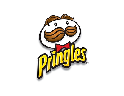
BeforeUntil Dec 2020
Pringles logo (to 2020), official JPG from Kellogg Company's PR Newswire releases. Source: mma.prnewswire.com
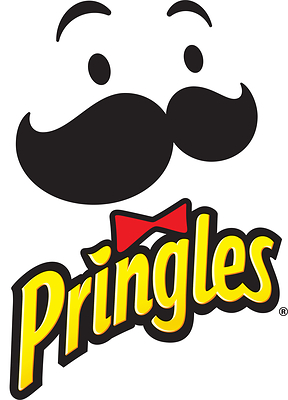
AfterSince 2 Dec 2020
Pringles logo (2020), official JPG from Kellogg Company's PR Newswire releases. Source: mma.prnewswire.com
Key facts
Pringles launched a new logo on 2 Dec 2020.
- Brand
- Pringles
- Launched
- Studio
- Not recordedAdd it
- What changed
- Mr. Pringle was redrawn as a flat black graphic: the brown hair and shaded face outline are gone, leaving a bolder, more dynamic mustache, eyes and eyebrows above a sharper red bow tie. The yellow Pringles wordmark stays below.
- Logo history
- 2 rebrands
Cite this Rebrand Log, "Pringles new logo (2020)", https://rebrandlog.com/rebrand/pringles-2020/, last updated .
The Pringles rebrand, explained
Kellogg announced the refresh on 2 December 2020, saying Pringles had updated its can for the first time in 20 years with bold hues and a clean design. The marketing team spent two years on research and design.
According to the release, the mascot was streamlined to better highlight the flavours and show a wider range of emotions, with a more dynamic mustache, sharper bow tie, sparkling eyes and expressive eyebrows. Marketing-Interactive noted that Mr. P lost his hair.
The new logo first appeared on the Scorchin' range that December and across all brand communications in early 2021. Marketing Dive placed it among several food brands simplifying their packaging that year.
In short: Mr. P loses his hair.
Quote
“We spent the last two years in research and design to create a modern look for the cans and Mr. P's style that reflects the bold flavor in every Pringles crisp and stack.”
Press
- Kellogg Company (PR Newswire)2 Dec 2020Pringles Stacks The End Of 2020 With New, Refreshed Brand Look And Feel
- Marketing Dive2 Dec 2020Mr. Pringle gets 'glow up' for snack brand's first packaging refresh in 20 years
- Marketing-InteractivePringles' Mr.P loses hair but upgrades to sleek new look after 20 years
Sources
- 1. prnewswire.comhttps://www.prnewswire.com/news-releases/pringles-stacks-the-end-of-2020-with-new-refreshed-brand-look-and-feel-301183208.html
- 2. marketingdive.comhttps://www.marketingdive.com/news/mr-pringle-gets-glow-up-for-snack-brands-first-packaging-refresh-in-20/591458/
- 3. marketing-interactive.comhttps://www.marketing-interactive.com/pringles-mrp-loses-hair-but-upgrades-to-sleek-new-look-after-20-years