Lay's
Oct 9 2025: Lay's biggest redesign (PepsiCo Design & Innovation): warmer sun with Lay's Rays, upward-angled ribbon and refined signature script
Lay's logo before and afterRefinement
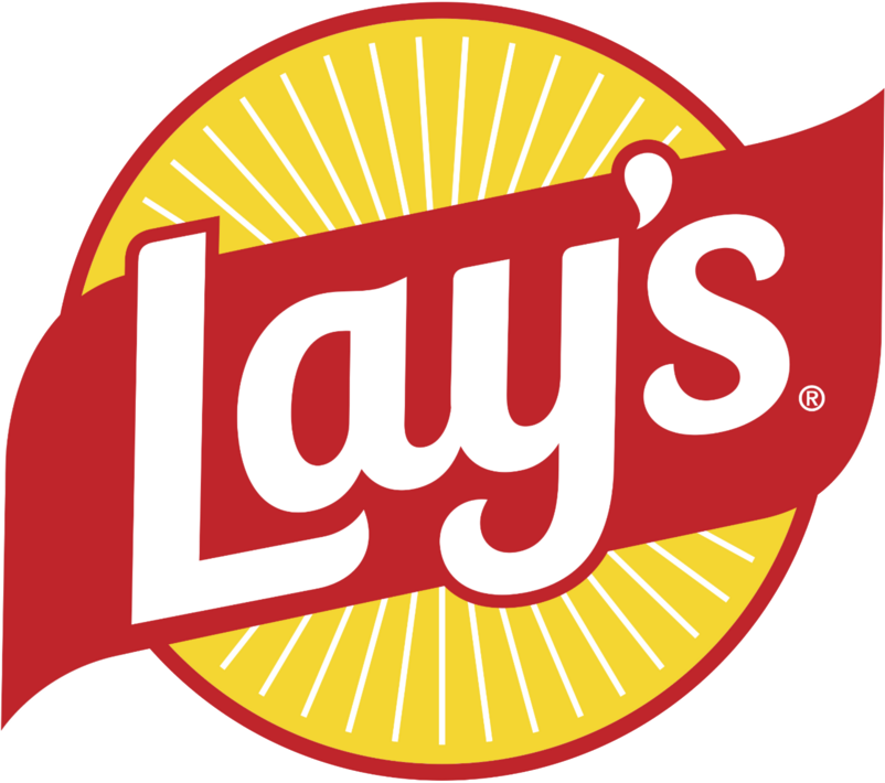
BeforeUntil Oct 2025
Lay's logo, PepsiCo media library (official). Source: lays.com (archived)
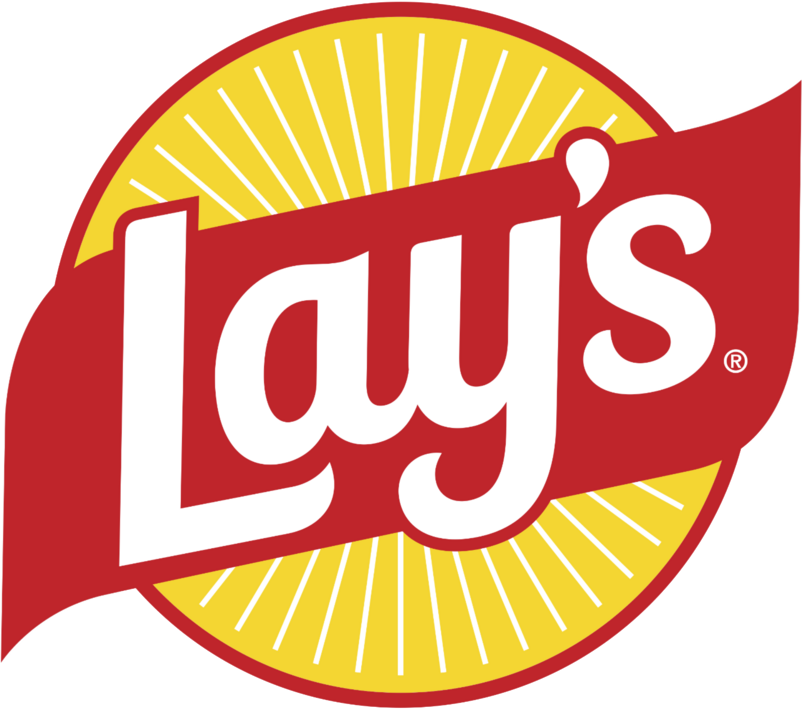
AfterSince Oct 2025
Lay's logo via Wikimedia Commons (author: PepsiCo Inc.). Source: commons.wikimedia.org
Refinement: the mark keeps its form.
Key facts
Lay's launched a new logo in Oct 2025, designed by PepsiCo Design & Innovation.
- Brand
- Lay's
- Launched
- Source: pepsico.com
- What changed
- Oct 9 2025: Lay's biggest redesign (PepsiCo Design & Innovation): warmer sun with Lay's Rays, upward-angled ribbon and refined signature script.
- Why
- Lay's redesigned its packaging after research showed many people did not realise its chips are made from real potatoes.
- Sources
- pepsico.com, usatoday.com, pepsico.com
Cite this Rebrand Log, "Lay's new logo (2025)", https://rebrandlog.com/rebrand/lays-2025/, last updated .
The Lay's rebrand, explained
Lay's says its own research turned up an awkward fact: plenty of people do not realise the chips are made from real potatoes. The October 2025 redesign, which PepsiCo calls the largest in the brand's nearly 100-year history, is built to fix that, and it arrived alongside a recipe change removing artificial flavours and colours from core US products.
The logo keeps its yellow sun and ribbon banner but both are retuned. The sun is warmer and more distinct, and new sun rays, branded Lay's Rays, beam out from it as a nod to the light that grows the crop. The packaging leans on close-up photography of chips and potatoes, and the colour palette now borrows from ingredients: pickle green, hickory brown, savoury red.
The work was done in-house by PepsiCo Design & Innovation with several outside studios. Mauro Porcini, who had left PepsiCo before launch, said on LinkedIn that the team kept the original design vision and praised the farm-to-bag story. Launched on 9 October 2025, it came with a promise, reported by USA Today, to remove artificial flavours and colours from core US products by year-end.
Shoppers were split. On Reddit many liked the cleaner, more natural look; others called made with real potatoes an obvious claim and accused the brand of health-washing a fried snack.
The packaging trade press filled in the details. Packaging Digest reported PepsiCo's finding that 42 percent of people who enjoy Lay's do not realise the chips are made from real, farm-grown potatoes, and tied the redesign to a pledge that core US products would drop artificial flavours and colours by the end of 2025. Packaging Strategies listed the system: a warmer sun with distinct Lay's Rays, some made by hand with a potato stamp for displays and ads; a custom typeface; colours named after ingredients such as pickle green and hickory brown; a wood-slat backdrop recalling farm crates and picnic tables; and closer chip photography on a matte bag. The red ribbon stayed as a seal of quality.
This is a sensible refresh rather than a reinvention. The sun-and-ribbon remains instantly recognisable in a snack aisle, and the rays add warmth without clutter. The farm story is doing more heavy lifting than the logo, which is probably right for a brand whose equity is already on every shelf.
In short: Same sun, more glow, and a lot more potato.
Sources
- 1. pepsico.comhttps://www.pepsico.com/newsroom/stories/2025/from-potato-to-chip-the-next-chapter-of-lays
- 2. thedieline.comhttps://thedieline.com/lays-gets-a-potato-focused-brand-refresh/
- 3. creativepool.comhttps://creativepool.com/pepsico-design-innovation/projects/lays-redesign