Mazda
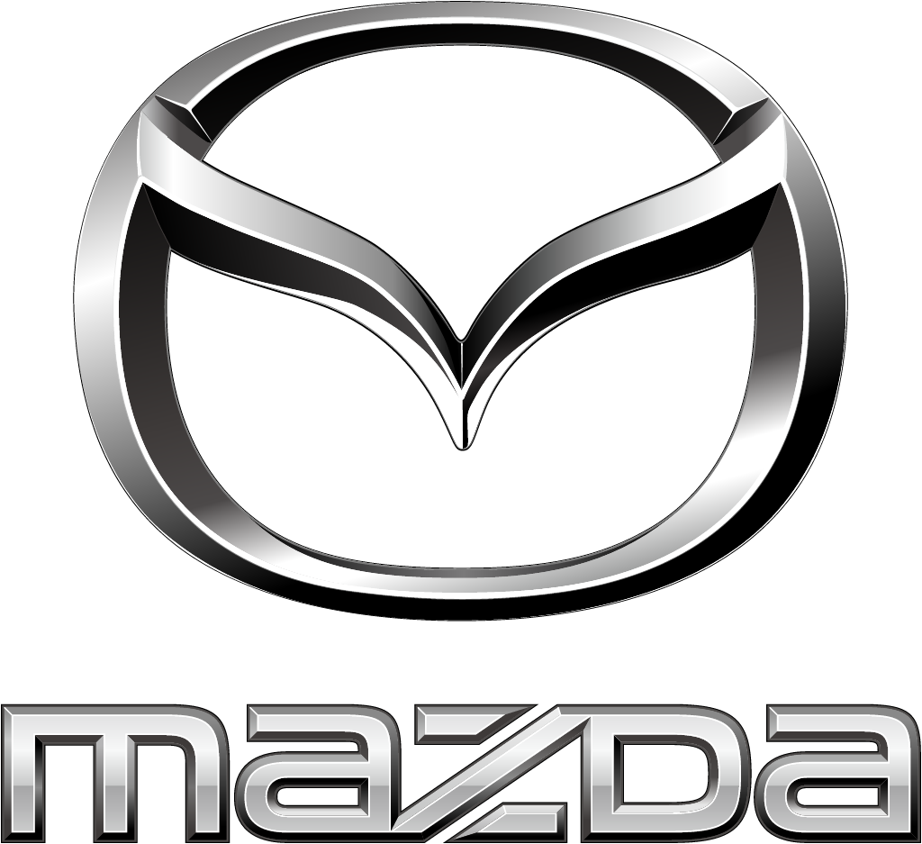
Oct 29 2025 (trademarked Jul 2024): chrome 3D wing emblem + lowercase mazda wordmark replaced by flat angular symbol + spaced caps Mazda
Mazda logo before and after
BeforeUntil Oct 2025
Mazda logo via Wikimedia Commons (author: الشيخ ماهر بن حمد المعيقلي). Source: commons.wikimedia.org


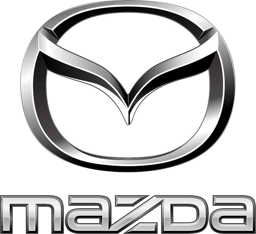

AfterSince Oct 2025
Mazda logo, official source. Source: mazda.co.uk (archived)


Key facts
Mazda launched a new logo in Oct 2025.
- Brand
- Mazda
- Launched
- Source: newsroom.mazda.com
- Studio
- Not recordedAdd it
- What changed
- Oct 29 2025 (trademarked Jul 2024): chrome 3D wing emblem + lowercase mazda wordmark replaced by flat angular symbol + spaced caps Mazda.
- Why
- Mazda said its new symbol keeps the spirit of the 1997 mark while improving visibility, particularly in digital environments.
- Sources
- autoguide.com, newsroom.mazda.com
Cite this Rebrand Log, "Mazda new logo (2025)", https://rebrandlog.com/rebrand/mazda-2025/, last updated .
The Mazda rebrand, explained
Mazda's winged M has been in use since June 1997, a letter M drawn to evoke soaring wings and, in the company's words, a commitment to continuous self-reform and unceasing growth. In 2024 a trademark filing in Japan revealed that a new version was coming. AutoGuide reported that the filed design shifted from the old oval to a more rounded, circular form, gave the wings a more uniform line thickness, and dropped the shadowy bevelling for a flat, two-dimensional look. A similar flat badge had already appeared on the Mazda Arata, an electric concept shown by Changan Mazda at Auto China 2024.
On 29 October 2025 Mazda confirmed the change, announcing it would gradually roll out the new symbol alongside a new wordmark in a modern style, starting on its corporate website that day and featuring it on its stand at the Japan Mobility Show 2025. The company said the new symbol inherits the spirit of the 1997 mark while its sleek, bold form improves visibility, particularly in digital environments.
Mazda did not replace the old mark outright. The new and current symbols are to be used according to location and media, an approach AutoGuide had anticipated, noting that it was unclear whether the new design would go on cars or stay corporate. Mazda framed it within its 'Radically Human' core value and its pursuit of the joy of driving.
AutoGuide compared it with Kia's far more radical 2021 rebrand, which drew criticism but coincided with strong sales, and judged Mazda's change less dramatic.
AutoGuide first found the trademark filing in July 2024. The winged M in use since 1997 stays recognisable, but the oval becomes a rounder circle, the wings take a uniform line weight, and the bevelled shadows are gone in favour of a flat, two dimensional mark, much like the one already seen on the Arata concept at Auto China. Mazda later confirmed the flat logo was meant to read better on digital platforms, especially phones, and would coexist with the current emblem. It is the industry's familiar flattening, done with restraint.
That is the right reading. This is flattening, the default automotive move of the decade after Volkswagen, BMW and Nissan, done carefully. The even line weight makes the wings read better small. But a two-symbol system is a hedge, and the M loses some of the sculpted depth that made it look like a badge rather than an app icon.
In short: The wings go flat.
Sources
- 1. newsroom.mazda.comhttps://newsroom.mazda.com/en/publicity/release/2025/202510/251029a.html
- 2. drive.com.auhttps://www.drive.com.au/news/new-mazda-logo-unearthed-trademark-filing/
- 3. autoguide.comhttps://www.autoguide.com/auto/manufacturers/mazda/mazda-trademarks-new-logo-44612284