Football Manager
New logo and identity.
Football Manager logo before and after
BeforeUntil Oct 2025
Football Manager logo via Wikimedia Commons (author: CutG). Source: commons.wikimedia.org
DownloadLightSVG not availablePNGDarkSVG not availablePNGDark mode version adapted by Rebrand Log
AfterSince Oct 2025
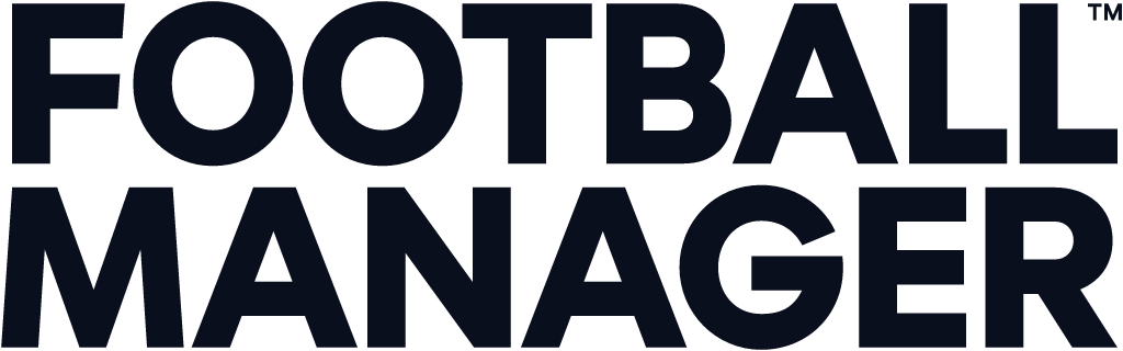
Logotype from the official Football Manager logo. Source: footballmanager.com

Key facts
Football Manager launched a new logo in Oct 2025, designed by Nomad.
- Brand
- Football Manager
- Launched
- Source: underconsideration.com
- What changed
- New logo and identity.
- Why
- Sports Interactive said its brand had lacked distinctiveness and it wanted a bigger rebrand to mark a new era for the game.
- Sources
- designweek.co.uk, footballmanager.com
Cite this Rebrand Log, "Football Manager new logo (2025)", https://rebrandlog.com/rebrand/football-manager-2025/, last updated .
The Football Manager rebrand, explained
Football Manager has a fan base that treats every interface tweak as a transfer saga, so its makers moved carefully. Design Week reported that the London studio Nomad, which had worked with the Sports Interactive team since 2021 on small yearly tweaks, was asked for something bigger to match a new era: a move to the Unity engine, new FIFA and Premier League licences, and women's football for the first time. The identity first appeared ahead of FM25; when that game was cancelled, it carried over to Football Manager 26, released in November 2025, after a review of every design decision.
Sports Interactive marketing director Alan Granger was candid: it was a strategic moment, the studio did not want a soft refresh, and it had felt for a while that its brand lacked distinctiveness. Nomad co founder Terry Stephens said change was not taken lightly because people love the game. A new logo was not in the original brief; Nomad argued that a growing international audience, many of whom do not speak English, needed a universal symbol at the heart of the system.
The mark is inspired by a three panel football with F and M drawn in a fluid, abstract style, crafted with the designer Miles Newlyn and tilted forward to show progressive energy. Brand marketing manager Kamal Miah said one lesson from the cancelled year was that the team had not been confident enough using the symbol alone and had shoehorned it into places that hurt legibility.
The best idea is the main graphic device: the manager's technical area, the two rectangles by the halfway line where bosses direct, rage and celebrate. Stephens called it a gift. It frames static and moving assets and the new key art, which shows male and female managers in their boxes with the match behind them. A custom typeface, FM Universe, by the Pangram Pangram foundry, echoes the sharp rectangles and the symbol's curves. Purple stayed, usefully free of big club associations, but in a new shade.
This is smart, specific branding. The technical area is the kind of insight that makes a system feel inevitable, and it is drawn from what the game is actually about. The symbol is solid if less memorable. The identity's best quality is restraint: it feels like football management, not like every other sports game.
In short: The technical area becomes the brand.
Press
Sources
- 1. underconsideration.com · paywalledhttps://www.underconsideration.com/brandnew/archives/new_logo_and_identity_for_football_manager_by_nomad.php
- 2. nomadstudio.comhttps://www.nomadstudio.com/work/football-manager
- 3. designweek.co.ukhttps://www.designweek.co.uk/bossing-it-nomad-creates-new-identity-for-football-manager-franchise/