La Banque Postale
Mar 11 2022: Carré Noir identity
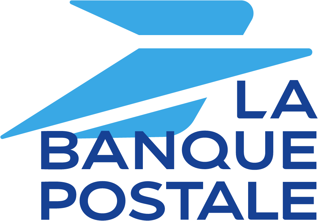
La Banque Postale logo before and after
BeforeUntil Mar 2022
La Banque Postale logo via Wikimedia Commons (author: La Banque Postale). Source: commons.wikimedia.org
AfterSince Mar 2022
La Banque Postale logo via Wikimedia Commons (author: La Banque Postale). Source: commons.wikimedia.org
Key facts
La Banque Postale launched a new logo in Mar 2022, designed by Carré Noir.
- Brand
- La Banque Postale
- Launched
- Source: labanquepostale.com
- What changed
- Mar 11 2022: Carré Noir identity.
- Why
- La Banque Postale said the new brand strategy affirms its citizen identity to accelerate the transformation driven by its strategic plan.
Cite this Rebrand Log, "La Banque Postale new logo (2022)", https://rebrandlog.com/rebrand/la-banque-postale-2022/, last updated .
The La Banque Postale rebrand, explained
La Banque Postale, the bank of the French postal group La Poste, was born in 2006, and its 11 March 2022 press release leaned hard on that fact. At 16, it said, it was the bank of its time, born the same year as Blablacar, Leboncoin and Twitter. Alongside a YouGov study of 16-year-olds commissioned with Havas Paris, the bank announced a fully revised communication platform: a new logo, a new signature, a new brand territory and a new campaign, to make visible the transformation driven by its strategic plan launched in early 2021.
The bank credited the new visual identity and brand territory to Carré Noir. La Correspondance de la Publicité reported on 14 March that the new brand platform was conceived with Carré Noir and Isobar, in a campaign orchestrated with Havas Paris, Starcom and 65db. According to the release, Havas Paris made the campaign, Starcom handled media, 65db the social media operation and Isobar a complete overhaul of retail materials.
The release spelled out the symbolism. A larger postal bird taking flight stands for the trust and proximity of the postal network. White, described as liberating, and blue, for infinite possibilities, express faith in the future. And the signature was simplified, designed in house and reduced to its purest expression, Citoyenne, as an intrinsic evidence of the common good. The whole sits in a more colourful and warmer territory, described as more premium and warmer, to be rolled out gradually across physical and digital touchpoints.
Enlarging the bird is the correct move: it is the one asset that visibly links the bank to its postal heritage and its presence in post offices. Cutting the signature to a single word is braver and better than most banking taglines, though Citoyenne, citizen, is a claim the bank will have to earn every day rather than print. The weak point is the explanation. White as liberating and blue as infinite possibility are the kind of colour meanings any bank could assign to any palette. The sixteen year old framing is clever for a campaign and irrelevant to a logo, which should outlive the anniversary by decades.
In short: A bigger bird and a one-word promise.
Sources
- 1. labanquepostale.comhttps://www.labanquepostale.com/content/dam/lbp/documents/communiques-de-presse/2022/CP-campagne-de-com-LBP_vDEF.pdf
- 2. adforum.comhttps://www.adforum.com/interviews/la-banque-postale-affirme-son-engagement-citoyen-pour-ses-16-ans