Minnesota Twins
The interlocking TC was refined rather than replaced: the letterforms were redrawn, the navy became darker and the red slightly brighter. It anchors a new system with an M and North Star mark, a modernised Twins script and an exclusive font.
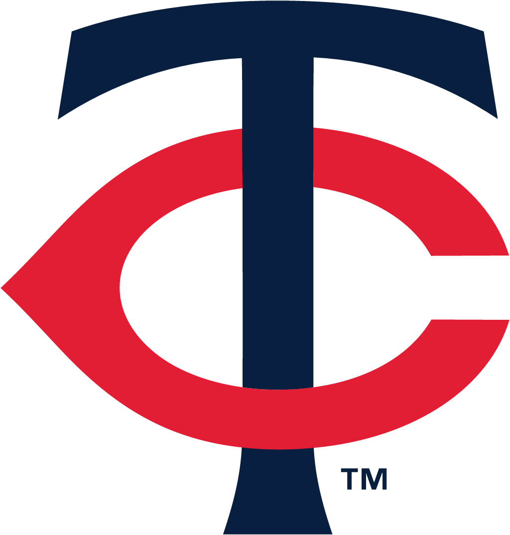
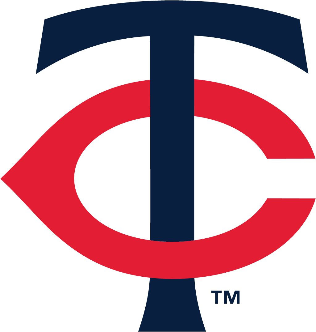
Minnesota Twins logo before and after
BeforeUntil Nov 2022
Logo: Minnesota Twins. Source: mlbstatic.com (archived)
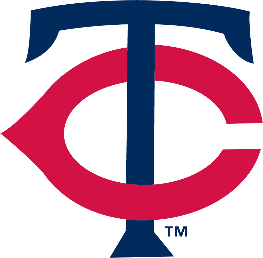
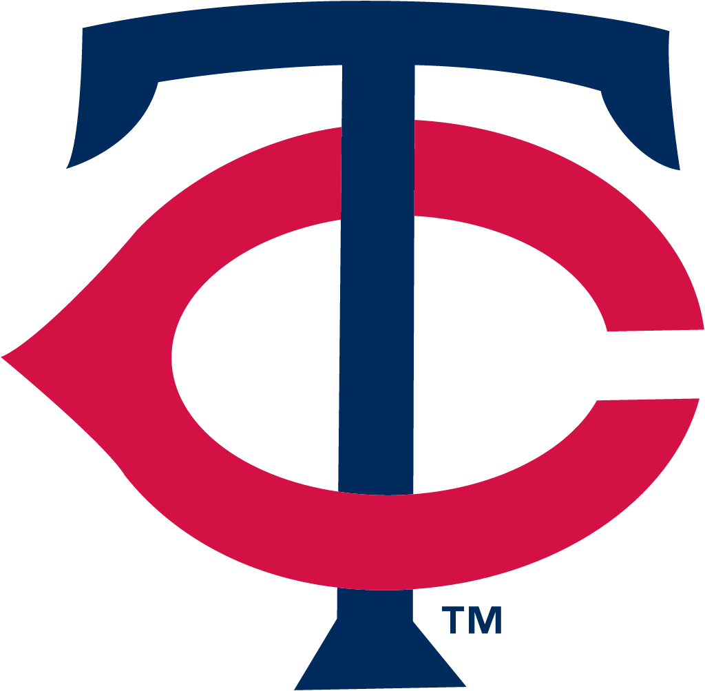
AfterSince 18 Nov 2022
Logo: Minnesota Twins. Source: mlbstatic.com (archived)
Key facts
Minnesota Twins launched a new logo on 18 Nov 2022.
- Brand
- Minnesota Twins
- Launched
- Studio
- Not recordedAdd it
- What changed
- The interlocking TC was refined rather than replaced: the letterforms were redrawn, the navy became darker and the red slightly brighter. It anchors a new system with an M and North Star mark, a modernised Twins script and an exclusive font.
Cite this Rebrand Log, "Minnesota Twins new logo (2022)", https://rebrandlog.com/rebrand/minnesota-twins-2022/, last updated .
The Minnesota Twins rebrand, explained
The Twins unveiled the new marks and uniforms on 18 November 2022 at Mall of America, after a multi-year process. The club called it the franchise's first complete design revamp since before the 1987 season.
The team said its recent marks had been an out-of-sync hodgepodge from different eras, and that the new system is built from one design palette. For the first time in club history, no elements are outlined in a secondary colour or given a drop shadow.
The legacy palette was modernised with a slightly brighter red, a darker navy and a brighter white, and cream returned for the first time since 2018. A new font takes its cues from the curves of the hand-drawn TC and the serifs of the Target Field era script.
In short: A refined TC.
Press
Sources
- 1. mlb.comhttps://www.mlb.com/press-release/release-twins-unveil-new-uniforms-11-18-22
- 2. mlb.comhttps://www.mlb.com/news/twins-unveil-new-uniforms-in-brand-refresh
- 3. espn.comhttps://www.espn.com/mlb/story/_/id/35048450/minnesota-twins-redesign-uniforms