BYD
Feb 2022: BYD brand upgrade
BYD logo before and after
BeforeUntil Feb 2022
BYD logo via Wikimedia Commons (author: Unknown authorUnknown author). Source: commons.wikimedia.org
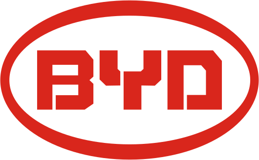
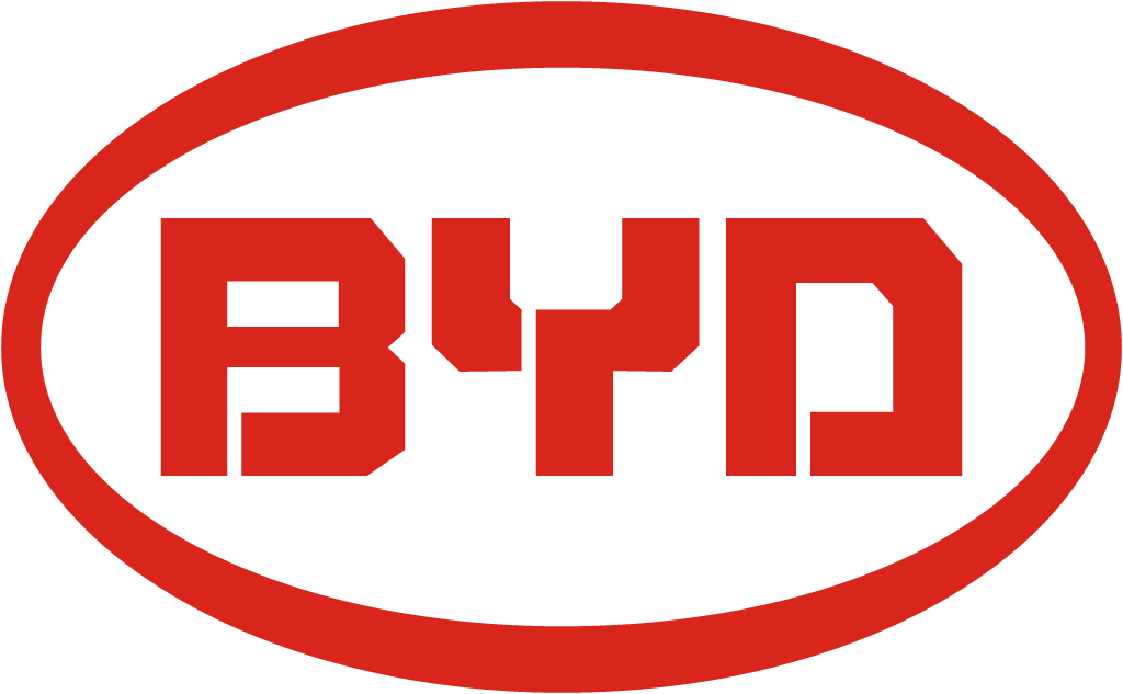
AfterSince Feb 2022
BYD logo via Wikimedia Commons (author: BYD). Source: commons.wikimedia.org




Key facts
BYD launched a new logo in Feb 2022.
- Brand
- BYD
- Launched
- Source: cnevpost.com
- Studio
- Not recordedAdd it
- What changed
- Feb 2022: BYD brand upgrade.
- Sources
- cnevpost.com, bydbrasil.com.br
Cite this Rebrand Log, "BYD new logo (2022)", https://rebrandlog.com/rebrand/byd-2022/, last updated .
The BYD rebrand, explained
On 17 February 2022 BYD Group announced a brand upgrade and a new logo. CnEVPost reported that the group mark still spells out the three letters BYD, but the design is more rounded and closer to the logo BYD Auto had been using.
The changes are a matter of detail. According to the company, the passionate red and the circle were retained, while the lines and font were adjusted and the original sharp corners of the letters became more mathematical, aesthetic rounded corners. BYD Brasil's announcement described the same move: instead of right angles in the font, rounded lines that bring a more harmonious aesthetic and a sense of affinity and openness.
The group logo covers four businesses, cars, rail transport, new energy and electronics, including BYD Electronics, while the passenger car series keep their own logos. BYD Auto's logo was updated too, though CnEVPost said it appeared indistinguishable from the previous version except for looking slightly slimmer. BYD said it was in line with current graphic design trends, with a more three-dimensional and recognisable design.
The timing is the story. CnEVPost noted that BYD sold 93,168 new energy vehicles in January 2022, up 361.7 percent on the year before, and was aiming for roughly 1.5 million sales that year. A company growing that fast needs a mark that works in every market it is about to enter.
CnEVPost noted how restrained the change was. The red and the circle stayed; the lines and lettering were adjusted and the sharp corners softened into rounded ones, which the company described as a more mathematical aesthetic. The group mark would cover businesses such as BYD Electronics, while the car brands kept their own logos. The context was the real story: BYD had sold 93,168 new energy vehicles in January, up 361.7 per cent, and was raising its targets. The logo was catching up with a company growing faster than its identity.
As design, this is housekeeping rather than reinvention. Softening the corners makes the letters friendlier and more consistent with the car badge, and the circle gives the group a tidy container. It remains a generic corporate logo, three capitals in a ring. BYD's real identity would come from its cars, and from how quickly it put them on the world's roads.
In short: Softer corners, faster growth.
Sources
- 1. cnevpost.comhttps://cnevpost.com/2022/02/17/byd-upgrades-brand-image-with-new-logo/
- 2. xinhuanet.comhttp://www.xinhuanet.com/auto/20220218/14529a64eb8b447e82407b40c72068e0/c.html
- 3. bydbrasil.com.brhttps://bydbrasil.com.br/byd-adota-novos-logos/