Bentley
The Winged B lost its lower feathers. Softer, rounded wings became sharp, angled ones with a diamond pattern, and the central B became a jewel-like badge that can stand on its own.
Bentley logo before and after
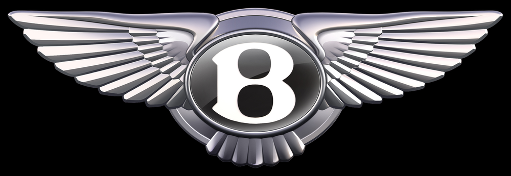
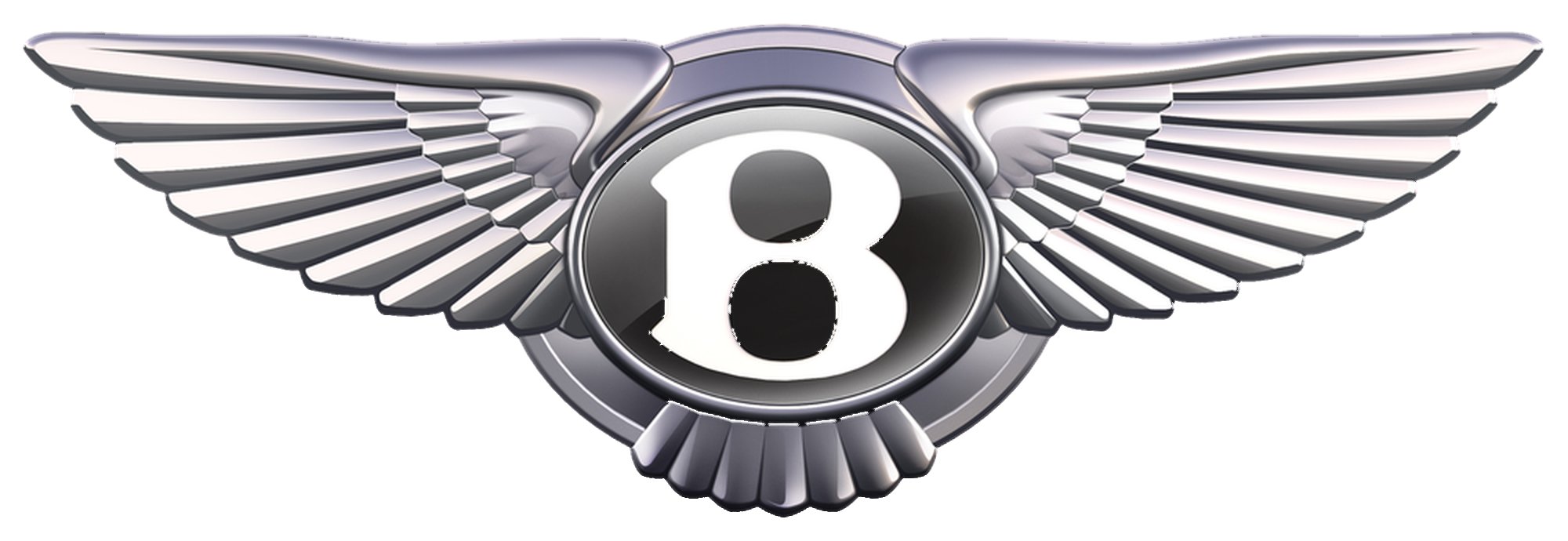
BeforeUntil Jul 2025
Bentley Winged B (2002) from the official Bentley Media press kit image "Bentley Emblem Evolution", cropped. Source: bentleymedia.com
DownloadLightSVG not availablePNGDarkSVG not availablePNGDark mode version adapted by Rebrand Log
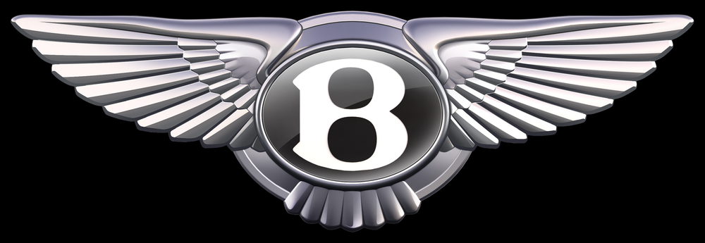
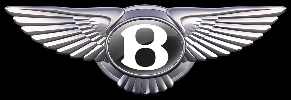
AfterSince 1 Jul 2025
Bentley Winged B (2025) from the official Bentley Media press kit image "Bentley Emblem Evolution", cropped. Source: bentleymedia.com
DownloadLightSVG not availablePNGDarkSVG not availablePNGDark mode version adapted by Rebrand Log
Key facts
Bentley launched a new logo on 1 Jul 2025, designed by Bentley in-house.
- Brand
- Bentley
- Launched
- Studio
- In-house at Bentley
- What changed
- The Winged B lost its lower feathers. Softer, rounded wings became sharp, angled ones with a diamond pattern, and the central B became a jewel-like badge that can stand on its own.
- Sources
- bentleymedia.com, dezeen.com, autocar.co.uk
Cite this Rebrand Log, "Bentley new logo (2025)", https://rebrandlog.com/rebrand/bentley-2025/, last updated .
The Bentley rebrand, explained
Bentley's winged emblem goes back to 1919, when W.O. Bentley asked his friend, the motoring artist F. Gordon Crosby, to draw it. It was revised in 1931, in the 1990s and in 2002, always keeping the same idea: a B in the middle with a feathered wing on each side.
On 1 July 2025 Bentley unveiled a new version, ahead of the EXP 15 concept car it would carry a week later. It was designed in-house. Director of Design Robin Page ran a competition inside the design team, and the winning idea came from Young Nam, a member of the interior design team.
The changes are clear side by side. The wings are sharper and more angular, "more reminiscent of the angled wings of a Peregrine Falcon than the previous softer shapes", with a diamond pattern on the inner feathers. The little fan of feathers under the B is gone. The B itself sits in a redesigned jewel with a bevelled glass edge and a chamfered metal ring, inspired by watchmaking, and it can now be used alone without the wings. Bentley also showed a flat version for screens.
Bentley's own release describes the new design as "just the fifth iteration" of the emblem, while quoting Page a few paragraphs later calling it "only the fourth evolution". Both are true, depending on whether you count the original, which is the kind of question only a 106-year-old company gets to have. Dezeen went with fourth rebrand, fifth version.
Reaction was polite, as befits the product. Terri Nakamura on X called it a "Handsome logo design refresh handled in-house. Bravo!" Next to the Jaguar rebrand of a few months earlier, Bentley's choice to change a lot of small things rather than one big one looked very deliberate.
In short: Fewer feathers, sharper wings, same B.
Quotes
“If a luxury brand is the product of the stories it has created, then its emblem is its signature.”
“more reminiscent of the angled wings of a Peregrine Falcon than the previous softer shapes”
Press
Reactions
- Terri Nakamura@terrinakamura on XHandsome logo design refresh handled in-house. Bravo! Bentley gets new wings in its greatest logo change in all its 100+ years - Cars - DesignTAXI Community: Creative Connections, Conversations and Collaborations5 Jul 2025 · 6 likes
- Hiiibrand@Hiiibrand on XBentley reveals a new “Flying B” logo—lighter, more modern, and ready for the electric age. Feathers become grid lines, tail feathers are gone, and a bold outline frames the emblem. Debuting on an electric urban SUV…3 Jul 2025 · 1 like
Sources
- 1. bentleymedia.comhttps://www.bentleymedia.com/en/newsitem/1718
- 2. dezeen.comhttps://www.dezeen.com/2025/07/01/bentley-logo-rebrand-winged-b/
- 3. autocar.co.ukhttps://www.autocar.co.uk/car-news/new-cars/sharp-new-logo-bentley-ahead-concept-car-unveiling-8-july