Pleo (2026)
Logo rebalanced and made bolder, Pleo pink a few shades cooler, spreadsheet-inspired stripe motifs; new navigation
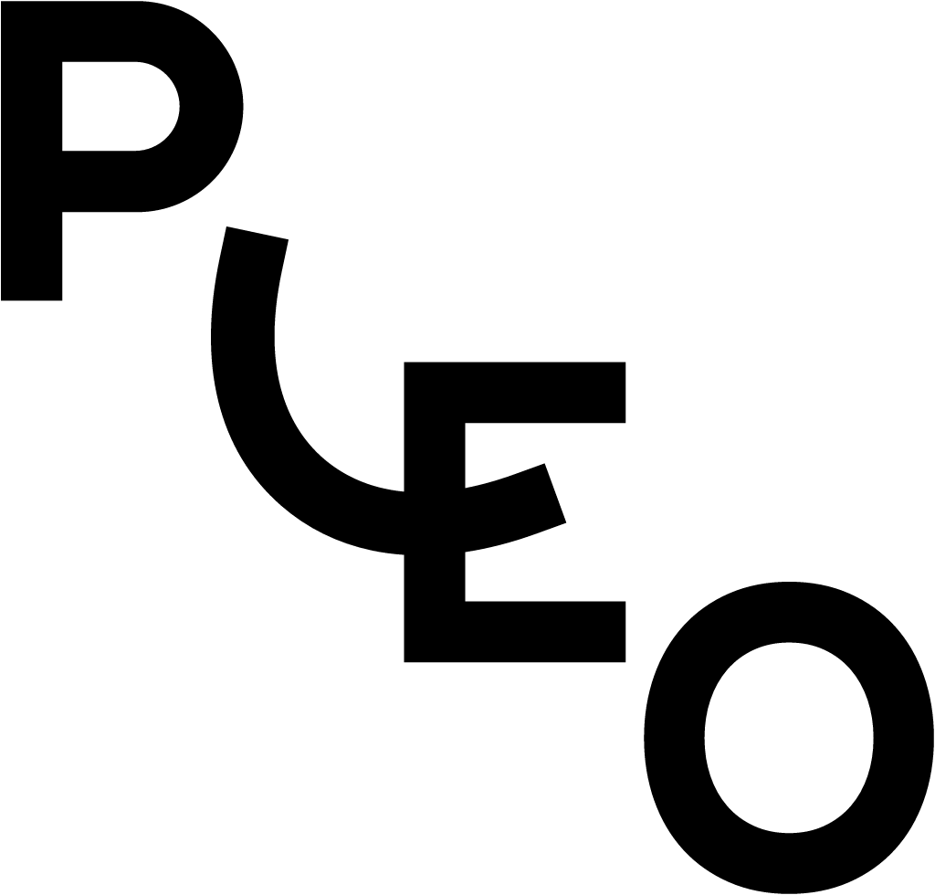
Pleo logo before and after



Key facts
Pleo launched a new logo on 3 Sep 2026, designed by Porto Rocha.
- Brand
- Pleo
- Launched
- Typeface
- Pleo Scandi Gellix
- What changed
- Logo rebalanced and made bolder, Pleo pink a few shades cooler, spreadsheet-inspired stripe motifs; new navigation.
- Sources
- blog.pleo.io, blog.pleo.io
- Logo history
- 2 rebrands
Cite this Rebrand Log, "Pleo new logo (2026)", https://rebrandlog.com/rebrand/pleo-2026/, last updated .
Identity
Pleo / Porto Rocha, image from blog.pleo.io
Rationale
Signals credibility "delivered with care and craft" for finance teams, sharpening Pleo's first-mover personality against generic category wordmarks.
Quote
“Together with brand agency Porto Rocha, the logo evolved into something more balanced and bold.”
Press
Sources
- 1. blog.pleo.iohttps://blog.pleo.io/en/brand
- 2. blog.pleo.iohttps://blog.pleo.io/en/evolving-the-pleo-brand