Nubank (Nu)
Bolder, simpler "nu" with smoother ribbon-like curves and a slightly different purple
Nubank logo before and after
BeforeUntil May 2021
Nubank logo via Wikimedia Commons (uploader/author: Nubank). Source: commons.wikimedia.org
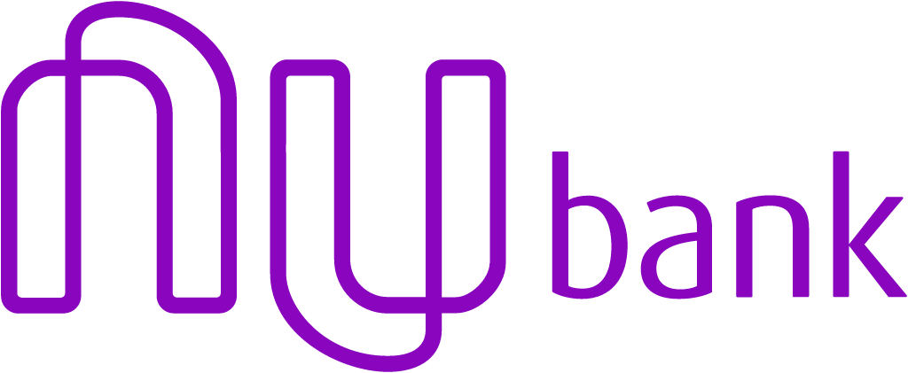
AfterSince 17 May 2021
Nubank logo via Wikimedia Commons (uploader/author: Nubank). Source: commons.wikimedia.org




Key facts
Nubank launched a new logo on 17 May 2021, designed by Nubank in-house.
- Brand
- Nubank
- Launched
- Studio
- In-house at Nubank
- What changed
- Bolder, simpler "nu" with smoother ribbon-like curves and a slightly different purple.
Cite this Rebrand Log, "Nubank new logo (2021)", https://rebrandlog.com/rebrand/nubank/, last updated .
The Nubank rebrand, explained
On 17 May 2021 Nubank revealed a new logo. The Brazilian fintech's own announcement summed it up as a slightly different purple, softer curves in the logo and a brand more representative of its current phase, reflecting its journey, its maturity and what lay ahead.
Adnews reported that the company chose to make the logo simpler and more rounded, filling with white the word nu that had previously been an outline. It said the new mark would appear across social media, the website, emails, advertising and the cards, and quoted specialists describing the trend toward minimalism as a way to strengthen a brand that is strong enough to be remembered with simple symbols and few colours.
Canaltech added that the logo, with soft shapes and a slightly different shade of purple, would be used at every point of contact with the company's more than 38 million customers, with updates rolling out over the following months. Nubank wrote that its colours gave the letters greater weight, making reading more accessible and representing its more mature products.
Purple is the asset everyone associates with Nubank, and the refresh rightly keeps it. What changes is the attitude. The outlined lettering felt like a startup sketch; the filled, rounded mark looks like an institution, which is what a bank with tens of millions of customers has become.
Estadão's tech desk, writing on launch day, 17 May, described the change closely. The new purple is more striking than the old one, while the curves of the nu are more fluid and less square, and up close the letters read as two turned ribbons in an almost endless movement. The strokes are heavier, meant to signal maturity and closeness to customers. The paper noted that Time had just named Nubank among its 100 most influential companies, and that the update would reach the app, website, social channels, blog and email over the following months. Grown up without going grey: a fair outcome for a fintech with a huge young audience.
The risk with softening is blandness, and the new curves are close to generic. But on a card, an app icon and a billboard, it is calm, legible and unmistakably Nubank.
In short: Same purple, grown up.
Rationale
Reflects Nubank's maturity as a broader financial platform rather than just a bank.
Quote
“A slightly different purple, softer curves in our logo and a brand that is more representative of our phase.”
Press
Reactions
- 𝔗𝔦𝔪𝔪𝔶 𝔗𝔲𝔯𝔫𝔢𝔯@Fabricio32Silva on XNova identidade e o logo da @nubank tá zuado kkkkkkk17 May 2021 · 0 likes
- Programadores Brasil@prog_brasil on XNubank altera logomarca. Entenda as mudanças por trás da nova identidade visual da fintech8 Jun 2021 · 1 like
- Matheus Moura@matheusmouraco on XOlha só! A Nubank está de cara nova! Hoje foi anunciado a sua nova identidade visual, além do novo logo, a marca também apresentou um novo tom de roxo! E ai? O que acharam? #logo #nubank #identidadevisual #identidade17 May 2021 · 5 likes
- André Macklemore@andremans on XParabéns. Nota 2. Nubank apresenta novo logo e nova identidade visual via @gPublicitario21 May 2021 · 1 like
Sources
- 1. building.nubank.comhttps://building.nubank.com/new-logo-nubank/
- 2. pentagram.comhttps://www.pentagram.com/work/nubank