Mastercard (2019)
Wordmark dropped from interlocking circles symbol
Mastercard logo before and after
BeforeUntil Jan 2019
Logo: Mastercard. Source: brand.mastercard.com (archived)
AfterSince 7 Jan 2019
Mastercard logo via Wikimedia Commons (author: Mastercard Incorporated). Source: commons.wikimedia.org
Key facts
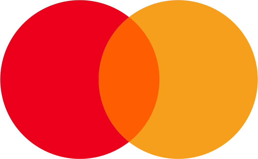
Mastercard launched a new logo on 7 Jan 2019, designed by Pentagram.
- Brand
- Mastercard
- Launched
- Source: fortune.com
- What changed
- Wordmark dropped from interlocking circles symbol.
- Why
- Mastercard dropped its name from the logo after research found more than 80 percent of people recognised the circles without it.
- Sources
- fortune.com, mastercard.com, mastercard.com
- Logo history
- 3 rebrands
Cite this Rebrand Log, "Mastercard new logo (2019)", https://rebrandlog.com/rebrand/mastercard-2019/, last updated .
The Mastercard rebrand, explained
Key people: Raja Rajamannar (Chief Marketing & Communications Officer, Mastercard) · Michael Bierut (Partner, Pentagram)
Mastercard announced at CES in January 2019 that its logo would no longer include the word Mastercard. It was the second step of a plan visible since 2016, when the name moved out of the circles, where it had sat since 1968, to sit beneath them.
The design change is pure subtraction: two overlapping circles, red and yellow, and nothing else. The company said the symbol would appear alone on cards, at retailers, at events and in advertising, and that it was chosen to work seamlessly across digital. Chief marketing and communications officer Raja Rajamannar said more than 20 months of global research found over 80 percent of people recognised the symbol without the name. Mastercard even announced it with a wordless press release.
The 2019 move completed the 2016 work. Mastercard's own brand history presents the two as one plan: first separate the name from the circles, then test whether the circles could stand alone. Research said they could, and the brand mark began appearing without the wordmark across cards, acceptance points and advertising.
The symbol-only mark was again the work of Pentagram, led by Michael Bierut, who had drawn the 2016 system. Fortune quoted him on how symbols like the Nike swoosh are earned through long investment in primary elements, not born that way.
The Drum reported that the decision followed 20 months of research among consumers, merchants and banks, and that chief marketing officer Raja Rajamannar had hinted at it as early as 2017. His case on stage at CES was about real estate: on a smartwatch or phone screen, ten letters compete with the circles, while the circles alone fill the space and read more clearly. Adweek framed the move as part of a longer effort to shed the plastic-card image and present Mastercard as a technology company, putting it in a nameless club alongside Apple's apple, Nike's swoosh and Target's bullseye. The rollout was gradual, starting with cards, acceptance marks and sponsorships.
Very few brands can do this, and Mastercard earned it the slow way: decades of consistent circles, then a separation, then the removal. The name still appears where recognition is weaker, as Fortune noted for some developing markets, which is a sensible hedge. Joining Apple, Nike and Target in the wordless club is less a design decision than a reward for discipline.
In short: A logo reduced to two circles, and fully deserved.
Sources
- 1. en.wikipedia.orghttps://en.wikipedia.org/wiki/Mastercard
- 2. fortune.comhttp://fortune.com/2019/01/07/mastercard-drops-its-name-from-company-logo-post-text-future-target-nike-apple/