Hiut Denim Co.
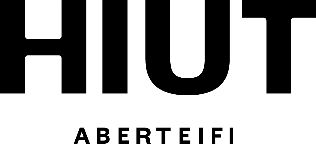
Welsh jeans maker Hiut replaced its Hiut Denim Co. wordmark in spaced capitals with a redrawn, heavier Hiut wordmark that carries the town name Aberteifi underneath, and made its owl mark bolder and rounder, in an identity by Pentagram partner Hugh Miller.
Hiut Denim Co. logo before and after
BeforeUntil Jun 2026
Logo: Hiut Denim Co.. Source: hiutdenim.co.uk (archived)


AfterSince Jun 2026
Hiut logo from the official website. Source: hiutdenim.co.uk
Key facts
Hiut Denim Co. launched a new logo in Jun 2026, designed by Pentagram.
- Brand
- Hiut Denim Co.
- Launched
- What changed
- Welsh jeans maker Hiut replaced its Hiut Denim Co. wordmark in spaced capitals with a redrawn, heavier Hiut wordmark that carries the town name Aberteifi underneath, and made its owl mark bolder and rounder, in an identity by Pentagram partner Hugh Miller.
Cite this Rebrand Log, "Hiut Denim Co. new logo (2026)", https://rebrandlog.com/rebrand/hiut-2026/, last updated .
The Hiut Denim Co. rebrand, explained
Hiut was founded in 2011 in Aberteifi, also known as Cardigan, on the Welsh coast. Its mission is to bring jeans-making back to a town whose first jeans factory, in the 1960s, employed more than 400 people and produced over 35,000 pairs a week, before production moved offshore in 2002. In June 2026 Creative Boom and Design Week reported a new visual identity and art direction framework designed by Pentagram partner Hugh Miller.
According to Design Week, Miller worked closely with the Hiut team, with Nigel Cottier and Jennifer Sturrock, on a system built around the brand's values: the factory, its people, its processes and its setting. The identity pairs industry with nature and utility with craft. Creative Boom described the brief as less about reinvention and more about telling the brand's story well.
The old logo set Hiut Denim Co. in light, widely spaced capitals next to a round, line-drawn symbol. The new logotype is a single heavy word, Hiut, with Aberteifi in small spaced capitals underneath, which Design Week says grounds the brand in its location, heritage and Welsh mother tongue. The owl stays as a separate mark, redrawn to be bolder, rounder and more recognisable.
Founders Grotesk is the main typeface, joined by The Makers Font, a handwritten face based on the signatures the factory's makers write inside each pair. The colours draw on the muted landscape around Aberteifi and the raw materials of the factory. Photographer Jess Ellis and motion director Cat Garcia shot the launch imagery on black and white and colour film.
Dropping Denim Co. and adding the town's Welsh name is a small change that says a lot. The heavy wordmark gives a small brand real presence on a label or a shop front, and the place name does what a tagline never could. It is a quiet rebrand that makes the brand easier to remember.
In short: Fewer words, and one of them is a place.
Press
Sources
- 1. designweek.co.ukhttps://www.designweek.co.uk/pentagrams-new-identity-for-denim-label-hiut-embraces-its-welsh-heritage/
- 2. creativeboom.comhttps://www.creativeboom.com/news/pentagrams-hugh-miller-rebrands-hiut-the-welsh-denim-label-bringing-jeans-making-back-to-aberteifi/
- 3. hiutdenim.co.ukhttps://hiutdenim.co.uk/blogs/the-makers-journal/hiut-x-pentagram-the-same-work-seen-more-clearly
- 4. pentagram.comhttps://www.pentagram.com/work/hiut