Google Maps
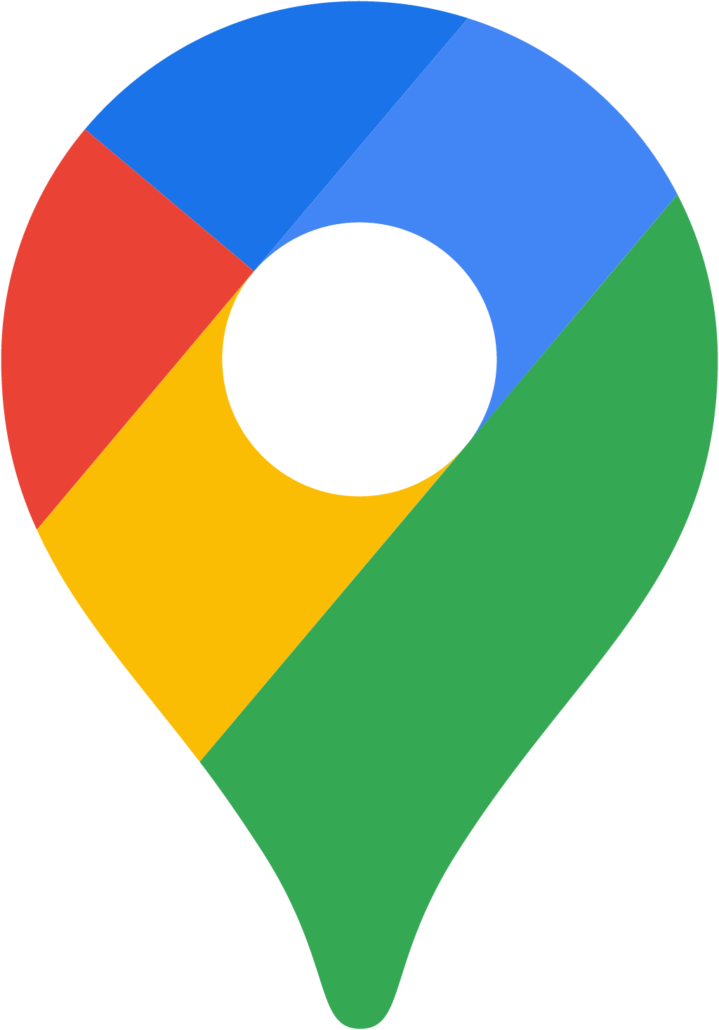
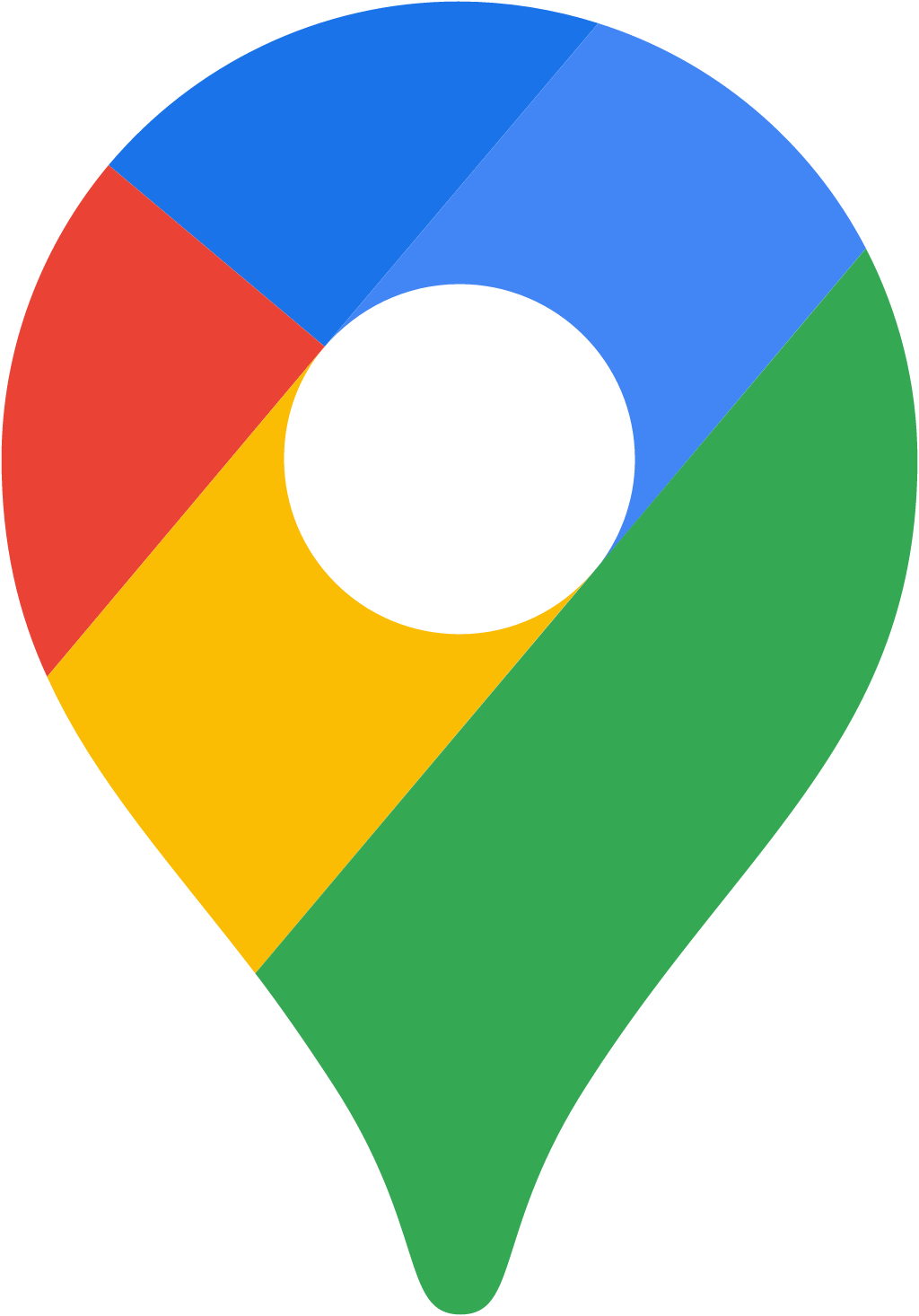
Folded-map icon replaced by a four-colour pin, launched for Maps' 15th birthday
Google Maps logo before and after
BeforeUntil Feb 2020
Google Maps logo via Wikimedia Commons (uploader/author: Google Inc.SVG by CMetalCore). Source: commons.wikimedia.org
AfterSince 6 Feb 2020
Google Maps logo via Wikimedia Commons (uploader/author: Google Inc.SVG by Premeditated). Source: commons.wikimedia.org


Key facts
Google Maps launched a new logo on 6 Feb 2020, designed by Google in-house.
- Brand
- Google Maps
- Launched
- Studio
- In-house at Google Maps
- What changed
- Folded-map icon replaced by a four-colour pin, launched for Maps' 15th birthday.
- Why
- Google said the new Maps icon reflected a shift from getting people from point A to B to also helping them explore places and get things done.
- Sources
- blog.google, blog.google, arstechnica.com
Cite this Rebrand Log, "Google Maps new logo (2020)", https://rebrandlog.com/rebrand/google-maps/, last updated .
The Google Maps rebrand, explained
Key people: Jen Fitzpatrick (SVP, Google Maps)
Google Maps turned 15 in February 2020, by which point Google said more than a billion people were using it. For the birthday Google shipped product updates, five tabs including Explore and Commute, and a new icon that it said reflected the evolution of how it maps the world.
The old icon was a folded paper map. The new one keeps only the pin, filled with Google's four colours. Google framed the change as a shift from getting you from point A to B to also helping you explore places and get things done. A party-themed car icon appeared in navigation for a limited time as a birthday extra.
Jen Fitzpatrick, senior vice president for Maps, said the mission had expanded from how do I get from here to there to helping people discover places and things to do, and that the icon was updated to reflect that journey. The app gained five tabs along the bottom at the same time. By then Maps covered more than 220 countries and around 200 million places.
The work was done in-house.
Ars Technica described the change with a shrug. The icon was no longer a map at all but a pin, and like Google's other recent icons it followed a formula: take a simple shape, fill it with red, blue, green and yellow, and call it a day. The redesign around it was mostly reshuffling. The bottom bar went from three tabs to five, adding Saved, Contribute and Updates, none of them genuinely new, and the hamburger menu disappeared. The pin is a better symbol for what Maps had become, a place finder rather than a map, but it is also one more piece of a family that was starting to blur together.
The pin is the right symbol. Nobody unfolds a paper map anymore, and the pin is what users actually see inside the app. The problem came later in 2020, when Google rolled the same four-colour treatment across Gmail, Calendar, Drive and Meet, leaving a home screen full of similar shapes in the same palette. Maps survived it best because its silhouette is the most distinct, but on its own the 2020 icon was a sensible update that simply arrived first in a family that later became hard to tell apart.
In short: The right symbol, unlucky to be first in a family of lookalikes.
Identity
© Google Maps, via blog.google
Rationale
Reflects the shift from getting you to a destination to also helping you discover places.
Quote
“It’s based on a key part of Google Maps since the very beginning—the pin— and represents the shift we’ve made from getting you to your destination to also helping you discover new places and experiences.”
Press
- Google6 Feb 2020Google Maps is turning 15! Celebrate with a new look and features
- underconsideration.comBrand New: New Logo for Google Maps
- The Verge6 Feb 2020Google Maps gets a new icon and more tabs to celebrate 15th anniversary
- 9to5Google7 Feb 2020What do you think of the new Google Maps logo? [Poll]
Reactions
- Ladi Ogunseye@LadiSpeaks on XWow - Google Maps has a new icon? Niceeeeee17 Mar 2020 · 3 likes
- Michael Brewis@MichaelJBrewis on XSince when has Google Maps had a new icon? 🤔7 Mar 2020 · 0 likes
- Techaeris 🔳@techaeris on XGoogle Maps turns 15, gets new icon and UI tweaks Google is celebrating Maps' 15th birthday with a new logo for the application and a few new features including more transit data #googlemaps7 Feb 2020 · 2 likes
- Agustín de la Villa@agusdelavilla on XGoogle Maps gets a new icon and more tabs to celebrate 15th anniversary. I’m not digging the new logo too much but it adds branding consistency with most of the other product logos.6 Feb 2020 · 0 likes
Sources
- 1. blog.googlehttps://blog.google/products-and-platforms/products/maps/maps-15th-birthday/