Gmail (Google Workspace)
Red envelope replaced by a four-colour "M"; matching icons for Drive, Calendar, Meet, Docs; G Suite renamed Google Workspace
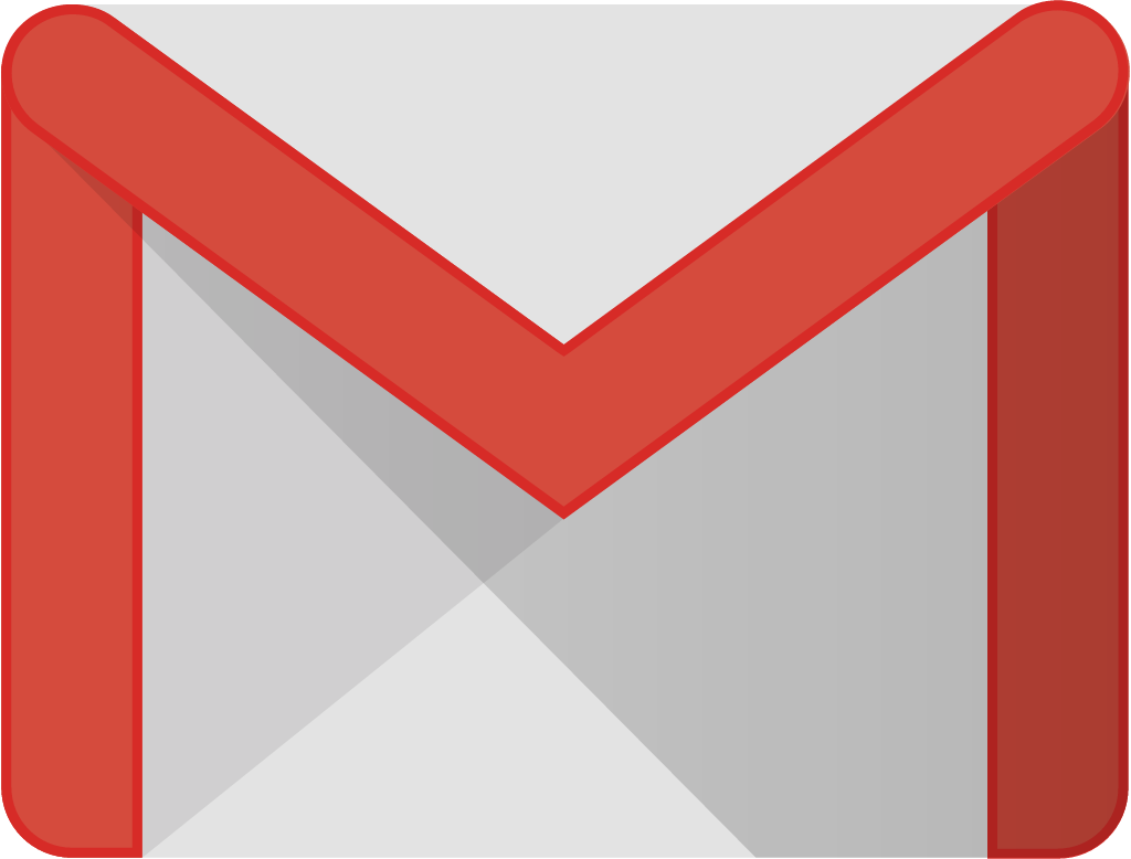
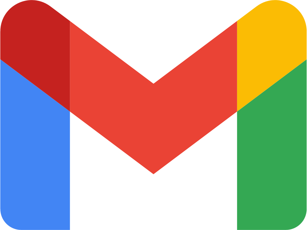
Gmail logo before and after
BeforeUntil Oct 2020
Gmail logo via Wikimedia Commons (uploader/author: Juancameneses11, Google, INC.). Source: commons.wikimedia.org
AfterSince 6 Oct 2020
Gmail logo via Wikimedia Commons (uploader/author: Google). Source: commons.wikimedia.org


Key facts
Gmail launched a new logo on 6 Oct 2020, designed by Google in-house.
- Brand
- Gmail
- Launched
- Studio
- In-house at Gmail
- What changed
- Red envelope replaced by a four-colour "M"; matching icons for Drive, Calendar, Meet, Docs; G Suite renamed Google Workspace.
- Why
- Google redesigned the Gmail icon so its Workspace apps, which had become deeply integrated, would read as one family.
Cite this Rebrand Log, "Gmail new logo (2020)", https://rebrandlog.com/rebrand/gmail/, last updated .
The Gmail rebrand, explained
Key people: Javier Soltero (VP & GM, Google Workspace)
In October 2020 Google renamed G Suite as Google Workspace and redesigned the icons of its core apps so they read as one family. Gmail's red-and-white envelope, one of the most recognisable icons on any phone, was the most visible casualty.
Javier Soltero, Google's VP and general manager for Workspace, framed the change as a product story: apps built a decade earlier to solve separate problems had become so integrated that the lines between them were disappearing, and the icons should show one family. He told Fast Company it was the moment to stop defining Google's offerings in terms invented by somebody else in a different era. The context was the pandemic shift to remote work.
The new Gmail mark keeps the M but builds it from Google's blue, red, yellow and green. The envelope is now only implied, using the white space around the central chevron. Red still dominates, with a touch of yellow and blue and green holding up the arches. Calendar, Docs, Meet and Sheets got matching redesigns, all following the same multi-colour, simplified-shape logic used for Maps, Photos and Chrome. The Verge cited Fast Company's report that Google had considered dropping the M or the red altogether, but research participants objected; the same research showed the envelope itself was not essential.
The response was immediate and hostile. TechCrunch ran a column headlined Google's new logos are bad, arguing the icons had all the colours and therefore none, so users would struggle to tell them apart in browser tabs. Ars Technica made the same point more coolly, suggesting the icons suited an app store search better than an app drawer, and Creative Bloq collected users calling the Gmail mark a joke.
The icons were designed in-house at Google.
TechCrunch's critique was the most detailed. Gmail's red, it argued, had made the icon recognisable even in peripheral vision for over a decade; the new icons all used every colour, in inconsistent orders and directions, so at real tab size of about 20 pixels they blurred together like crumpled candy wrappers. The writer also faulted the hollow, mostly rectangular shapes, which let whatever background a user's theme provided leak through, and the lopsided visual weight as darker colours dominated on white. His guess was that the team had judged the icons at large sizes rather than on a cheap Chromebook or phone, and he predicted they would not last.
The Verge's verdict was blunt: lined up with Google's other icons, they are hard to tell apart. That is the central trade-off. As a family the system is coherent, but at the size of a phone's home screen, every icon became a small four-colour shape. Gmail survived better than most because the M and the red stayed.
In short: A coherent family, at the cost of telling the icons apart.
Identity
Gmail / Google in-house, image from workspace.google.com
Rationale
Part of rebranding G Suite as Google Workspace, giving its apps a consistent family in Google's core colours.
Quote
“The new Gmail logo is now an M made out of Google’s core blue, red, yellow, and green brand colors.”
Reception
The Verge: 'Gmail has a new logo that’s a lot more Google'. · theverge.com
Press
- The Verge6 Oct 2020Gmail has a new logo that’s a lot more Google
- Google Workspace Blog6 Oct 2020Announcing Google Workspace, everything you need to get it done, in one location | Google Workspace Blog
- 9to5Google6 Oct 2020Gmail, Calendar, Drive, Docs, and Meet getting new icons as part of Google Workspace
- underconsideration.comPushing the Envelope
Reactions
- Bitswift.Tech |🇨🇦 🦉@bitswift_tech on XThanks for the new icon #Gmail.22 Oct 2020 · 4 likes
- YΛ⚡H@yashsrivastavv on X@gmail the new icon is seriously ugly!7 Oct 2020 · 0 likes
- The Big B@amonkeydidit on XHey @gmail Your new icon sucks.27 Oct 2020 · 0 likes
- Princess♥@ashh_dm on XGmail new icon kinda cute19 Oct 2020 · 0 likes
- Sabina on BSky and IG@SabinaYWong on X@Bibliogato @gmail I’m here for your campaign against the new logo! I hate the new logo.28 Oct 2020 · 1 like
- C3 - Complete Corporate Communication@thecthreeIN on XGmail introduces new logo that looks typically Google. What are your thoughts on the new logo? #Gmail #GmailNewLogo7 Oct 2020 · 0 likes
Sources
- 1. theverge.comhttps://www.theverge.com/2020/10/6/21503835/gmail-new-logo-design-google-workspace-features
- 2. workspace.google.comhttps://workspace.google.com/blog/product-announcements/introducing-google-workspace
- 3. 9to5google.comhttps://9to5google.com/2020/10/06/new-gmail-icon/