gamescom
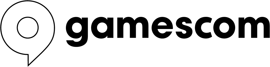
2022 Jung von Matt identity: stacked purple/blue pin -> horizontal black outline pin + wordmark
gamescom logo before and after
BeforeUntil 2022
gamescom logo via Wikimedia Commons (author: Game, Verband der deutschen Games-Branche). Source: commons.wikimedia.org
AfterSince 2022
gamescom logo via Wikimedia Commons (author: Game, Verband der deutschen Games-Branche). Source: commons.wikimedia.org

Key facts
gamescom launched a new logo in 2022, designed by Jung von Matt Brand Identity.
- Brand
- gamescom
- Launched
- Source: jvm.bi
- What changed
- 2022 Jung von Matt identity: stacked purple/blue pin -> horizontal black outline pin + wordmark.
- Why
- The organisers said the new brand would position gamescom as more premium, lifestyle and community focused and strengthen its international appeal.
- Sources
- gameswirtschaft.de, blachreport.de
Cite this Rebrand Log, "gamescom new logo (2022)", https://rebrandlog.com/rebrand/gamescom-2022/, last updated .
The gamescom rebrand, explained
Gamescom came back to the Cologne fairgrounds in August 2022 after the pandemic years with a different face. GamesWirtschaft reported in June that the organisers, the German games industry association game and Koelnmesse, had worked with Jung von Matt Brand Identity, Jung von Matt Nerd and TLGG on a complete recalibration of the brand. The logo change looks minor at first glance, the outlet noted: reduced to its basic forms, more stylised and now used in black and white and transparent versions. The trademark had been filed in February.
The positioning shift is bigger. The motto was more premium, more lifestyle, more community. The old line Heart of Gaming stayed in use, but the loud, colourful animated logo full of game elements was retired in favour of a new claim, Ahead of the Game, meant to signal that the industry, and the fair, are always a step ahead. Blachreport confirmed that every channel already carried the new look, designed to reach the community both online and on site, alongside a first dedicated co working space for creators.
The commercial logic was explicit. GamesWirtschaft said one aim was to open gamescom more to lifestyle brands from outside the games world, such as car makers and consumer goods companies, and to present the event as a festival of games cultures including esports, manga, anime, K-pop and cosplay. It also noted that big publishers increasingly hold their own livestreams and that several large exhibitors had skipped the 2022 fair. Christian Baur of game said the new brand had been developed over several years with the industry and would boost the fair's international appeal. Moritz Thauer of Jung von Matt Brand Identity said gaming had become the new avant garde of culture, and the brand deliberately broke away from the cutesy style of earlier years while leaving room for publishers, indies and communities.
For an event that once dressed like a toy box, going monochrome is a statement of adulthood, and it makes sense if the target is brand sponsors rather than teenagers. A neutral mark also gives exhibitors more room to be loud. The risk is that premium reads as corporate to the community that made the fair, and the new claim is generic. But as a frame for a festival that wants to sell itself to non games brands, the restraint fits.
In short: The toy box logo grows up.
Sources
- 1. jvm.bihttps://www.jvm.bi/project/gamescom-duplicate
- 2. gameswirtschaft.dehttps://www.gameswirtschaft.de/gamescom/gamescom-relaunch-rebranding-jvm-tlgg/