BritBox
New logo and identity.
BritBox logo before and after
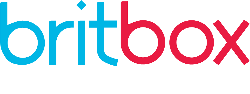
BeforeUntil Jan 2026
Logo: BritBox. Source: britbox.com (archived)


AfterSince 27 Jan 2026
BritBox logo from official website (live site). Source: britbox.com
Key facts
BritBox launched a new logo on 27 Jan 2026, designed by Sibling Rivalry.
- Brand
- BritBox
- Launched
- Source: siblingrivalry.com
- What changed
- New logo and identity.
- Why
- BritBox dropped the Union flag from its logo because, its head of brand said, the name already did the job and the red and blue vibrated in small digital spaces.
- Sources
- designweek.co.uk, mediapost.com
Cite this Rebrand Log, "BritBox new logo (2026)", https://rebrandlog.com/rebrand/britbox-2026/, last updated .
The BritBox rebrand, explained
Key people: Joel Pickard (Composer)
BritBox, the streaming service owned by BBC Studios, had leaned heavily on the Union Jack since launch. Design Week reported that as it grew into a profitable service, the red, white and blue tropes started to feel limiting, and its brand lived more in instinct than in system. It worked with Sibling Rivalry, which MediaPost and Design Week both credited, to turn 'British' from a place into a perspective.
BritBox's head of brand told Design Week the name already did the job: there was no need to double down on expected conventions. The teams identified 'Four Cs' as the real identifiers of the brand, Craft, Character, Charm and Country, focusing on how stories are told rather than where they are filmed. Dropping the flag was also practical: she said the red and blue vibrated next to each other in small digital spaces, were hard to place on some titles, and posed accessibility problems.
The hero of the system is the box, reimagined as a quiet curator rather than a container for a logo. In motion it works as a portal that frames characters, sliding horizontally then exiting vertically, a 'same but different' move. The mark became single-colour, and a toolkit of layouts called 'macro moments' pairs a character's face with the texture of their setting. Composer Joel Pickard wrote a sonic mnemonic, developed alongside the motion. The agency and client worked in a shared Figma file with 'office hours' for feedback. Out-of-home work rolled out in North America and Australia, MediaPost reported.
Sibling Rivalry's strategist summed up the approach as consistency plus frequency equals attribution.
Design Week's interview opened with an unlikely metaphor. BritBox's VP of brand and creative, Abby Elkin, said every brand's job is to lift and separate, recalling a 1980s bra advertisement, by finding the support structure underneath. Bo Bishop, the agency-side strategist in the conversation, described a sponge phase of listening before solving anything, followed by a duh test: the best answer should feel obvious once revealed. Elkin also said the flag had become a challenge for ADA compliance. The duh test is a good standard, and dropping the Union Jack passes it: the name already says British.
Removing the flag from a brand called BritBox is the kind of decision that sounds reckless and is actually disciplined. The box as a moving frame is simple and ownable. It risks looking a little anonymous on a crowded home screen, but character-led layouts give it more charm than any flag could.
In short: Britishness without the flag.
Press
Sources
- 1. underconsideration.com · paywalledhttps://www.underconsideration.com/brandnew/archives/new_logo_and_identity_for_britbox_by_sibling_rivalry.php
- 2. siblingrivalry.comhttps://www.siblingrivalry.com/studio/work/britbox
- 3. mediapost.comhttps://www.mediapost.com/publications/article/412277/sibling-rivalry-rebrands-britbox-with-logo-ooh.html
- 4. designweek.co.ukhttps://www.designweek.co.uk/ditching-the-jack-how-britbox-unboxed-a-new-perspective/