Tripadvisor (2020)
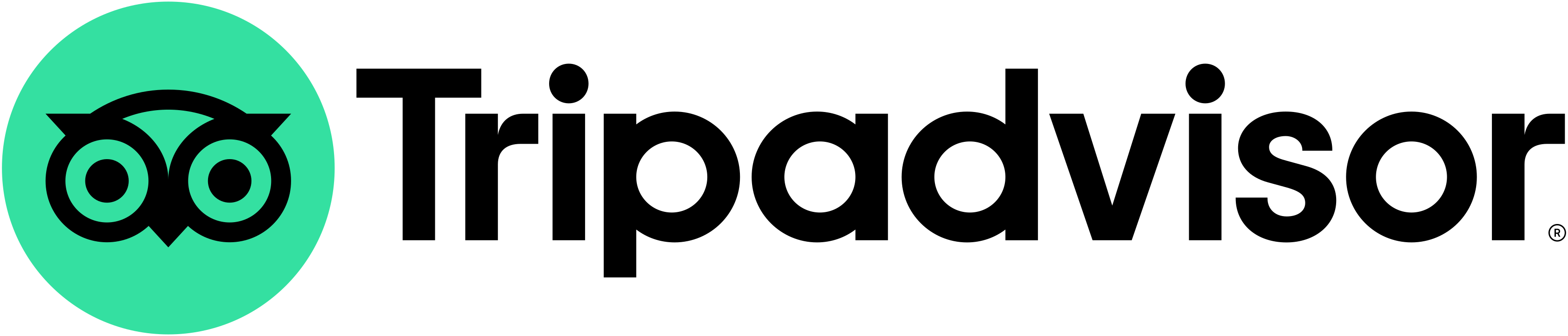
Ollie the owl simplified to monochrome, keeping its big eyes; name styled "Tripadvisor"; Trip Sans and pictogram set
Tripadvisor logo before and after
BeforeUntil Jan 2020
Tripadvisor logo via Wikimedia Commons. Source: commons.wikimedia.org




AfterSince Jan 2020
Tripadvisor logo via Wikimedia Commons (uploader/author: Tripadvisor). Source: commons.wikimedia.org

Key facts
Tripadvisor launched a new logo in Jan 2020, designed by Mother Design.
- Brand
- Tripadvisor
- Launched
- Typeface
- Trip Sans
- What changed
- Ollie the owl simplified to monochrome, keeping its big eyes; name styled "Tripadvisor"; Trip Sans and pictogram set.
- Why
- Tripadvisor redrew its owl in black so the logo would reproduce at all sizes while keeping its personality.
- Logo history
- 2 rebrands
Cite this Rebrand Log, "Tripadvisor new logo (2020)", https://rebrandlog.com/rebrand/tripadvisor-2020/, last updated .
The Tripadvisor rebrand, explained
Tripadvisor's owl, Ollie, was famous for its eyes: one red, one green, under a yellow head, which made the logo memorable and, as Creative Bloq put it, gave the impression that Ollie was on a different kind of trip. By 2020 the site had nearly 460 million unique visitors a month and 830 million reviews, and the logo had to work at tiny sizes.
Mother Design's New York studio, credited by Design Week and Creative Bloq, redrew the owl in black only. The studio described it as an exercise in reducing complexity and amplifying character: it kept the owl's personality but refined its geometry for reproduction at all sizes. The colour moved out of the logo and into a wider palette built around Trip Green, with orchid, salmon, rose, sand, moss, pine and mustard. Colophon Foundry made a custom typeface, Trip Sans, and new icons included a parasol for rest, a backpack for hike and a bed for stay.
The company also changed its name from TripAdvisor to Tripadvisor, saying that after 20 years people recognised and pronounced it as a single word. It called the logo the first step in a refresh to be rolled out over the year.
Designers mostly approved: on Reddit's logo design forum people called it an immense improvement and said they had never noticed how manic the old owl looked. Users were less kind. On Tripadvisor's own forum some called the new black owl unfriendly and a waste of money, and missed Ollie's heterochromia; a Brazilian design blog called it 100% flat and 50% dull.
Creative Bloq was kind about Ollie's makeover. The old owl was memorable, but its mix of colours limited it at small sizes, and the mismatched eyes gave the impression he was on a different kind of trip. The new version keeps his personality with refined, simpler geometry in monochrome, which Mother Design described as reducing complexity while amplifying character. A custom typeface, Trip Sans, and a palette built around a familiar Trip Green came with it. It is a sensible edit: the owl stays recognisable, it just stops squinting.
Both reactions are fair. The new owl is better drawn and works everywhere. But the mismatched eyes, odd as they were, were the most distinctive thing about the brand, and the new owl is just another clean mark.
In short: Ollie sobers up: cleaner and more versatile, with less charm.
Rationale
Prepare the brand for its next 20 years by refining its most distinctive assets and adding new ones.
Quote
“Our brief was to prepare the brand for the next 20 years by refining its most distinctive assets and introducing new ones, which would create a more cohesive visual identity,”
Press
Reactions
- Future London Academy@FLondonAcademy on XMother Design has created a fresh new look for @TripAdvisor by refining the iconic owl logo, and they collaborated with @colophonfoundry to design a custom typeface #FLA_inspiration #motherdesign #rebrand #tripadvisor5 Feb 2020 · 10 likes
- Parker Lee Creative@ParkerLeeCreate on XIt seems that TripAdvisor's old logo is taking a permanent vacation. Do you like the new look? . . . . . . . . . #Logo #Rebrand #TripAdvisor #Logomark #Rebrand #InReview #Media #BeforeAfter3 Feb 2020 · 0 likes
- Harold Magnus@Harold_Magnus on X#tripadvisor revealed a new logo and #branding system, which sees its well-known mascot getting a monochrome makeover and a custom type family that looks great as is expected from any Colophon Foundry work. The new…1 Feb 2020 · 11 likes
- Angsana@Angsana_UK on XNew logo for @Tripadvisor as part of a year-long identity refresh, but #OllietheOwl lives on! Created by @MotherDesign who says it reduces complexity and amplifies the character, and is the first step to a new look…4 Feb 2020 · 0 likes
Sources
- 1. itsnicethat.comhttps://www.itsnicethat.com/news/tripadvisor-rebrand-mother-design-graphic-design-050220
- 2. designweek.co.ukhttps://www.designweek.co.uk/issues/27-january-2-february-2020/tripadvisor-reveals-new-logo-ahead-of-year-long-identity-refresh/