Cadillac
Sep 18 2021 (digital
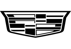
Cadillac logo before and after

BeforeUntil Sep 2021
Logo: Cadillac. Source: media.cadillac.com (archived)


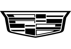
AfterSince Sep 2021
Logo: Cadillac. Source: media.cadillac.com (archived)
DownloadLightSVG not availablePNG
Key facts
Cadillac launched a new logo in Sep 2021, designed by Mother Design and Cadillac in-house.
- Brand
- Cadillac
- Launched
- Source: foxnews.com
- What changed
- Sep 18 2021 (digital.
- Why
- Cadillac tied its new monochrome crest to its new tagline Be Iconic as it moved toward an all-electric future.
- Sources
- foxnews.com, thedrive.com, carbuzz.com
Cite this Rebrand Log, "Cadillac new logo (2021)", https://rebrandlog.com/rebrand/cadillac-2021/, last updated .
The Cadillac rebrand, explained
Cadillac's crest takes its inspiration from the family crest of Antoine de la Mothe Cadillac, founder of Detroit, and has gone through many versions. Earlier, the brand dropped the round badge with its laurel wreath for a wider shield. In 2021, as it moved toward an all-electric future, it dropped the colour.
The new crest keeps the wide shape but renders it in grayscale outline, first online and on the 2023 Lyriq EV, where it appears lit up. Its cut-out construction lets colour from photography show through it, a trick that features heavily in the new art direction. The rollout of the wider identity, including photography, a new colour palette and typography, continued in stages. A spokesperson tied it to the new tagline, Be Iconic.
The new crest arrived in October 2021 and was tied to electrification: Carscoops and Fox News reported the colour badge would stay on combustion models while the monochrome version led on the EVs. Creative Bloq's headline said fans were not happy, and car forums called it cheap and dull, though the illuminated version on the Lyriq won some over.
The identity was developed by Mother Design with Cadillac's in-house team; the designers said the changes were meant to improve scalability.
CarBuzz added the transition plan. The black and white crest appeared first on Cadillac's website and social channels, then as an illuminated badge on the Lyriq, while legacy combustion models such as the Escalade and CT5-V Blackwing kept the colour version until the brand went fully electric by 2030. It was the second crest change since 2014, when the laurel wreath went and the shield widened. A spokesperson tied the mark to a new tagline, Be Iconic, and the monochrome badge could already be ordered on the Escalade Sport's Onyx package or fitted by dealers.
One review offered a small eulogy, noting the colours flew one last time on the CT5-V Blackwing before they faded to grey. Fair enough. The monochrome crest is more modern and more flexible, and the see-through trick is genuinely nice in motion. But it is also part of a wave that saw Kia, Volkswagen and Volvo flatten their marks, and Cadillac had more character to lose than most.
In short: Flattened for the EV age; elegant in motion, a little too grey on the badge.
Sources
- 1. foxnews.comhttps://www.foxnews.com/auto/cadillac-changing-logo-electric-age
- 2. thedrive.comhttps://www.thedrive.com/news/42650/now-cadillac-has-a-new-logo-hope-you-like-minimalism
- 3. carbuzz.comhttps://carbuzz.com/news/cadillac-is-getting-a-new-logo/
- 4. gmauthority.comhttps://gmauthority.com/blog/2021/10/2023-cadillac-lyriq-grille-features-50-leds-welcome-signature-video/