The Atlantic
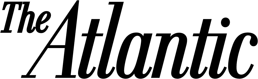
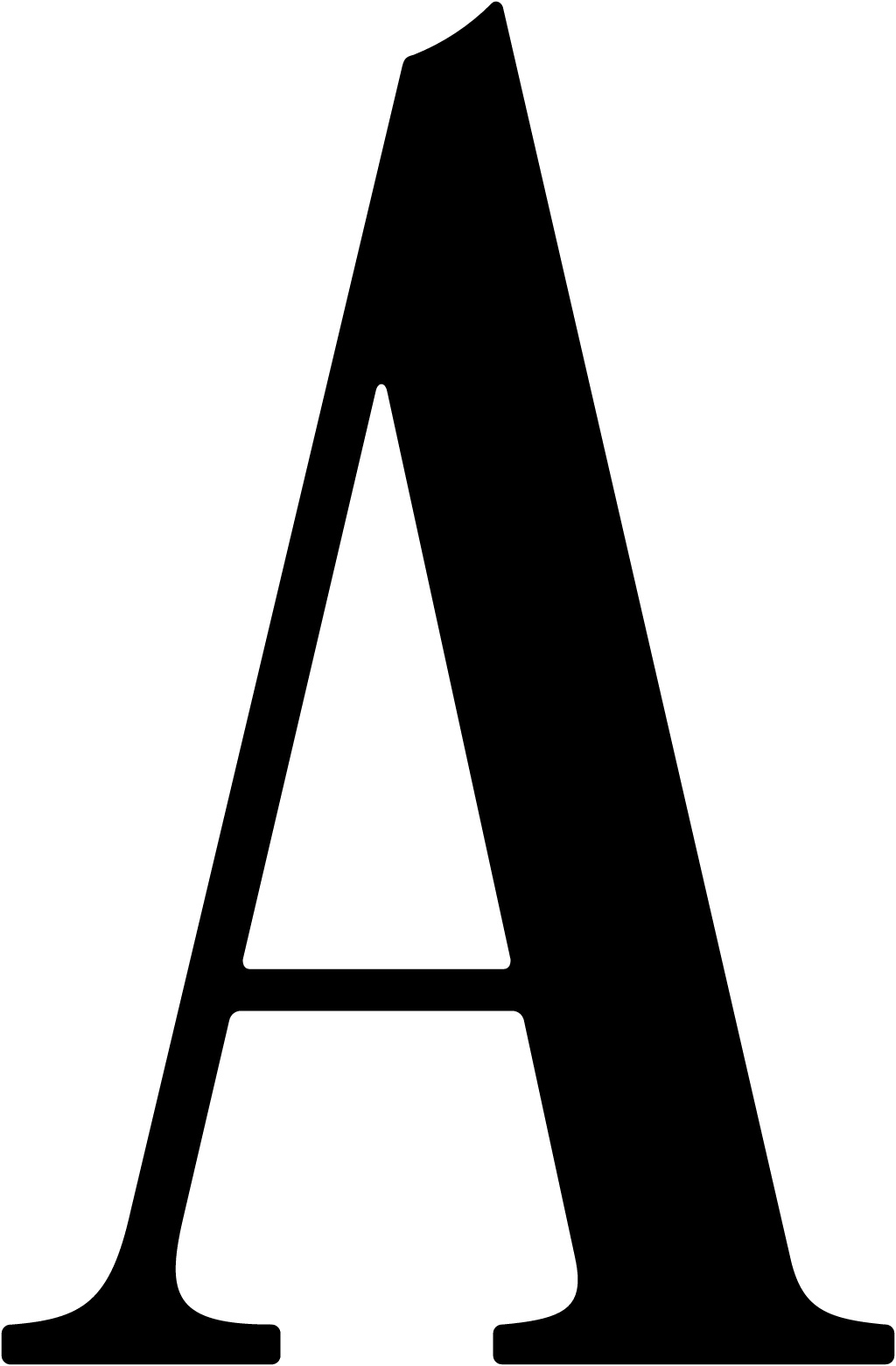
The italic "The Atlantic" nameplate, written out in full, was replaced as the primary logo by a single upright condensed capital A with a notch at its apex and adjusted feet. The full name lives on as a secondary wordmark.
The Atlantic logo before and after
BeforeUntil Nov 2019
Logo: The Atlantic. Source: theatlantic.com (archived)

AfterSince 12 Nov 2019
Logo: The Atlantic. Source: theatlantic.com (archived)

Key facts
The Atlantic launched a new logo on 12 Nov 2019.
- Brand
- The Atlantic
- Launched
- Studio
- Not recordedAdd it
- What changed
- The italic "The Atlantic" nameplate, written out in full, was replaced as the primary logo by a single upright condensed capital A with a notch at its apex and adjusted feet. The full name lives on as a secondary wordmark.
Cite this Rebrand Log, "The Atlantic new logo (2019)", https://rebrandlog.com/rebrand/the-atlantic-2019/, last updated .
The The Atlantic rebrand, explained
On 12 November 2019 The Atlantic launched a new logo and visual identity, a redesigned print magazine starting with the December issue and a new iOS app. It called this "the most dramatic overhaul of The Atlantic's visual identity in its 162-year history."
The nameplate that had "consistently topped the magazine (in different forms) for a century and a half has been updated to a simple and declarative A," the magazine said. Creative director Peter Mendelsund said the upright letter conveys more authority than the old italic, and that the mark works across the website, phones and social media.
The work was done in house by Mendelsund and senior art director Oliver Munday. Munday said they started from a condensed capital A that echoed a 19th-century logo by the Boston Type Foundry, added a notch to the top and adjusted the feet, then hired the typographer Jeremy Mickel of MCKL to refine it.
Alongside the A came the magazine's first bespoke typeface, Atlantic Condensed, based on the type the founders chose for the first issue in 1857. The cover also carries the founding year as a nod to the past.
In short: 162 years of nameplate became one letter.
Quotes
“The most notable change in this redesign is the new nameplate, the move to the A as representative of the whole.”
“We started with a condensed capital A that pointed toward an old version of The Atlantic logo drawn by Boston Type Foundry in the mid-19th century.”
Press
Sources
- 1. theatlantic.comhttps://www.theatlantic.com/press-releases/archive/2019/11/atlantic-makes-new-mark/601810/
- 2. theatlantic.comhttps://www.theatlantic.com/news/archive/2019/11/introducing-new-look-atlantic/601762/
- 3. designweek.co.ukhttps://www.designweek.co.uk/issues/11-17-november-2019/the-atlantic-magazine-redesigns-in-a-bid-for-elegance-and-urgency/
- 4. typeroom.euhttps://www.typeroom.eu/article/its-all-atlantic-stunningly-redesigned-bespoke-typeface-monogram
- 5. mckltype.comhttps://www.mckltype.com/custom/atlantic