ProPublica
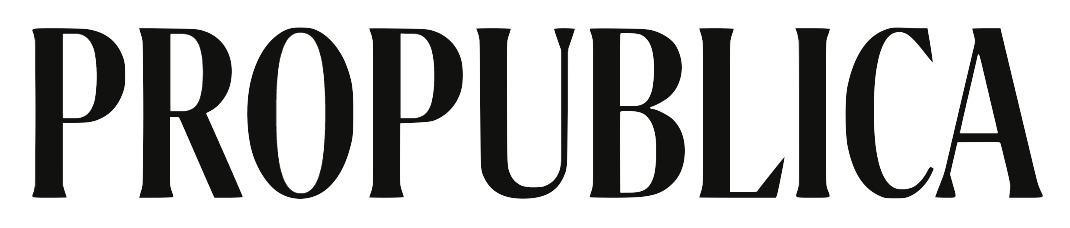
Identity refresh by Gretel: new wordmark intended to connect to the classicism of the name, built for cross-platform use.
ProPublica logo before and after
BeforeUntil May 2026
Logo: ProPublica. Source: propublica.org (archived)


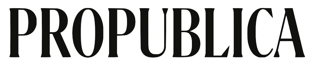
AfterSince May 2026
ProPublica logo via Wikimedia Commons (author: ProPublica). Source: commons.wikimedia.org
DownloadLightSVG not availablePNG
Key facts
ProPublica launched a new logo in May 2026, designed by Gretel and ProPublica in-house.
- Brand
- ProPublica
- Launched
- Source: propublica.org
- What changed
- Identity refresh by Gretel: new wordmark intended to connect to the classicism of the name, built for cross-platform use.
- Why
- ProPublica said its previous identity was built for an era before mobile phones and social media were ubiquitous, and the new logo travels better across screens.
Cite this Rebrand Log, "ProPublica new logo (2026)", https://rebrandlog.com/rebrand/propublica-2026/, last updated .
The ProPublica rebrand, explained
ProPublica rolled out its redesign on 5 May 2026. Chief product and brand officer Tyson Evans explained it in a note to readers: the logo and typefaces were new, bolder and cleaner, while maintaining a connection to the classicism of the name, and better at traveling across the many screens where the newsroom's work appears. The previous identity, he wrote, was built for a different era, launched before mobile phones and social media were ubiquitous, and was due for an update.
Nieman Lab's Sophie Culpepper reported that the changes went beyond the logo: the homepage now packages investigations with explainers, methodology and tip lines, gives translations and audio narration more prominence, and showcases archive work. She also reported that ProPublica partnered with the branding studio Gretel to rethink a system that had not kept pace with how its journalism reaches people across social, video, newsletters, films and podcasts, with a refreshed logo, typography and refined colour palette.
Editor and Publisher went deeper into the logo decision. Design director Allen Tan recalled deliberations over whether to use a full wordmark or a boxed P logo with a magnifying glass; the team committed to the text-only wordmark. Tan described a shift away from the newsroom's early scrappy underdog image toward a more monolithic identity presented uniformly across platforms, with simple tools for many teams and room for experimentation by its custom story design team.
Choosing the wordmark over the magnifying glass was the right call. A detective's lens is the most literal possible symbol for investigative journalism, and literal symbols tend to age fast. A plain, heavy wordmark says authority without the costume. The risk is the reverse: monolithic is a polite word for anonymous, and a bold wordmark alone gives readers little to remember beyond the name. Evans himself supplied the best review, telling Editor and Publisher that people know ProPublica not because of its name or logo but because of its reporting.
In short: No magnifying glass, just the name.
Sources
- 1. propublica.orghttps://www.propublica.org/article/why-propublica-redesign
- 2. niemanlab.orghttps://www.niemanlab.org/2026/05/propublica-gets-a-new-look-built-to-work-across-platforms/
- 3. editorandpublisher.comhttps://www.editorandpublisher.com/stories/inside-propublicas-major-brand-overhaul,263134