Telefe
21 Nov 2018: glossy blue/green/red 3D balls over grey "telefe" replaced by three flat black circles and bold black lowercase "telefe"; regional stations (e.g. Canal 8 Tucumán) dropped their own logos for the unified mark.
Telefe logo before and after
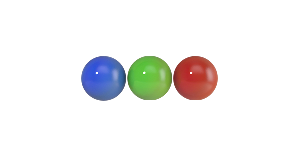
BeforeUntil Nov 2018
Logo: Telefe. Source: telefe.com (archived)
DownloadLightSVG not availablePNGDark mode version adapted by Rebrand Log
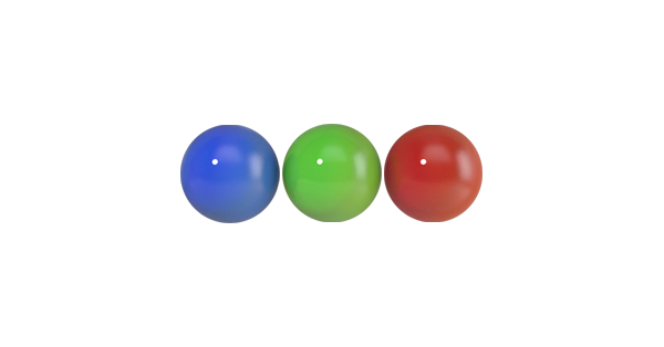
AfterSince Nov 2018
Telefe logo via Wikimedia Commons (author: Telefe). Source: commons.wikimedia.org

Key facts
Telefe launched a new logo in Nov 2018.
- Brand
- Telefe
- Launched
- Source: totalmedios.com
- Studio
- Not recordedAdd it
- What changed
- 21 Nov 2018: glossy blue/green/red 3D balls over grey "telefe" replaced by three flat black circles and bold black lowercase "telefe"; regional stations (e.g. Canal 8 Tucumán) dropped their own logos for the unified mark.
- Sources
- totalmedios.com, lagaceta.com.ar
Cite this Rebrand Log, "Telefe new logo (2018)", https://rebrandlog.com/rebrand/telefe-2018/, last updated .
Sources
- 1. totalmedios.comhttps://www.totalmedios.com/nota/36865/telefe-unifica-la-identidad-visual-de-sus-senales-del-interior
- 2. lagaceta.com.arhttps://www.lagaceta.com.ar/nota/790454/actualidad/adios-al-logo-canal-8-telefe-unifico-imagen-todo-pais.html