WPP
Dec 2018: Mark Read creative-transformation identity by Superunion/Landor
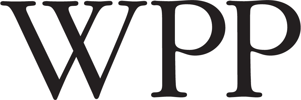
WPP logo before and after
BeforeUntil Dec 2018
WPP logo via Wikimedia Commons (author: Unknown authorUnknown author). Source: commons.wikimedia.org

AfterSince Dec 2018
WPP logo via Wikimedia Commons (author: Unknown authorUnknown author). Source: commons.wikimedia.org




Key facts
WPP launched a new logo in Dec 2018, designed by Superunion, Landor and WPP in-house.
- Brand
- WPP
- Launched
- Source: wpp.com
- What changed
- Dec 2018: Mark Read creative-transformation identity by Superunion/Landor.
- Why
- WPP's new identity aimed to show that the company was changing.
- Sources
- web.archive.org, medianews4u.com, wpp.com
Cite this Rebrand Log, "WPP new logo (2018)", https://rebrandlog.com/rebrand/wpp-2018/, last updated .
The WPP rebrand, explained
Key people: Mark Read (Chief executive, WPP) · Greg Quinton (Chief creative officer, Superunion) · Jim Prior (Global chief executive, Superunion) · Jane Geraghty (Global chief executive, Landor)
2018 was a turbulent year for WPP. Martin Sorrell, who had run it for more than 30 years, left in April and Mark Read took over a group facing weak growth and a falling share price. In December Read laid out a strategy to reposition WPP as a creative transformation company with a simpler offer, cutting and merging businesses; Design Week reported about 3,500 job losses.
The identity was unveiled the same day, during a marathon analyst presentation. It was made by WPP's own branding agencies, Superunion and Landor, with the group's central creative team, in a few months. Superunion chief creative officer Greg Quinton, a design lead, said the aim was to show that WPP was changing.
The old plain black and white serif wordmark gave way to a logo built from many parts that combine to form the name, standing for WPP's people, agencies, countries and clients working as one. On screen it constantly changes form and colour, and the team planned a coded version to generate variants across platforms. A bespoke sans serif, simply called WPP, set the copy. Superunion chief executive Jim Prior said the goal was to present WPP with the same energy it offers clients; Landor chief executive Jane Geraghty said the brand better reflected who the company was.
Design Week set the identity against a turbulent year. Martin Sorrell had left in April after more than three decades, Mark Read had taken over, growth was weak and the share price down, though WPP remained the world's biggest marketing group. The new logo, built from many parts that combine to form the name, was made by WPP's own consultancies with its in house team, and was meant to signal change as the group cut and merged its businesses. A mark about many parts becoming one is apt for a holding company; the test was whether the merging would follow.
The irony is unavoidable: a holding company announcing thousands of job cuts with a confetti logo about togetherness. As design, it is competent and generic, the kind of generative dot system many agencies were selling in 2018. It says change without saying what WPP actually does, which was precisely the problem Read was trying to solve.
In short: Confetti for a restructuring.
Sources
- 1. wpp.comhttps://www.wpp.com/news/2018/12/wpp-presents-strategy-for-growth
- 2. wpp.comhttps://www.wpp.com/featured/work/2018/12/superunion-and-landor---wpps-radical-evolution
- 3. medianews4u.comhttps://www.medianews4u.com/wpp-unveils-refreshing-multicoloured-identity-echoing-mark-reads-vision/