StockX
Arrow removed from the "X", which now also reads as a percent sign; custom type, brighter palette and photography
StockX logo before and after
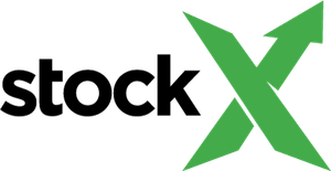
BeforeUntil Apr 2021
Logo: StockX. Source: stockx.com (archived)
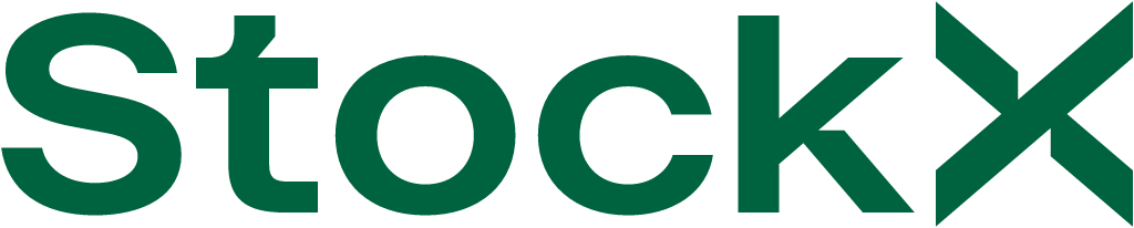
AfterSince Apr 2021
StockX logo via Wikimedia Commons (uploader/author: StockX). Source: commons.wikimedia.org

Key facts
StockX launched a new logo in Apr 2021, designed by StockX in-house.
- Brand
- StockX
- Launched
- Studio
- In-house at StockX
- Typeface
- StockX custom typeface
- What changed
- Arrow removed from the "X", which now also reads as a percent sign; custom type, brighter palette and photography.
- Why
- StockX removed the arrow from its logo because it was associated with the male symbol, as part of a push to include women and other shoppers.
- Sources
- campaignlive.com, itsnicethat.com
Cite this Rebrand Log, "StockX new logo (2021)", https://rebrandlog.com/rebrand/stockx/, last updated .
The StockX rebrand, explained
Key people: Deena Bahri (Chief marketing officer, StockX)
StockX did well out of 2020. The resale marketplace for sneakers, apparel, collectibles, trading cards, electronics, watches and handbags recorded $1.8 billion in gross merchandise value, more than 200 million visitors and a 90 per cent jump in active buyers, Campaign and It's Nice That reported. Five years after launch, it had expanded into Europe and Asia and added new categories, and in 2021 it refreshed its brand around a new logo.
The old wordmark had two disjointed parts: 'stock' in plain sans serif, followed by an X whose upward stroke ended in a green arrowhead, like a rising line on a stock chart. Chief marketing officer Deena Bahri told Campaign the arrow was commonly associated with the international symbol for male, and removing it was a push to include women and other shoppers. The new X is symmetrical and slimmer. The negative space either side forms two arrows pointing inward, which the company described as buyers and sellers meeting on a level playing field, and the shape also suggests an abstract percentage sign, a nod to the marketplace's stock-like price mechanics. 'Stock' is now set in a custom typeface whose t and k borrow cuts from the X, unifying the wordmark.
Around it came new product and lifestyle photography and a brighter palette of emerald green, coral, mustard yellow and blush pink, with collage-style mood boards. Bahri said it reflected a more mature, confident and inclusive StockX. The logo appeared first online and rolled out to packaging in phases.
Campaign added the commercial logic. StockX closed more than 7.5 million trades in 2020, and Bahri called women shoppers an area of hyper growth and focus, which is why the campaign showed off newer categories such as electronics and handbags. She said the logo reflected the aesthetic the next generation customer values, and that the rebrand marked the change the company had undergone in the previous two years rather than a new beginning. Framing it as catching up rather than starting over is honest, and it suits a mark that is a careful edit, not a reinvention.
It is a sensible tidy-up. The old arrow was a cliché as well as an accidentally gendered one, and the inward arrows are a smarter metaphor for a two-sided market. The custom letter cuts are fussy at small sizes, but the mark finally reads as one word.
In short: The arrow comes off the X.
Rationale
A more mature, confident and inclusive StockX not "anchored to a single audience or product category".
Quote
“Our updated brand expression showcases how we’re moving into a stage of modernisation and punctuates our evolution into a more mature, more confident, and more inclusive StockX,”
Press
Reactions
- Chris Kaufman@kauf on XI’m very excited to share the new @stockx brand identity. Our new logo represents a confident step towards becoming a world-class brand. It honors our past, speaks to who we are today, and highlights our bright…15 Apr 2021 · 190 likes
- Supreme@supremeandother on X@stockx love the new logo but you guys really didn’t account for the red/green color blind folks out here 😭😭😭😭16 Apr 2021 · 0 likes
- Sole Weekly@SoleWeekly on XStockX has a new logo... it's not good. April 11-17.17 Apr 2021 · 4 likes
- the player formerly known as mouse cop@dagenFCB8 on X@brendandunne @stockx The new logo makes me think StockX is the newest member of the Microsoft Office Suite22 Apr 2021 · 2 likes
- Doyle St.@stdoyle on XNew brand ID from StockX is 🔥15 Apr 2021 · 1 like
- michael 🇭🇰@Gulpinnn on Xstockx new logo just doesn’t hit the same1 May 2021 · 1 like
Sources
- 1. itsnicethat.comhttps://www.itsnicethat.com/news/stockx-rebrand-graphic-design-200421
- 2. campaignlive.comhttps://www.campaignlive.com/article/stockx-unveils-new-inclusive-logo/1713053