Staples
The red all-capitals Staples wordmark, whose L was bent into a staple, was replaced by a standalone symbol of a straight staple next to a friendlier lowercase Staples wordmark in red.
Staples logo before and after
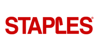
BeforeUntil Apr 2019
Logo: Staples. Source: staples.com (archived)
AfterSince 2 Apr 2019
Logo: Staples. Source: staples.com (archived)




Key facts
Staples launched a new logo on 2 Apr 2019.
- Brand
- Staples
- Launched
- Studio
- Not recordedAdd it
- What changed
- The red all-capitals Staples wordmark, whose L was bent into a staple, was replaced by a standalone symbol of a straight staple next to a friendlier lowercase Staples wordmark in red.
- Sources
- chainstoreage.com, retaildive.com, twice.com
Cite this Rebrand Log, "Staples new logo (2019)", https://rebrandlog.com/rebrand/staples-2019/, last updated .
The Staples rebrand, explained
Staples' old logo hid its idea inside the name: the L of the red wordmark was drawn as a staple, bent so the word stayed legible. Creative Bloq noted the design "had been going strong for over 25 years."
In early April 2019 the company replaced it as part of a push to reposition itself as "The Worklife Fulfillment Company," in TWICE's words. Chain Store Age reported that it "replaced its signature slanted L logo with a streamlined mark whose main component is an actual staple." Retail Dive said the font was refined to be more "friendly and approachable," and quoted the release calling the icon "a more direct representation of the Staples' name."
"Our new logo is symbolic of the commitment we are making to our customers: They are innovative, forward-thinking problem-solvers, and it's important for them to know that we are, too," said chief marketing officer Marshall Warkentin. The logo came with five new private labels, Tru Red, NXT Technologies, Coastwide Professional, Union & Scale and Perk, and new social pages under #WorklifeSolutions. No design studio was named in the coverage.
The reveal itself became the story. An internal video of staff cheering the new logo spread online, with one viewer calling it "the greatest video ever made" and another describing employees "giving their new corporate logo... a standing ovation."
The symbol drew a running joke. Creative Bloq asked, "Is it a staple? Is it a table?" On X, one person wrote "New Staples logo is... a table?" and another pointed out that "the word 'staples' easily becomes 'tables'."
In short: The bent staple in the L became a straight staple of its own.
Quotes
“Our new logo is symbolic of the commitment we are making to our customers: They are innovative, forward-thinking problem-solvers, and it's important for them to know that we are, too”
“Our customers deserve more than just an algorithm for ordering products for their business”
Press
Reactions
- Tomas Markevicius@tmarkevicius on XNew Staples logo is... a table? 🤦🏻♂️8 Apr 2019 · 0 likes
- ZeroFoxFX@ZeroFoxFX on X@TheseRetailDays @RMac18 It's not 😥 I just thought the new logo looked more like a table now and ironically the word 'staples' easily becomes 'tables'. Man... I kinda do want to come round your house though. I like…9 Apr 2019 · 2 likes
- Jym@JymFox on XGuys I know I said the new Staples logo reveal was the greatest video ever made but now I can't stop laughing about this. Two greatest videos ever made in one day, damn.7 Apr 2019 · 6 likes
- Olivier Schmouker@OSchmouker on XWatch Staples employees giving their new corporate logo... a standing ovation.8 Apr 2019 · 0 likes
Sources
- 1. chainstoreage.comhttps://chainstoreage.com/technology/staples-in-big-brand-revamp-rolling-out-more-private-labels
- 2. retaildive.comhttps://www.retaildive.com/news/staples-launches-brand-revamp/551834/
- 3. twice.comhttps://www.twice.com/retailing/staples-rebrands-as-worklife-fulfillment-company
- 4. creativebloq.comhttps://www.creativebloq.com/news/new-staples-logo