WNBA
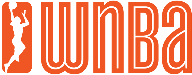
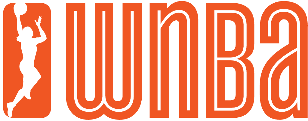
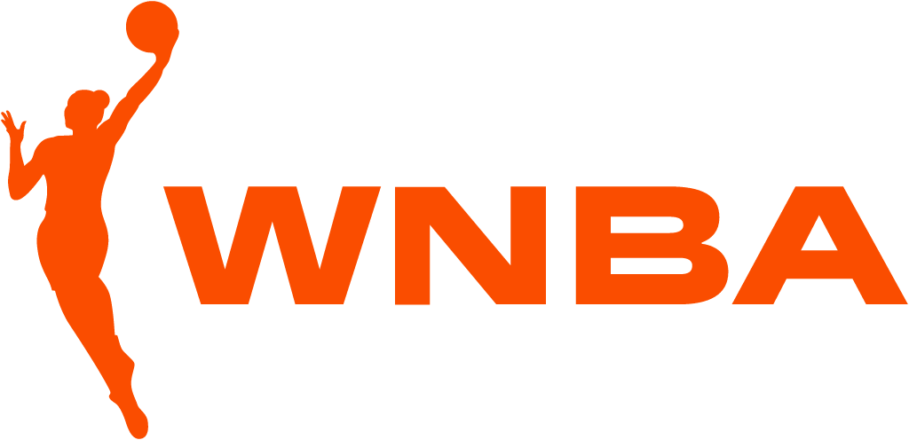
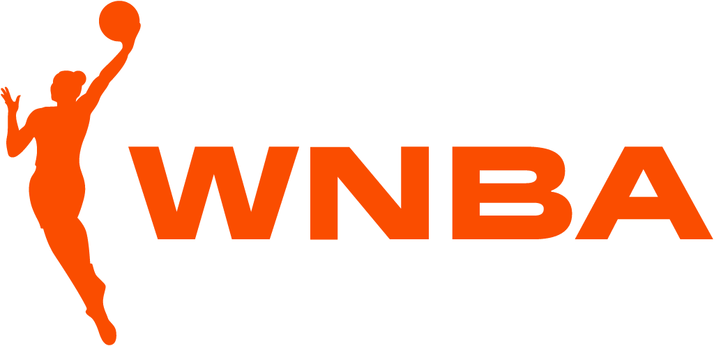
The logowoman left her box. The boxed silhouette and outlined lowercase wnba gave way to a freer, longer figure with a bun beside a bold, solid WNBA wordmark in orange.
WNBA logo before and after
BeforeUntil Apr 2019
Logo: WNBA. Source: wnba.com (archived)
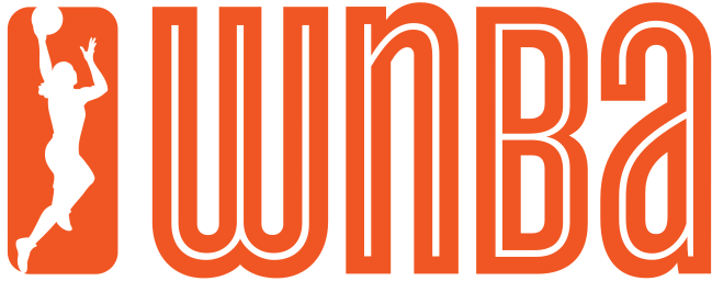
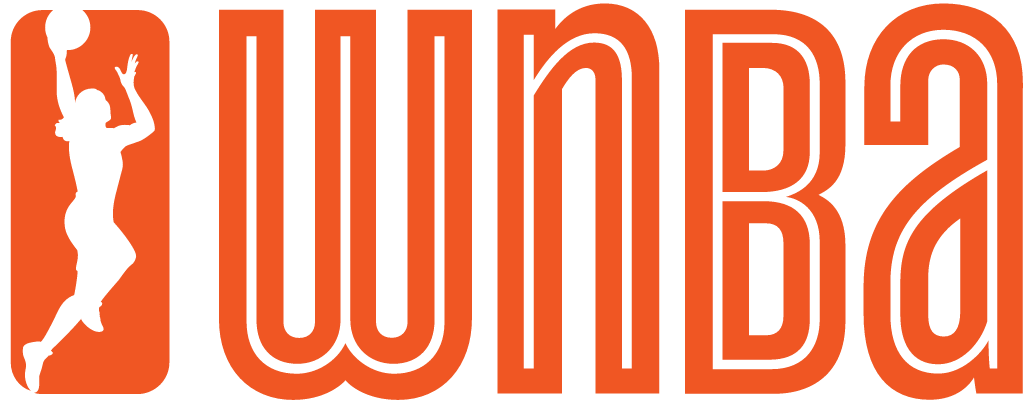
AfterSince 8 Apr 2019
Logo: WNBA. Source: wnba.com (archived)


Key facts
WNBA launched a new logo on 8 Apr 2019, designed by Sylvain Labs.
- Brand
- WNBA
- Launched
- What changed
- The logowoman left her box. The boxed silhouette and outlined lowercase wnba gave way to a freer, longer figure with a bun beside a bold, solid WNBA wordmark in orange.
- Sources
- apnews.com, sylvain.co, commarts.com
Cite this Rebrand Log, "WNBA new logo (2019)", https://rebrandlog.com/rebrand/wnba-2019/, last updated .
The WNBA rebrand, explained
The WNBA's silhouette logo, known to everyone as the logowoman, had always followed the NBA's lead: a player inside a rectangle. The version used since 2013 put her in an orange box next to an outlined lowercase wnba.
On 8 April 2019 the league unveiled a new identity built with the consultancy Sylvain Labs. Chief operating officer Christy Hedgpeth told AP the work started with strategy, aimed at a much younger audience, "the 16-to-34 millennials, who are very diverse, very socially conscious, engaged in issues of today." Sylvain says it worked with players throughout, and its credits list Katie Sadow as lead designer and Cole Nielsen as creative director, with a variable typeface made with Hélène Marian and Production Type.
The big change is the box, or rather its absence. "They took the silhouette out of the box which is a massive breakthrough," Hedgpeth said, adding that the new figure is "more athletic, longer physique." She made the comparison explicit: "The NBA logo, there’s a rectangle around him, he’s in a box... She had a box around her. The box is going away." The figure now wears her hair in a bun, which Hedgpeth said was a big part of the conversation, and she sits beside a solid, heavy WNBA in capitals.
Because of production lead times, the new logo did not reach uniforms and balls until the 2020 season, but it went everywhere else straight away. Early reaction was warm. Howard Megdal wrote that he was "Hearing only great reviews", and AP's own Doug Feinberg looked ahead to a different argument: "Waiting for the outcry that everyone’s calling the new wnba logo logowoman and the nba is just called logo."
It is a good example of a small graphic change carrying a big idea. Removing one rectangle did more to separate the WNBA from the NBA than a new name could have.
In short: Out of the box, and into her own league.
Quote
“The NBA logo, there’s a rectangle around him, he’s in a box. Same with the G-League logo and the previous W-logo. She had a box around her. The box is going away. It’s powerful, it’s freeing and it’s expansive.”
Press
Reactions
- Doug Feinberg@DougFeinberg on XWaiting for the outcry that everyone’s calling the new wnba logo logowoman and the nba is just called logo8 Apr 2019 · 3 likes
- Howard Megdal@howardmegdal on XHearing only great reviews about @WNBA rebrand so far, by the way. A big investment from the league, so that's significant. #WNBA8 Apr 2019 · 8 likes
- Michael Voepel@MAVoepel on XWNBA's Christy Hedgpeth and firm league worked with looked at hundreds of sketches for new logowoman. Marketing at that granular level is esoteric. Like when people who *really* know poetry talk about it. :) It's…8 Apr 2019 · 28 likes
Sources
- 1. apnews.comhttps://apnews.com/52ab22301ef84d65adc9e09e0bae6d2a
- 2. sylvain.cohttps://sylvain.co/work/wnba/
- 3. commarts.comhttps://www.commarts.com/project/29309/women-s-national-basketball-association-identity