Poetry Foundation
Poetry Foundation replaced its detailed flying Pegasus with a heavier, geometric Pegasus that stands with one hoof raised, one of four new poses.
Poetry Foundation logo before and after
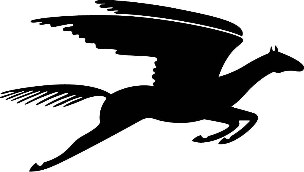
BeforeUntil Sep 2026
Poetry Foundation Pegasus (before 2026) from the official Poetry Foundation website, as archived. Source: arquivo.pt

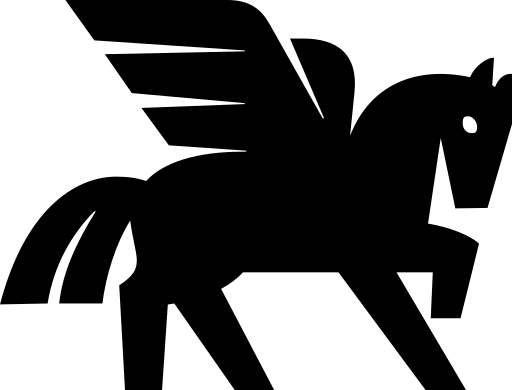
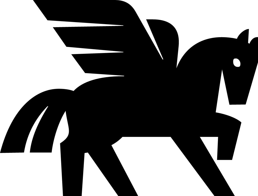
AfterSince 28 Sep 2026
Poetry Foundation Pegasus (2026) from the official Poetry Foundation website (poetryfoundation.org). Source: poetryfoundation.org
Key facts
Poetry Foundation launched a new logo on 28 Sep 2026, designed by Pentagram.
- Brand
- Poetry Foundation
- Launched
- Source: poetryfoundation.org
- What changed
- Poetry Foundation replaced its detailed flying Pegasus with a heavier, geometric Pegasus that stands with one hoof raised, one of four new poses.
- Sources
- poetryfoundation.org, prnewswire.com
Cite this Rebrand Log, "Poetry Foundation new logo (2026)", https://rebrandlog.com/rebrand/poetry-foundation-2026/, last updated .
The Poetry Foundation rebrand, explained
The Poetry Foundation announced the new identity on its website and through PR Newswire on Sep 28, 2026. Foundation creative director Fred Sasaki led the rebrand with Andrea Trabucco Campos and his team at Pentagram, the studio that also redesigned the brand in 2016 under Michael Bierut.
According to the announcement, Pegasus has been Poetry's logo since 1912. The new version comes in four poses: one hoof raised, standing, rearing, and in flight, and it is designed to scale from the spine of the magazine to large poetry installations. The update also brings an expanded color palette and a new type system with Times Modern and Times Gothic, and magazine covers now carry poem excerpts.
Side by side, the old mark was a finely drawn flying Pegasus in solid black, with long feathered wings, a streaming tail and its legs stretched out. The new one, the one hoof raised pose used in the website header, is built from heavier, flatter shapes: straight-cut wing feathers, a blocky body, a raised foreleg and a small round eye.
In short: Poetry Foundation traded its flying Pegasus for a bolder, geometric Pegasus in four poses, by Pentagram, in September 2026.
Quote
“We wanted an identity that could convey the full range of what we do and the vibrancy of poetry: big, bright, and beautiful in itself.”
Press
Sources
- 1. poetryfoundation.orghttps://www.poetryfoundation.org/articles/1829637/the-poetry-foundation-and-poetry-magazine-launch-a-new-brand-identity
- 2. prnewswire.comhttps://www.prnewswire.com/news-releases/the-poetry-foundation-and-poetry-magazine-launch-a-new-brand-identity-302891644.html