PayPal (2014)
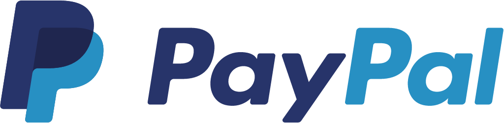
Overlapping PP monogram and refined wordmark
PayPal logo before and after
BeforeUntil Apr 2014
Logo: PayPal. Source: paypal.com (archived)




AfterSince Apr 2014
Logo: PayPal. Source: paypal.com (archived)

Key facts
PayPal launched a new logo in Apr 2014, designed by fuseproject.
- Brand
- PayPal
- Launched
- What changed
- Overlapping PP monogram and refined wordmark.
- Why
- PayPal updated its logo because the old one had not adapted to the places it would now appear, from smart watches to shop counters.
- Logo history
- 4 rebrands
Cite this Rebrand Log, "PayPal new logo (2014)", https://rebrandlog.com/rebrand/paypal-2014/, last updated .
The PayPal rebrand, explained
Key people: Yves Béhar (Founder, fuseproject) · Christina Smedley (VP global brand and communications, PayPal) · David Marcus (President, PayPal)
PayPal had not touched its identity since 2007, and an internal audit found a problem: the brand that entered the world as a challenger now, in the company's own words, resembled the banking establishment it had set out to disrupt. Christina Smedley, vice president of global brand and communications, told Dezeen the old logo had not adapted to the places it would now appear, from smart watches to shop counters. President David Marcus tied the launch to PayPal's first global brand campaign and a line about people, not money, making the world go round.
The system has four parts. The wordmark is still italic, which PayPal said signals forwardness, but is set in a modified Futura with softened edges. A new monogram overlaps two translucent Ps, which Yves Béhar said represented the physical act of a peer-to-peer payment. The single blue became two: a deep indigo Pay blue and a brighter Pal blue, chosen for high-definition screens. A dynamic angled graphic carries the forward motion into layouts. Wordmark and monogram lock up as the signature, and the monogram was meant to lead on small screens.
The identity was developed by fuseproject, Béhar's San Francisco studio, which had already designed the PayPal Here card reader and its brand. It was applied to checkout buttons, apps, PayPal Here devices, marketing and sales material, and the new campaign.
Béhar used the launch to argue, in his Dezeen interview, that Silicon Valley obsessed over products but neglected brands that should match the scale of their influence. At the time PayPal had 143 million active accounts in 193 countries.
ReadWrite explained the rush. PayPal president David Marcus was rolling out a new in-context checkout and a raft of products, and because merchants, app developers and retailers from Home Depot to Jamba Juice displayed PayPal buttons, he wanted the identity changed once, at the same time, rather than asking them to update their buttons later. The project began only in December, a fast timeline for the scale involved. Marcus likened the overlapping double-P monogram to Nike's swoosh as a shorter form of expression that would also become the app icon, and the logo debuted alongside PayPal's first US TV advertising, with print, outdoor and in-store work in the US, Germany and the UK.
The overlapping Ps are the strongest idea: a simple, ownable symbol that explains the product without a word. The wordmark is less transformed than the press release suggests, and the two-blue split is a subtle trick most people never notice, but the system did what it promised, giving PayPal a mark that works at the size of a button.
In short: Two overlapping Ps gave PayPal a symbol it never had, and the wordmark finally stopped looking like a bank's.
Sources
- 1. en.wikipedia.orghttps://en.wikipedia.org/wiki/PayPal
- 2. fuseproject.comhttps://fuseproject.com/work/paypal