DeviantArt
New logo and identity.
DeviantArt logo before and afterRefinement
BeforeUntil Dec 2014
DeviantArt logo via Wikimedia Commons (DeviantArt logo.png). Source: commons.wikimedia.org
AfterSince Dec 2014
DeviantArt logo via Wikimedia Commons (DeviantArt Logo2.svg). Source: commons.wikimedia.org
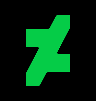
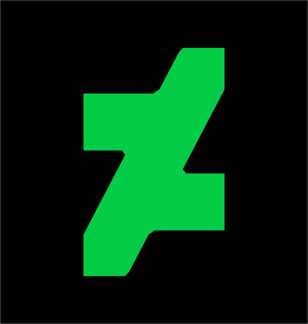
Refinement: the mark keeps its form. The refresh also covers identity.
Key facts
DeviantArt launched a new logo in Dec 2014, designed by Moving Brands.
- Brand
- DeviantArt
- Launched
- Source: underconsideration.com
- What changed
- New logo and identity.
- Why
- DeviantArt rebranded around its core story, bleed and breed art, which it said guided everything from partnerships to its first app.
Cite this Rebrand Log, "DeviantArt new logo (2014)", https://rebrandlog.com/rebrand/deviantart-2014/, last updated .
The DeviantArt rebrand, explained
Key people: Angelo Sotira (Chief executive, DeviantArt)
DeviantArt started in 2000 as a place to share modifications to computer applications and by 2014 had 32 million registered users. Moving Brands was brought in to redefine its core beliefs to enable growth. Chief executive Angelo Sotira wrote that defining that core story took almost a year, and the result was the phrase 'bleed and breed art', which he said guided everything, from partnerships to the first DeviantArt app.
The new symbol evolves the old lower-case d and capital A, cut on either side at 62 degrees. Sotira praised its ability to tessellate into a pattern in which the two As become clear. The 62-degree cut runs through the wordmark and is trimmed into type on the site. The typeface is Calibre, set in capitals wherever possible. Sotira said there was no question DeviantArt was green; after trying every shade the team picked a vibrant 'DeviantArt Green', used selectively against neutral greys chosen to show off art. Moving Brands also drew a custom icon set and designed the app, which launched on 10 December, in tandem with the brand.
The community did not take it quietly. Creative Bloq reported that many users simply could not see the initials, and some pointed out a resemblance to the logo of Russian studio PlatzKart. Design Week commenters read it as a backwards dollar sign. Others answered with tributes, painting the symbol in their own styles.
The launch journal posted on DeviantArt read like a manifesto. DeviantArt, it said, was not a company or a brand or a website but a community united in its love of art and artists, and the new look was not designed to compete or keep up with anyone else. It called the site where art starts, the movement for the liberation of creative expression, and an unapologetically addictive experience. Writing a brand story that disowns being a brand is a familiar move, and it sat awkwardly beside a logo that many members took personally.
The critics had a point. Stripped of the obvious dA, the mark reads as an abstract glyph, and the manifesto language, 'prolific orgy of originality' included, oversold it. Yet it is cleaner, more ownable and better on screens than the old logo. The problem was never the shape; it was asking a site of artists to admire a corporate abstraction.
In short: A sharp symbol nobody could read.
Press
Sources
- 1. underconsideration.com · paywalledhttps://www.underconsideration.com/brandnew/archives/new_logo_and_identity_for_deviantart_by_moving_brands.php
- 2. deviantart.comhttps://www.deviantart.com/spyed/journal/Boldly-Facing-The-Future-498282387
- 3. designweek.co.ukhttps://www.designweek.co.uk/issues/december-2014/online-community-deviantart-rebrands-to-bleed-and-breed-art/