Ottawa Senators
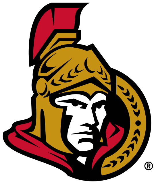
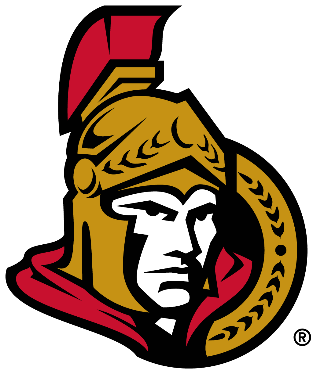
The front-facing 3D centurion in a gold helmet with a red plume was replaced by a flat, side-on centurion in the spirit of the club's original 1992 logo, with a red plume, gold cape trim instead of red, and a gold laurel semicircle that completes an O.
Ottawa Senators logo before and after
BeforeUntil Sep 2020
Logo: Ottawa Senators. Source: www-league.nhlstatic.com (archived)
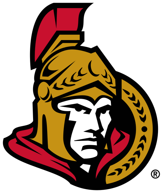
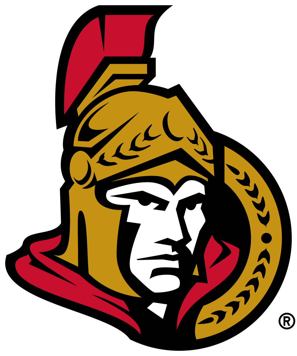
AfterSince 18 Sep 2020
Logo: Ottawa Senators. Source: www-league.nhlstatic.com (archived)




Key facts
Ottawa Senators launched a new logo on 18 Sep 2020.
- Brand
- Ottawa Senators
- Launched
- Studio
- Not recordedAdd it
- What changed
- The front-facing 3D centurion in a gold helmet with a red plume was replaced by a flat, side-on centurion in the spirit of the club's original 1992 logo, with a red plume, gold cape trim instead of red, and a gold laurel semicircle that completes an O.
- Sources
- nhl.com, cbc.ca, sportsnet.ca
Cite this Rebrand Log, "Ottawa Senators new logo (2020)", https://rebrandlog.com/rebrand/ottawa-senators-2020/, last updated .
The Ottawa Senators rebrand, explained
The Senators announced the logo on 18 September 2020, saying they were returning to their heritage. It is a modified version of the two-dimensional centurion the club used from its first season in 1992-93, which had since been replaced by a front-facing 3D head.
CBC News described the new mark as going "back to basics": the cape trim is gold rather than red, and a gold laurel semicircle reinforces the O shape. The club said it would not use a secondary logo that season, and revealed matching uniforms at the draft.
In short: The centurion went flat again.
Press
Sources
- 1. nhl.comhttps://www.nhl.com/senators/news/ottawa-senators-introduce-new-primary-logo-319089730
- 2. cbc.cahttps://www.cbc.ca/news/canada/ottawa/ottawa-senators-logo-2d-nhl-1.5729788
- 3. sportsnet.cahttps://www.sportsnet.ca/nhl/article/senators-announce-new-primary-logo-will-reveal-new-uniforms-draft/