Nielsen
18 Oct 2021: serif white "n" on a cyan square (with lowercase "nielsen") replaced by a cluster of coloured play-button/rating triangles forming a negative-space N beside a bold navy sentence-case "Nielsen" (Siegel+Gale), after the NielsenIQ sale.
Nielsen logo before and after
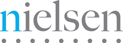
BeforeUntil Oct 2021
Nielsen logo, PR Newswire multimedia (media 409456; Wayback 2017-01-30). Source: prnewswire.com (archived)
DownloadLightSVG not availablePNGDark mode version adapted by Rebrand Log
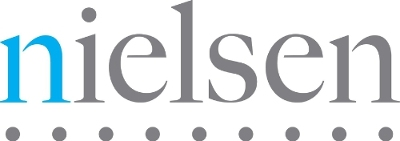

AfterSince Oct 2021
Nielsen logo, PR Newswire multimedia (Nielsen brand identity release, 18 Oct 2021). Source: prnewswire.com (archived)
DownloadLightSVG not availablePNGDark mode version adapted by Rebrand Log

Key facts
Nielsen launched a new logo in Oct 2021.
- Brand
- Nielsen
- Launched
- Source: nielsen.com
- Studio
- Not recordedAdd it
- What changed
- 18 Oct 2021: serif white "n" on a cyan square (with lowercase "nielsen") replaced by a cluster of coloured play-button/rating triangles forming a negative-space N beside a bold navy sentence-case "Nielsen" (Siegel+Gale), after the NielsenIQ sale.
- Why
- Nielsen said perceptions had not kept pace with the company's transformation.
- Sources
- adweek.com, nielsen.com
Cite this Rebrand Log, "Nielsen new logo (2021)", https://rebrandlog.com/rebrand/nielsen-2021/, last updated .
The Nielsen rebrand, explained
Key people: Jamie Moldafsky (Chief marketing and communications officer, Nielsen)
In March 2021 Nielsen sold its Global Connect business, NielsenIQ, to Advent International, leaving a slimmer company focused solely on media: audience measurement, outcomes and content services, with cross-media measurement combined into Nielsen One. Chief marketing and communications officer Jamie Moldafsky said perceptions had not kept pace with the company's transformation, and told Adweek that a brand facing outward should reflect the organisation and culture inside.
On 18 October 2021 Nielsen unveiled its first brand refresh in five years and its first new logo since 2007, launching it at Advertising Week New York with signage at Hudson Yards. The purpose line became 'Powering a better media future for all people'.
The new logo is built from shapes inspired by the universal play button and by ratings, which come together to form an N in the negative space, Adweek reported. Nielsen described it as playful, optimistic and smart, signifying insights revealed by data and the constant momentum of media. The palette is deliberately varied: many colours for the diversity of media, music, shows, creators and audiences; green and orange triangles for ratings moving up and down; and a red triangle for the content people choose not to watch or hear, since data is also about what audiences skip.
The launch also introduced a new purpose statement and a refreshed brand system across the company.
Nielsen's announcement laid out the narrower business behind the new look. After selling Global Connect, it would focus on three areas, measurement, audience outcomes and content services, folding its measurement products into Nielsen One and continuing to build Gracenote's metadata and analytics for on demand content. The launch even came with signage across two floors at Hudson Yards and a daily breakfast in a lounge decked out in the new logo, images and colours. A play button for a ratings company is apt, and a smaller, sharper company deserved a mark that says media rather than market research.
The play-button N is a neat idea, cleverer than the old wordmark, and the colour logic is unusually specific. Whether so many colours stay disciplined across a measurement business is the open question.
In short: A hidden N, in play buttons.
Sources
- 1. nielsen.comhttps://www.nielsen.com/news-center/2021/nielsen-unveils-new-brand-identity-reflecting-companys-transformation-and-focus-on-the-global-future-of-media/
- 2. adweek.comhttps://www.adweek.com/convergent-tv/nielsen-refreshes-brand-logo-following-nielseniq-sale/
- 3. adage.comhttps://adage.com/article/marketing-news-strategy/nielsen-rebrands-amid-measurement-troubles/2373951/