Lancia
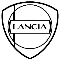
28 Nov 2022 (Lancia Design Day): the glossy blue-and-chrome 2007 shield replaced by a flat, minimal shield, Lancia's eighth logo, based on the 1957 Flaminia badge. It keeps the wheel, flag and an asymmetric lance and adds a new fashion-inspired Lancia lettering.
Lancia logo before and after
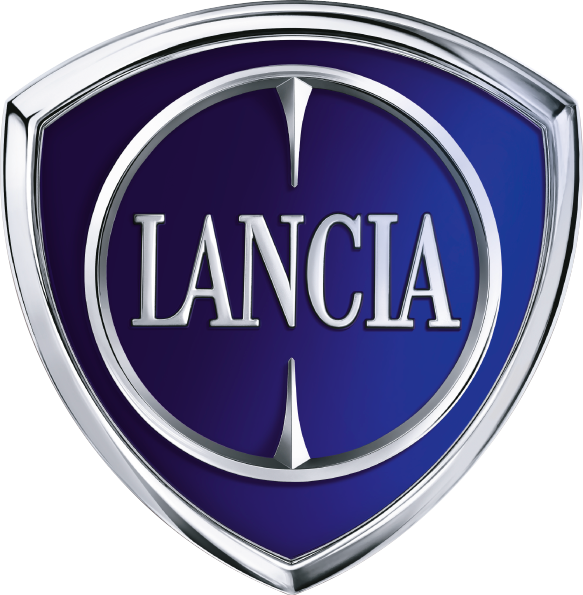
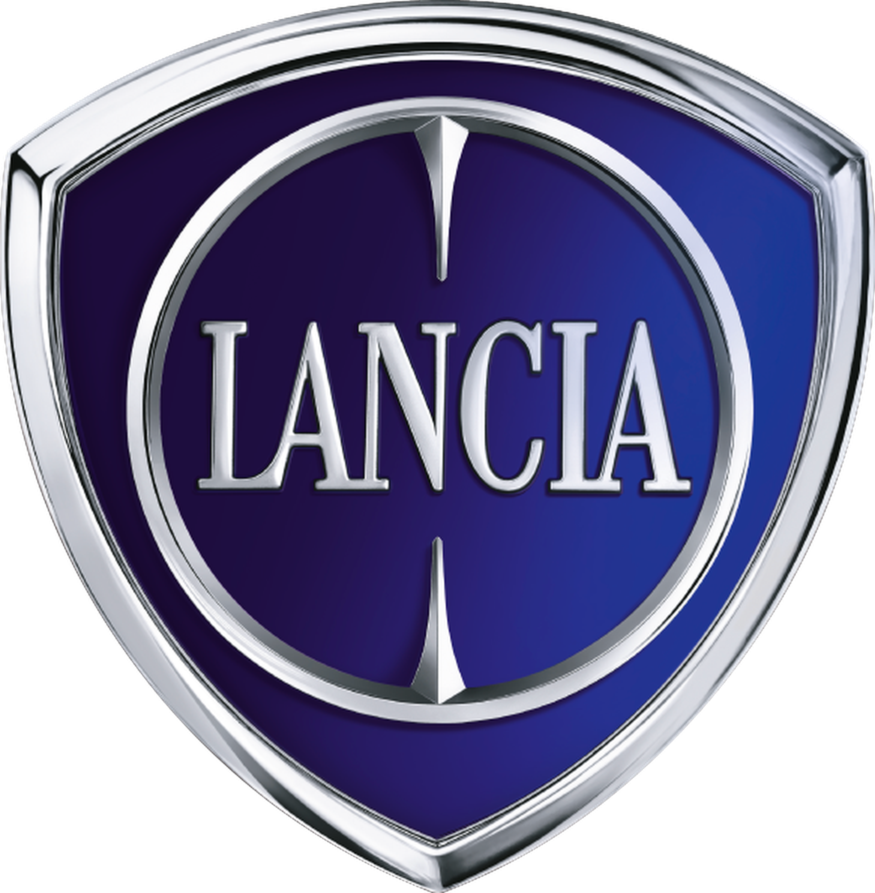
BeforeUntil Nov 2022
Logo: Lancia. Source: media.stellantis.com (archived)
DownloadLightSVG not availablePNGDarkSVG not availablePNGDark mode version adapted by Rebrand Log
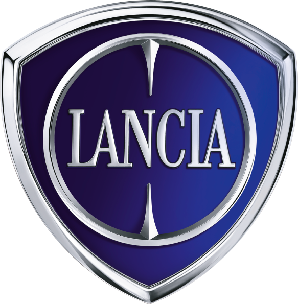
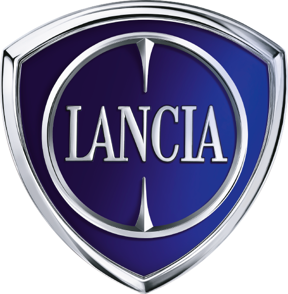
AfterSince Nov 2022
Logo: Lancia. Source: lancia.it (archived)
DownloadLightSVG not availablePNG
Key facts
Lancia launched a new logo in Nov 2022.
- Brand
- Lancia
- Launched
- Source: media.stellantis.com
- Studio
- Not recordedAdd it
- What changed
- 28 Nov 2022 (Lancia Design Day): the glossy blue-and-chrome 2007 shield replaced by a flat, minimal shield, Lancia's eighth logo, based on the 1957 Flaminia badge. It keeps the wheel, flag and an asymmetric lance and adds a new fashion-inspired Lancia lettering.
- Why
- Lancia said its new logo, inspired by the Flaminia emblem, revisits its historical elements in a Progressive Classic style.
- Sources
- theverge.com, media.stellantis.com, autonews.com
Cite this Rebrand Log, "Lancia new logo (2022)", https://rebrandlog.com/rebrand/lancia-2022/, last updated .
The Lancia rebrand, explained
Key people: Luca Napolitano (CEO, Lancia)
Lancia held its Design Day on 28 November 2022 and revealed a new logo, the eighth in its 116-year history. The Verge reported it alongside the news that the Stellantis brand would be reborn as an electric marque, with three cars between 2024 and 2028, a new Ypsilon, a new Delta and an unnamed flagship, and only electric vehicles sold from 2028.
The logo, The Verge noted, harks back to the 1957 design. Lancia's own release said it was mainly inspired by the emblem first seen on the Flaminia, and described it as Progressive Classic: it revisits the historical elements, the wheel, the flag, the shield, the lance and the lettering, simplifies their lines and shapes and arranges them in a new balance, with an asymmetrical lance adding a touch of eclecticism. It is made of aluminium with circular brushing like a watch dial. The lettering uses a new font inspired by fashion.
Designers studied all seven earlier versions, Lancia said, from the minimal gold script of 1907 to the 1911 design with its four-spoke wheel, flag and lance, the 1929 shield, the 1957 badge, the 1974 version, Massimo Vignelli's 1981 stylisation and the 2007 logo it replaces.
Chief executive Luca Napolitano called it the start of a renaissance. Automotive News described a mockup sculpture, the Pu+Ra Zero, showing the new identity at the front and the logo on the C pillar.
The Verge added the arithmetic of a revival. This was the eighth logo in Lancia's 116 years, harking back to 1957, and it arrived with a plan for three electric cars between 2024 and 2028: a new Ypsilon, a new Delta and an unnamed flagship. At the time the brand sold one car in one market, Italy. Chief executive Luca Napolitano unveiled a sculpture, Pu+Ra Zero, as a three dimensional manifesto of the new design language, where past and future are in continuous contact. A heritage badge is the cheapest part of a revival; the cars have to do the rest.
Retreating into the archive is the right instinct for Lancia. The 1950s logo had real elegance, and the designers clearly knew it. The new one is cleaner, flatter and more jewel-like, and it reconnects the brand with the era when its cars mattered. The open question is whether nostalgia can sell an electric hatchback outside Italy.
In short: Back to the Flaminia.
Sources
- 1. media.stellantis.comhttps://www.media.stellantis.com/em-en/lancia/press/lancia-design-day-the-first-event-of-the-new-lancia-era
- 2. motor1.comhttps://www.motor1.com/news/623875/lancia-design-day-concept-debut/
- 3. autonews.comhttps://www.autonews.com/cars-concepts/lancia-unveils-new-logo-design-language-ahead-relaunch/