Milwaukee Bucks
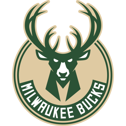
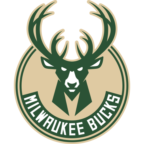
The green buck head over a red triangle and a slab "Bucks" wordmark was replaced by a forward-facing buck inside a cream roundel with "Milwaukee Bucks" arched below. The antlers grew from eight points to 12 and frame a basketball in negative space, the neck forms an M, and red left the palette.
Milwaukee Bucks logo before and after
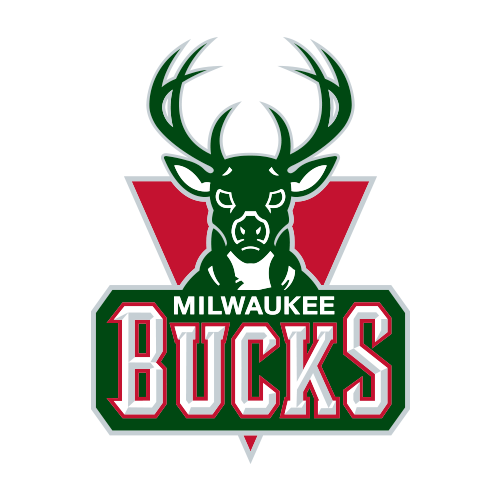
BeforeUntil Apr 2015
Logo: Milwaukee Bucks. Source: i.cdn.turner.com (archived)
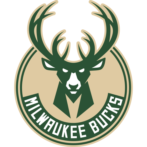
AfterSince 13 Apr 2015
Logo: Milwaukee Bucks. Source: i.cdn.turner.com (archived)
Key facts
Milwaukee Bucks launched a new logo on 13 Apr 2015, designed by Doubleday & Cartwright.
- Brand
- Milwaukee Bucks
- Launched
- What changed
- The green buck head over a red triangle and a slab "Bucks" wordmark was replaced by a forward-facing buck inside a cream roundel with "Milwaukee Bucks" arched below. The antlers grew from eight points to 12 and frame a basketball in negative space, the neck forms an M, and red left the palette.
- Sources
- nba.com, news.sportslogos.net, espn.com
Cite this Rebrand Log, "Milwaukee Bucks new logo (2015)", https://rebrandlog.com/rebrand/milwaukee-bucks-2015/, last updated .
The Milwaukee Bucks rebrand, explained
The Bucks revealed the identity at a halftime ceremony on 13 April 2015, with speed painters creating the marks live. The logos took over after the 2014-15 season.
The new palette is Good Land Green, Cream City Cream, after Milwaukee's cream brick, and Great Lakes Blue. The team said it was the only NBA team to use a cream. In the primary logo the buck faces forward, its chest forms an M for Milwaukee, and the antlers go from eight points to 12, "symbolic of the young bucks' maturation", with a basketball hidden in the negative space between them.
Brooklyn studio Doubleday & Cartwright designed the set with Milwaukee native Justin Thomas Kay as managing creative director. SportsLogos.Net reported that the Bucks approached the firm in July 2014, leaving about six weeks to meet the NBA's deadline. A secondary ball-in-roundel badge and a Wisconsin map mark completed the family.
In short: A fiercer buck, an M for Milwaukee and no more red.
Quote
“The buck's chest comprises an "M" to serve as reminder of the city we call home, while the rack has expanded from eight points in the previous logo to 12 here”
Press
Sources
- 1. nba.comhttps://www.nba.com/bucks/release/bucks-unveil-new-visual-identity
- 2. news.sportslogos.nethttps://news.sportslogos.net/2015/04/13/milwaukee-bucks-honour-history-move-into-future-with-new-logos/
- 3. espn.comhttps://www.espn.com/nba/story/_/id/12685594/milwaukee-bucks-unveil-fiercer-more-aggressive-logo
- 4. doubledayandcartwright.comhttps://www.doubledayandcartwright.com/work/milwaukee-bucks