KOHO
"K" refined into a forward-pointing, arrow-like form; bolder colours, friendlier rounded type and Canadian-inspired illustration
KOHO logo before and after
BeforeUntil Oct 2024
KOHO logo via Wikimedia Commons (uploader/author: Unknown authorUnknown author). Source: commons.wikimedia.org

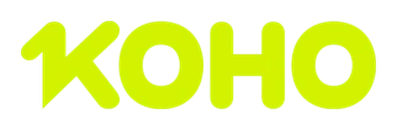
AfterSince 9 Oct 2024
KOHO logo via Wikimedia Commons (uploader/author: Koho). Source: commons.wikimedia.org
DownloadLightSVG not availablePNGDark mode version adapted by Rebrand Log

Key facts
KOHO launched a new logo on 9 Oct 2024, designed by KOHO in-house.
- Brand
- KOHO
- Launched
- Studio
- In-house at KOHO
- What changed
- "K" refined into a forward-pointing, arrow-like form; bolder colours, friendlier rounded type and Canadian-inspired illustration.
- Sources
- koho.ca
Cite this Rebrand Log, "KOHO new logo (2024)", https://rebrandlog.com/rebrand/koho/, last updated .
Identity
KOHO / KOHO in-house, image from koho.ca
Rationale
The logo represents members' financial progress.
Quote
“We’ve spruced up our logo, particularly the 'K', to reflect the progress KOHO members can make when they join.”
Press
Reactions
Sources
- 1. koho.cahttps://www.koho.ca/learn/visualizing-progress/