Jacksonville Icemen
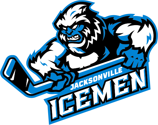
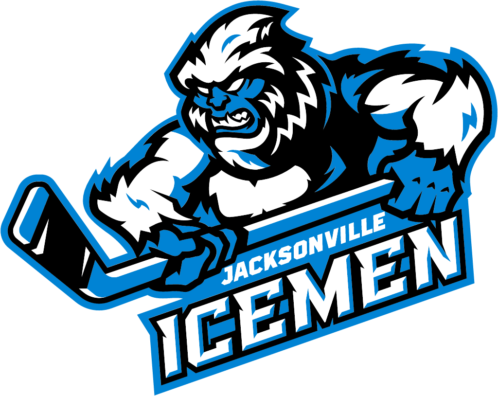
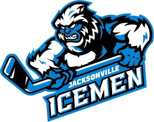
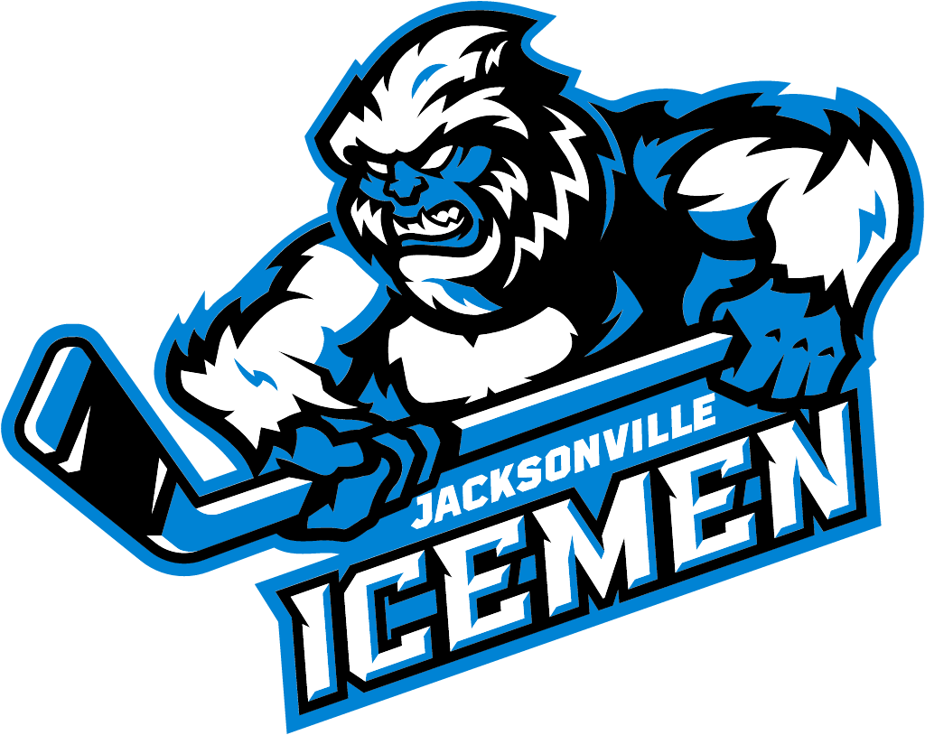
Ahead of its 10th anniversary season, the ECHL hockey team introduced a new primary logo, a stick-wielding Yeti over an angled Icemen wordmark, replacing the parka-clad man carried over from the club's Evansville days, and swapped navy and gray for iceberg blue, black and snow.
Jacksonville Icemen logo before and after
BeforeUntil Jul 2026
Jacksonville Icemen logo (before 2026) from the official team website (jacksonvilleicemen.com), archived capture. Source: jacksonvilleicemen.com




AfterSince 16 Jul 2026
Jacksonville Icemen logo (2026), official SVG from jacksonvilleicemen.com. Source: jacksonvilleicemen.com
Key facts
Jacksonville Icemen launched a new logo on 16 Jul 2026, designed by The Barn Creative.
- Brand
- Jacksonville Icemen
- Launched
- What changed
- Ahead of its 10th anniversary season, the ECHL hockey team introduced a new primary logo, a stick-wielding Yeti over an angled Icemen wordmark, replacing the parka-clad man carried over from the club's Evansville days, and swapped navy and gray for iceberg blue, black and snow.
Cite this Rebrand Log, "Jacksonville Icemen new logo (2026)", https://rebrandlog.com/rebrand/jacksonville-icemen-2026/, last updated .
The Jacksonville Icemen rebrand, explained
The Icemen announced the new look on their own site and through the ECHL on Jul 16, 2026, calling it a completely new look for Icemen hockey. The team is the ECHL affiliate of the Minnesota Wild and the Iowa Wild, and opens its 10th anniversary season on Oct 31, 2026. The rebrand was designed by The Barn Creative.
The old primary logo was not born in Florida. ECHL Commissioner Ryan Crelin said "the prior logo was carried forward from the membership in Evansville, IN, before relocating to Jacksonville," and that the new design gives the team and fans "a modern look that they can call their own."
The new primary logo is what the team calls a mythic snow creature, a Yeti swinging a stick over an angled Icemen wordmark, backed by a full suite of alternate logos. According to Nick Matarese of The Barn Creative, the idea came from a pencil sketch in which a Yeti foot turns into the shape of Florida. "This isn't just a new look - it's Jacksonville's team," he said.
"This rebrand is about more than a new look - it's a reflection of how much this community has embraced the Icemen over the last decade," said Andy Kaufmann, the team's owner and chief executive. The colors change too: iceberg blue, black and snow come in, and the navy blue and gray of the previous look are gone. Three new jersey concepts are to follow later.
In short: The Icemen swapped a parka-clad man inherited from Evansville for a stick-swinging Yeti in iceberg blue.
Quotes
“This rebrand is about more than a new look - it's a reflection of how much this community has embraced the Icemen over the last decade,”
“This isn't just a new look - it's Jacksonville's team,”
Press
Sources
- 1. jacksonvilleicemen.comhttps://jacksonvilleicemen.com/news/2026/07/icemen-unveil-new-logo-and-team-colors
- 2. echl.comhttps://echl.com/news/2026/07/icemen-unveil-new-logo
- 3. news.sportslogos.nethttps://news.sportslogos.net/2026/07/17/echls-jacksonville-icemen-mark-10th-anniversary-with-new-suite-of-logos/hockey/